• Skip to primary navigation
  • Skip to main content
  • Skip to primary sidebar
Antichaos

Antichaos

Data Visualisation, Tableau & Data Services

  • Home
  • Blog
  • Services
  • Training
  • Portfolio
  • Contact
  • Nederlands
  • Show Search
Hide Search

Data Visualization

Create a Radarchart in Tableau – Modular and Simple

2026-02-11 by Johan de Groot

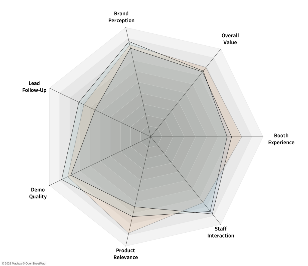
In an earlier post, Radar Charts: Practical tips for when and how to use them, I explored when radar charts work well, when they don’t, and the common pitfalls that make them misleading or hard to read. This article builds on that foundation.

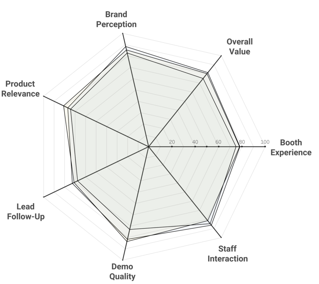
Instead of revisiting the theory, I’ll focus on how to construct a radar chart in Tableau in a different way than usual. The new way is is more modular, provides more options, and might be easier.

[Read more…] about Create a Radarchart in Tableau – Modular and Simple

Radar Charts: Practical tips for when and how to use them

2026-01-25 by Johan de Groot

Radar charts (also known as spider charts, web charts, or even Kiviat diagrams) are among the most recognizable – and controversial – chart types in data visualization.

They promise a compact way to compare multiple metrics at once, which is why they often show up in dashboards, even when they create more confusion than clarity.

This article explains

  • What a radar chart actually encodes
  • Where radar charts can be effective
  • Why they often fail in analytical contexts
  • Practical guidance for using them responsibly

The goal is not to ban radar charts, but to use them deliberately and with clear awareness of their trade-offs.

[Read more…] about Radar Charts: Practical tips for when and how to use them

Responsive Labels – Smarter, Cleaner Dashboards

2025-05-22 by Johan de Groot

Data Visualization is about visualizing data the right way.

Interactive business dashboards tend to have a special challenge: the must display data with accurate labels, regardless of how the data changes from day to day. Many infographics visualizations are using static data – and therefor the labels can be put on the most convenient location. But what happens when the data changes – either due to new data, or filtering? Labels will overlap, disappear, and/or get mixed up.

The funnel chart is one type of visualization that’s especially prone to this, even with just a few data marks. While working on one, I came up with a solution to keep all the labels nice and clear, no matter what the data throws at it. Bonus: it’s flexible enough for easy customization!

[Read more…] about Responsive Labels – Smarter, Cleaner Dashboards

Deep Cleaning Barcharts – part 2: Punctuated Bar Chart

2025-01-16 by Johan de Groot

[part of the ‘Datafam London 2024 series]

In part 1 we took a look at a basic bar chart, and ended with the lollypop chart. A fun chart with one major issue: the dot obfuscates the real datapoint.

Punctuated Bar Chart

One solution for it the Punctuated Bar Chart:
We highlight the end of each bar, instead of enlarging the endpoint.

[Read more…] about Deep Cleaning Barcharts – part 2: Punctuated Bar Chart

Deep Cleaning Barcharts – part 1: the basics

2025-01-16 by Johan de Groot

[part of the ‘Datafam London 2024 series]

On DataFam 2024 in London I gave a presentation / workshop on deep cleaning dashboards.

Why cleaning dashboards?

  • Make it look better ▶ Users want to use it
  • Less clutter on your dashboard ▶ Less clutter in your brain
  • Making your dashboard more actionable ▶ Focusing on what’s important.

Dashboard cleaning is about: Removing, adding , re-arranging, and replacing stuff. In Tableau, it’s about: Table calculations, extra sheets, changing images, talking to users, being critical to yourself, … Is hard work – and a lot of fun!

[Read more…] about Deep Cleaning Barcharts – part 1: the basics

Primary Sidebar

Antichaos Services

  • Need Tableau Help ?
  • Basic, Advanced and Custom Training

Recent Blogposts

  • Create a Radarchart in Tableau – Modular and Simple
  • Radar Charts: Practical tips for when and how to use them
  • Smarter dashboard design – with fewer tooltips
  • Top 2000 in Perspective – Behind the Scenes
  • How to Visualize High-Value Metrics in Tableau Without Starting at Zero
  • Why is COUNTD so slow – and how can I fix this?
  • Visualizing ‘Dynamic’ Data using a Sine Wave
  • Add ‘All’ and more options to a Dynamic Parameter
  • Tableau Container Art – 4 examples of formatting dashboards without images
  • Letting Users Choose Their Visual

Follow & Connect on

Antichaos

Copyright © 2026 Antichaos

  • Antichaos
  • Privacy
  • Contact