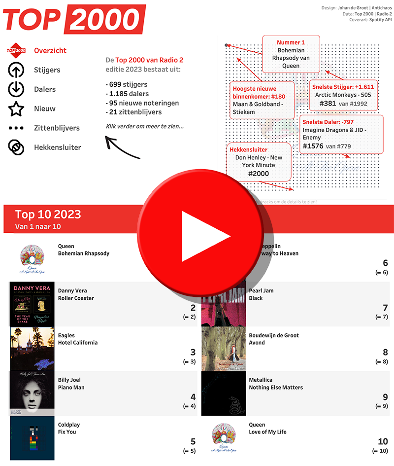
The Top 2000 of Radio 2 (a populair Dutch radio station) has been broadcast for the 25th time – and traditionally I am trying to turn this into a ‘different’ interactive data visualization…
Antichaos
Data Visualisation, Tableau & Data Services
The Top 2000 of Radio 2 (a populair Dutch radio station) has been broadcast for the 25th time – and traditionally I am trying to turn this into a ‘different’ interactive data visualization…
De 25e keer is de Top 2000 van Radio 2 uitgezonden – en traditiegetrouw probeer ik hier weer een ‘andere’ interactieve datavisualisatie van te maken…
Now and then you encounter data with ‘extreme values’. Values which are much larger than the other ones – and so hard to analyse.
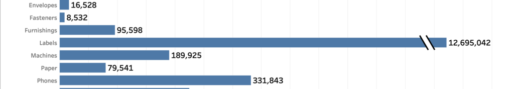
A dataset which is skewed like that needs to have a special treatment when visualized, because otherwise the individual values can’t be identified correctly.
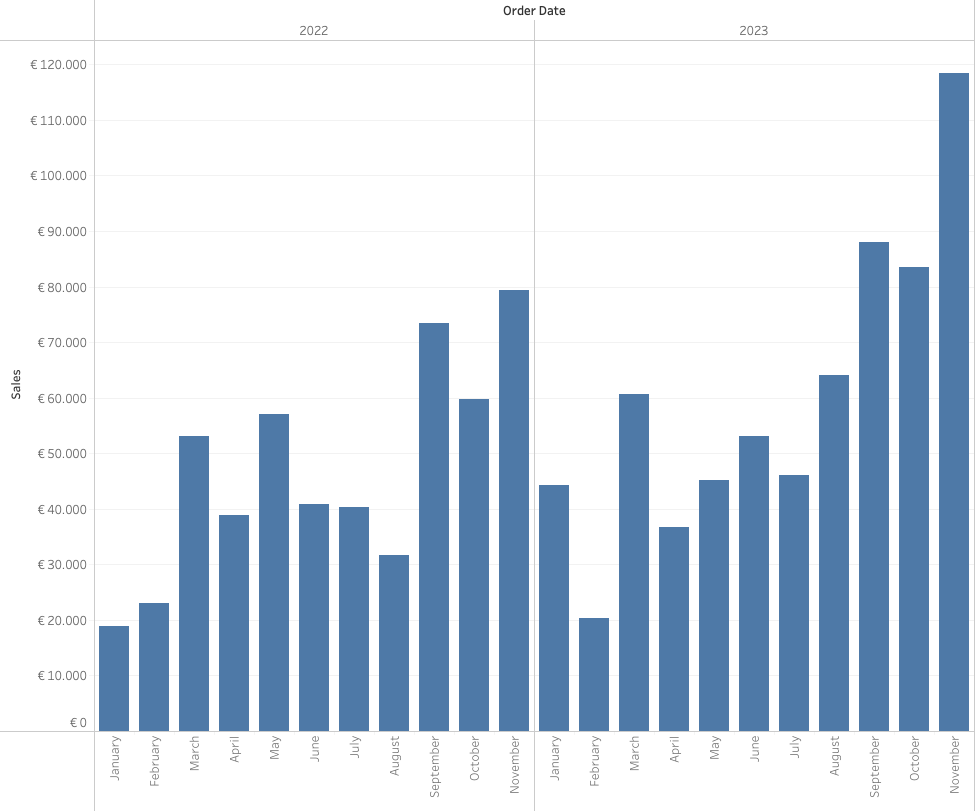
[Read more…] about How to visualize extreme values?Often improving a dashboard is about small changes. Have a look a this chart:
[This blogpost is part of a series tips tricks, as being presented at VizIt Berlin 2023]
[Read more…] about Improve layout of percentags – Better labels in TableauLabels are often an after-thought for many users – we don’t like them, but are necessary. Using some simple steps we can create better labels which are easier to interpret for the users of the dashboard.
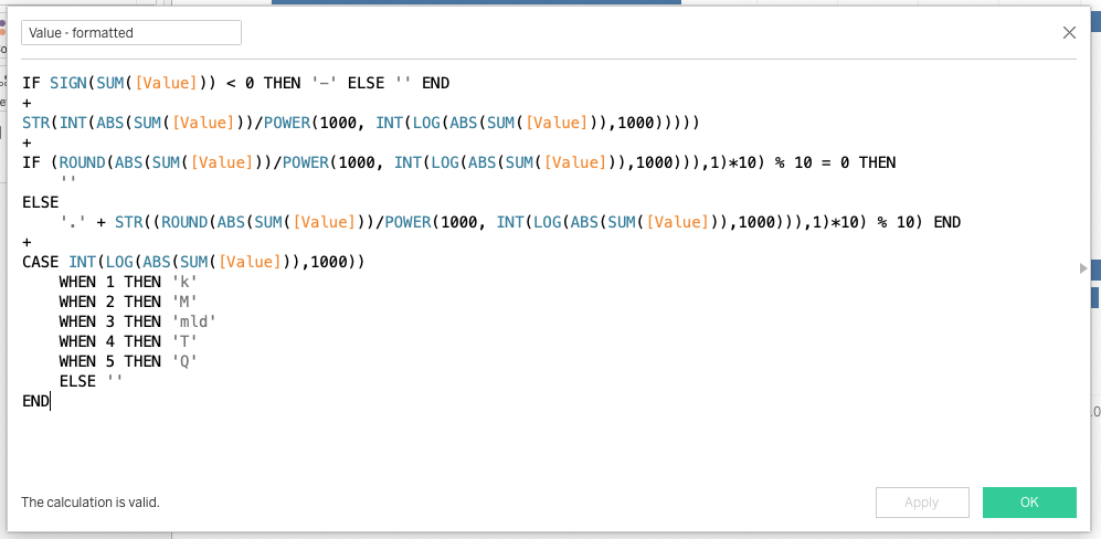
[This blogpost is part of a series tips tricks, as being presented at VizIt Berlin 2023]