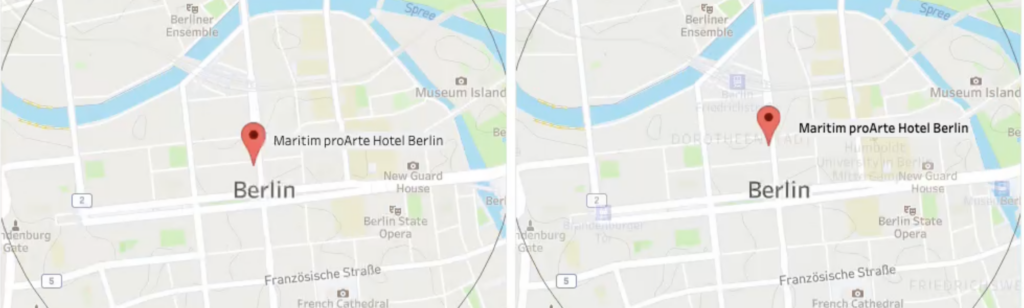
The ‘shapes’ functionality in Tableau is a nice way to enhance and personalize a visualization. But be aware what exactly you are decoration – especially on maps.
Antichaos
Data Visualisation, Tableau & Data Services
The ‘shapes’ functionality in Tableau is a nice way to enhance and personalize a visualization. But be aware what exactly you are decoration – especially on maps.
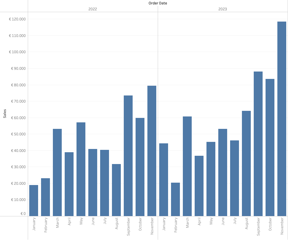
Often improving a dashboard is about small changes. Have a look a this chart:
[This blogpost is part of a series tips tricks, as being presented at VizIt Berlin 2023]
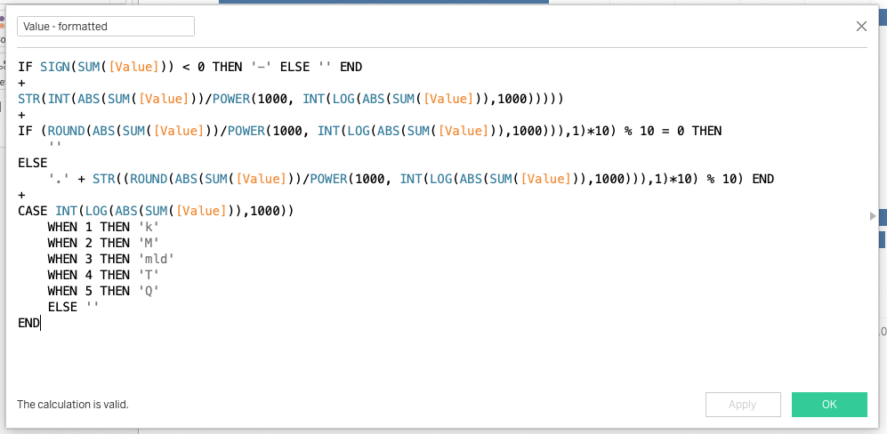
[Read more…] about Improve layout of percentags – Better labels in TableauLabels are often an after-thought for many users – we don’t like them, but are necessary. Using some simple steps we can create better labels which are easier to interpret for the users of the dashboard.
[This blogpost is part of a series tips tricks, as being presented at VizIt Berlin 2023]
This week the “DataFam” was reuniting in Berlin. Two days of great talks, great people in a wonderful atmosphere!