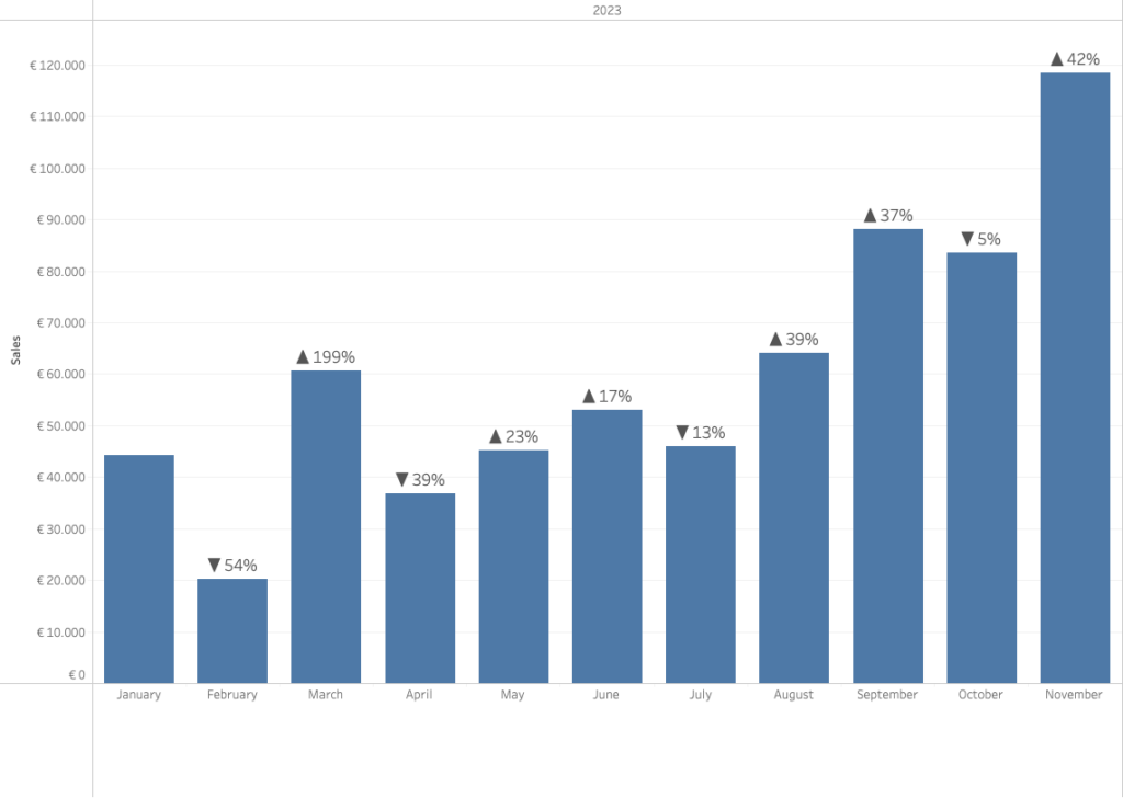
Often improving a dashboard is about small changes. Have a look a this chart:

[This blogpost is part of a series tips tricks, as being presented at VizIt Berlin 2023]
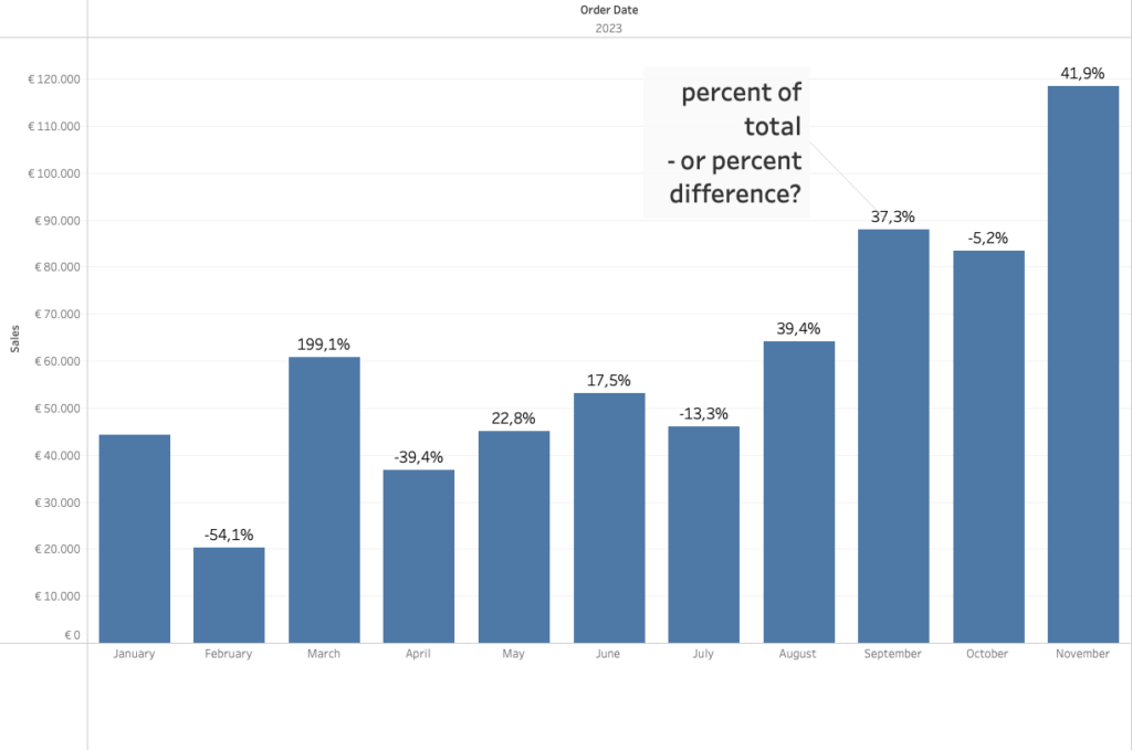
If I want to focus on the difference sales values per month, I add the ‘percentage change’ using a Table Calculation.
Percentage: “change” or “of total”?
One of the questions you can expect when using this is this:
“What is this percentage value – is it the percentage of total, or percentage difference?
Avoid confusion: change the format
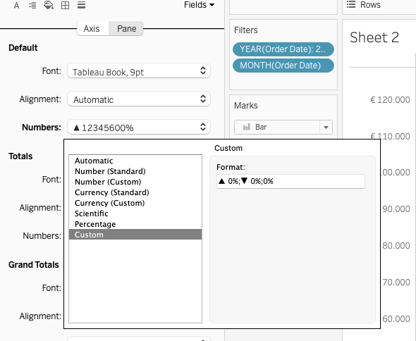
To avoid this question, just add a plus-sign to the positive values.Go to ‘format’, change ‘Numbers‘ to ‘Custom‘.
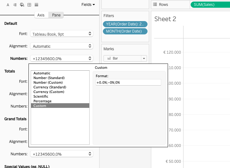
This custom notation might seem overwhelming to some, but don’t be afraid.
Here you can define the exact way a value is shown.
It’s usually three-part:
Formatting of values above zero, below zero, and equal to zero, divided by a semicolon.
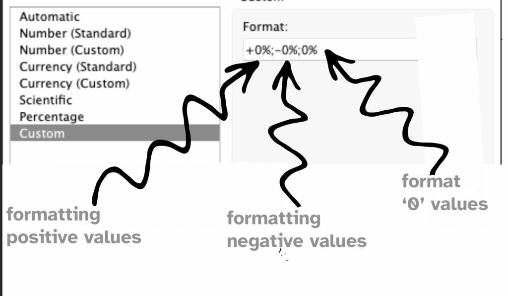
What this means:
For every value about zero:
- start with a plus sign (+) as the prefix
- show the value (0)
- and add the percentage sign (%) as the suffix
For every value below zero:
- start with a mimus sign (-) as the prefix
- show the value (0)
- and add the percentage sign (%) as the suffix
For every value equal to zero:
- show the value (0)
- and add the percentage sign (%) as the suffix
Adding the plus sign to the value is a very small change, but for the users of a dashboards it is immediately clear the percentage means difference, and not percentage of total.

Using symbols
And you can bring even more focus on growth and decline by not using minus and plus signs, but triangles which you can copy from many websites.
The easiest way is to go to a website which give you an overview of all kind of these symbols. For example, go to Compart, and search for ‘triangle’ (https://www.compart.com/en/unicode/search?q=triangle#characters)
Just select the symbol you like, and copy (Ctrl-C Windows, Cmd-C Mac) the symbol to your clipboard, and paste (Ctrl-V Windows, Cmd-V Mac) it into the config box like this:
(Not all symbols are shown the right way, so please test before you publish your dashboard!)
This will show a triangle-up▲ instead of a plus-sign +, and a triangle-down ▼ for all negative values!