Radar charts (also known as spider charts, web charts, or even Kiviat diagrams) are among the most recognizable – and controversial – chart types in data visualization.
They promise a compact way to compare multiple metrics at once, which is why they often show up in dashboards, even when they create more confusion than clarity.
This article explains
- What a radar chart actually encodes
- Where radar charts can be effective
- Why they often fail in analytical contexts
- Practical guidance for using them responsibly
The goal is not to ban radar charts, but to use them deliberately and with clear awareness of their trade-offs.
What Is a Radar Chart?
A radar chart visualizes data by placing multiple (quantitative) variables on axes around a central point. Each axis represents one metric, scaled outward from the center. A single entity (e.g., a event, person or system) becomes a polygon connecting the values across all axes. Some use cases with examples:
- Comparing performance profiles
Examples:- Competitor Analysis: Market Share, Brand Loyalty, Innovation Pipeline, and Customer Service.
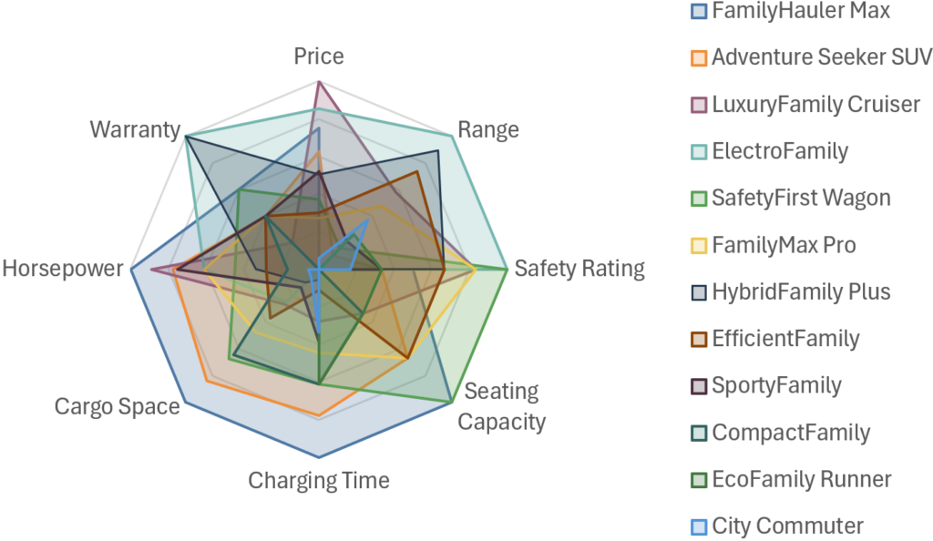
- Car Reviews: Fuel Efficiency, Cargo Space, Off-road Capability, and Comfort.
- Showing strengths and weaknesses across dimensions
- Crossfit Athlete: Strength, Endurance, Agility, Flexibility
- Injury Recovery: Range of Motion across different joints
- Strategy and Risk Analysis
- Cybersecurity Maturity: readiness in Threat Detection, Incident Response, Employee Training, Data Encryption.
- Investment Portfolios: Volatiliy, Liquidity Risk, Inflation Risk, and Credit Risk.
- Personality and Psychology Profiles
- Team Dynamics: mapping a team’s collective personality as Execution, Relational, Analytics, Agile
- Brand Personality: brand perception as Exciting, Sincere, Rugged, Sophisticated, or Competent.
The intent is to compare relative but similar values – so don’t compare revenue with customer satisfaction, but also not sales in different regions.
The limitations – what to watch for
Despite their good looks, radar charts suffer from many weaknesses. Where shall we begin… ?
We are not good at comparing angles and areas. Radar charts use radial distance, angles, and area sizes to visualize date, all of which humans interpret less accurately than length on a straight axis. The consequence: readers struggle to spot meaningful differences, even between close values.
Axis order strongly influence. The order of dimensions around the circle can dramatically change the apparent shape of the polygon, even though the data remains identical. The same data can ‘tell’ different stories depending on axis order.
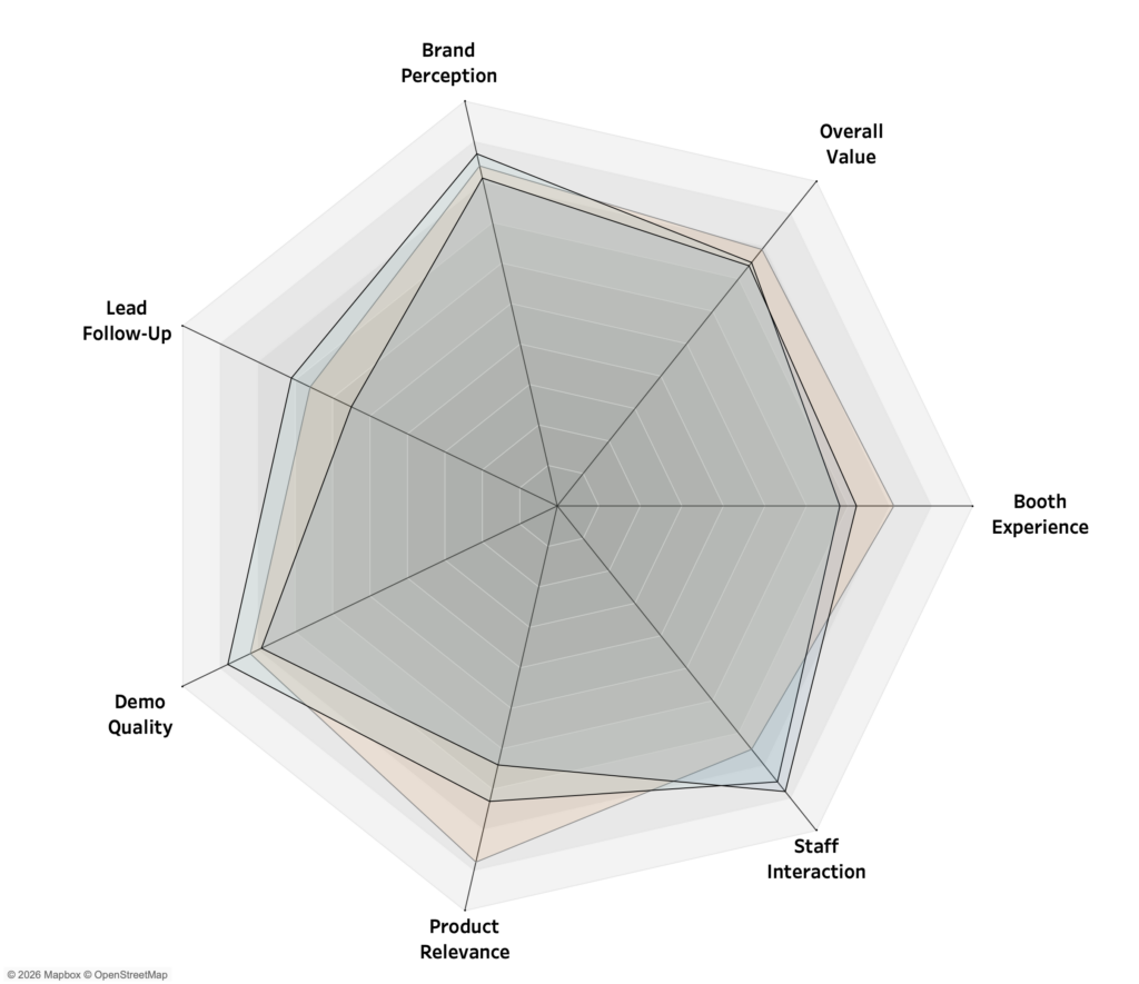
Comparing versions (multiple shapes) is difficult. If multiple versions are being used, it can be very hard to compare. If the changes are rather large it’s ok, but a satisfaction rate of 8.5 vs 8.7 is difficult to notice.
Normalization is required. If different metrics are being used (percentages, absolute values, scores…) the chart becomes misleading.
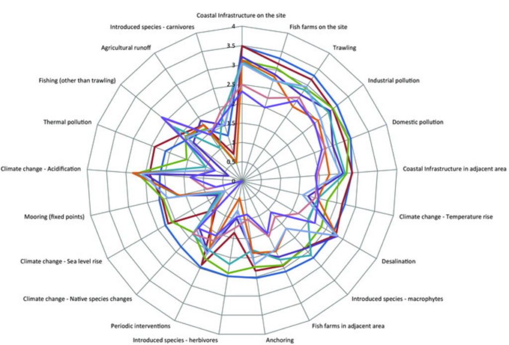
Scalabilty. Radar charts quickly become unreadable as complexity increases, because labels, gridlines and polygons collide.
Unprecise for analysis. Due to the above mentioned reasons, radar charts are not good for tasks like precise comparisons, trend- and distribution analysis. Bar charts, dot plots, slope charts, or tables typically provide higher analytical accuracy.
What Radar Charts Do Well
So radar charts are often criticized as ‘bad data visualization practice’ – but these charts have a few legitimate strengths when used appropriately:
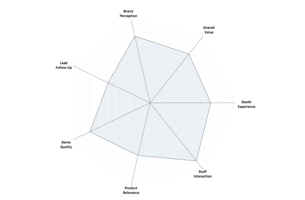
Radar Charts excel at communicating the overall shape of a profile. Viewers can quickly see whether a profile is balanced, spiky, or skewed toward certain dimensions.
They support pattern recognition better than tables. Humans are good at spotting visual patterns, even if we are not precise at reading values from them. Radar charts make it easy to detect: symmetry vs imbalance, outliers within a profile, missing strengths or weaknesses.
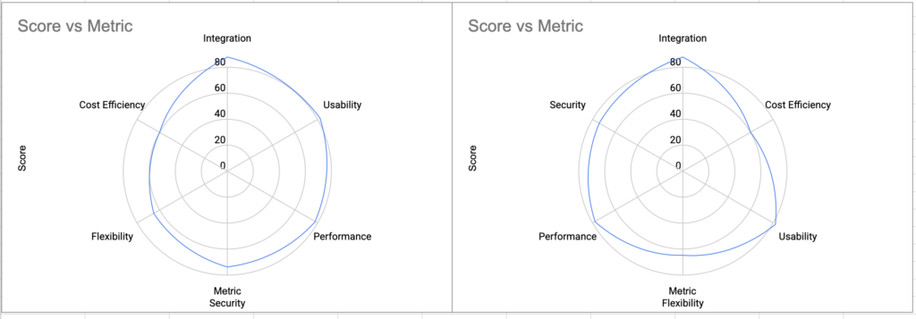
They are also compact: multiple variables are compressed into a single visual, which is ideal for dashboards with limited space.
And let’s be honest: radar charts look nice, which can increase engagement and memorability, even if they are not analytically optimal. Therefor is can be an effective storytelling method.
When You Should Use a Radar Chart
Use radar charts intentionally, not by default… They can be used when:
- The goal is pattern recognition, not precision.
- The number of dimensions is small and fixed (3-6).
- All metrics are normalized to the same scale.
- You compare at most 1 to 3 entities at a time.
- The audience is non-technical or presentation-focused.
- Axis ordering is meaningful and consistent.
In short: radar charts work best as summary visuals, not for precise ranking.
When You Should Avoid a Radar Chart
Don’t use radar charts when:
- Users must compare values precisely.
– Look at other visualization options, like a bar chart - There are many dimensions or many entities.
– The chart becomes cluttered and misleading. - Metrics have different units or scales.
– Normalization hides semantic differences. - Users need to detect small changes or trends.
– Radar charts mask subtle variation. - Axis ordering is arbitrary or subjective.
– You can’t avoid perceptual bias.
In short: if the primary task is comparison, ranking, or optimization, radar charts are almost never the best choice.
Tips on Radar Charts
If a radar chart is justified, follow these rules:
- Normalize all values consistently.
Convert to a consistent scale (0-5, 0-100 or percentages) - Limit dimensions.
Fewer dimensions (radial axes) increase readability. - Avoid more than 2–3 overlapping shapes.
Use small multiples if comparison is required. - Fix axis ordering.
Avoid arbitrary arranged dimensions, and explain your logic to the audience - Reduce visual “noise”.
Many tools encourage visual distractions – but keep it simple: Minimize gridlines, don’t use heavy fills and unnecessary decoration. - Provide numeric context where possible.
Tooltips, labels, or companion tables improve trust in the data - Test alternative charts first.
Be honost to yourself: a bar chart or dot plot often communicates the same information more clearly.
Conclusion – and Tableau Follow-up
Radar charts look very attractive and are fine for giving a quick impression of a profile. But they are a poor tool for serious analysis. Precise comparisons are difficult, patterns can be distorted, and something as trivial as changing the axis order can change the conclusion you draw from the chart.
Use radar charts intentionally and sparingly. Otherwise, you risk creating visuals that look convincing but quietly tell the wrong story.
In a follow-up article, I’ll show how to build a radar chart in Tableau that goes beyond the standard approach – easy to use, yet technically advanced, with interactive features you rarely see in typical dashboard implementations.