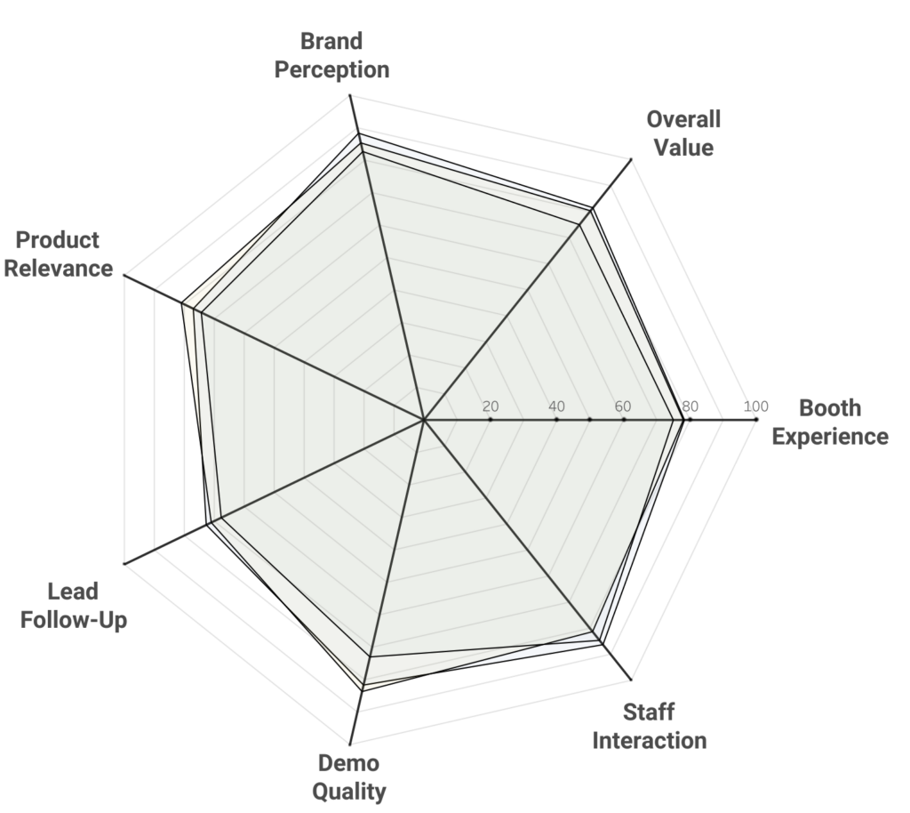
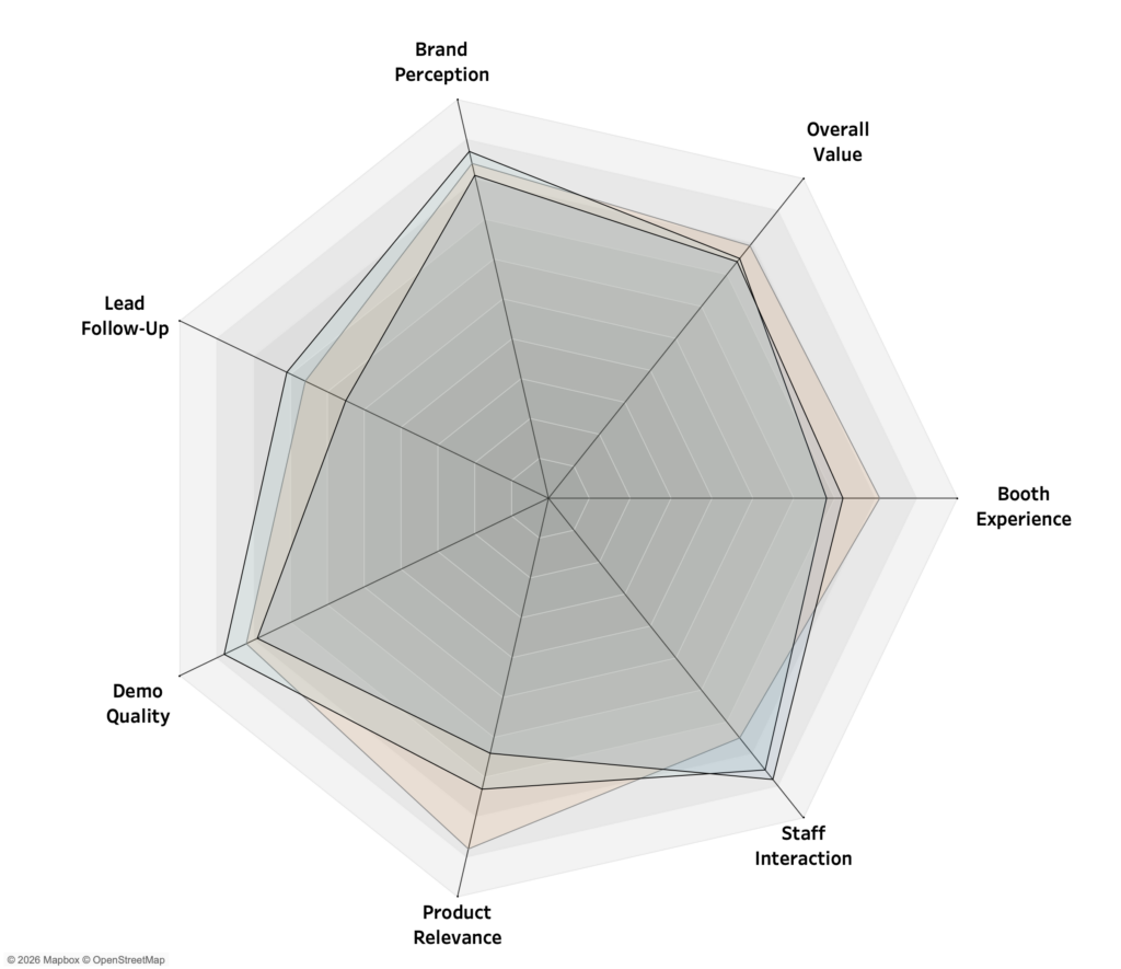
In previous posts, I explored when to use radar charts and how to build them flexible and modular in Tableau. But as we’ve seen, this format has a notorious ‘blind spot.’ While it works well for showing a recognizable shape, the granular details often get drowned out in the overall picture.
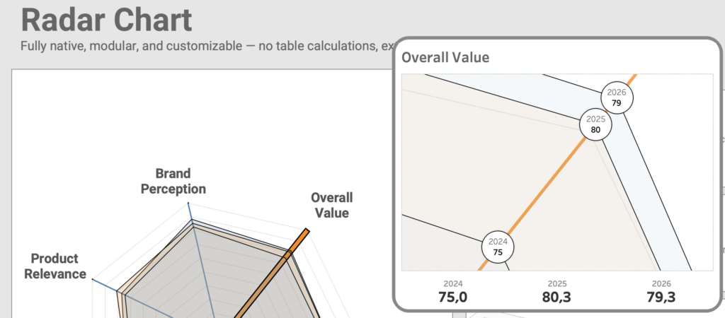
Now we are taking the next step: improving the legibility of the radar chart by zooming in on individual spoke values without losing the context of the whole.
[Read more…] about Improving Radar Charts: Showing Overview and Details