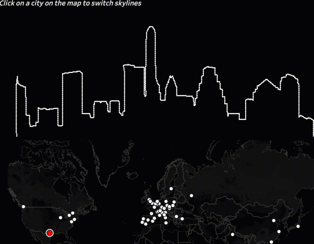
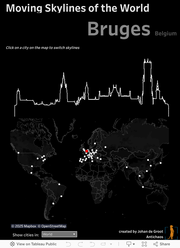
Showing the Skylines of cities in Tableau – one by one.
The visualisation below is set on ‘auto-play’ (using the Tableau Javascript API) – if you want to travel around the world on your own pace you can start here.
Underlying technique
This summer I saw some beautiful framed skylines in Berlinische Galerie, which inspired me to visualise such skylines one by one in animated form using Tableau.
I obtained a file with 58 skylines of cities all around the world. The format of the file was vector-based. Vectors are close to ‘real data’ – but Tableau needs columns and rows, or x and y coordinates. I converted each of the skylines from EPS to the SVG format. Using open source software Coördinator (originated in Spotify) the SVG could be ‘converted’ into a CSV file with X and Y coordinates.
But some of these skylines contained quite a bit more coordinates than others; especially cities with high detailed structures (like the Erasmus bridge of Rotterdam). This would complicate a smooth transition between two skylines: each coordinate (dot) should correspond to a coordinate in a different skyline. Therefore I simplified the illustration forcing it to use 2048 per skyline: enough detailed for a skyline without slowing the visualisation too much.

This worked well – and tweaking this dataset in Tableau was enough to create a nice animated transition between the skylines when switching between cities.
Continuous animation using the Tableau Javascript API
To be able to make an animation which runs (and loops) on itself I used the Javascript API.
The pages-shelf animation loop from Tableau Desktop/Server itself didn’t workout for me (height/width not equal for all skylines, and a not-intuitive play button), so I used the Javascript API: each city is called from a loop which starts as soon as the visualisation is loaded.