• Skip to primary navigation
  • Skip to main content
  • Skip to primary sidebar
Antichaos

Antichaos

Data Visualisation, Tableau & Data Services

  • Home
  • Services
    • Data Analysis
    • Training
    • Portfolio
  • Blog
  • About Johan
  • Contact
  • Nederlands
  • Show Search
Hide Search

Tableau Calculations

How to Visualize High-Value Metrics in Tableau Without Starting at Zero

2025-11-29 by Johan de Groot

Every time you publish a chart that doesn’t start at zero, someone will appear in the comments accusing you of misleading your audience. But the truth is simple: not every dataset lives anywhere near zero.

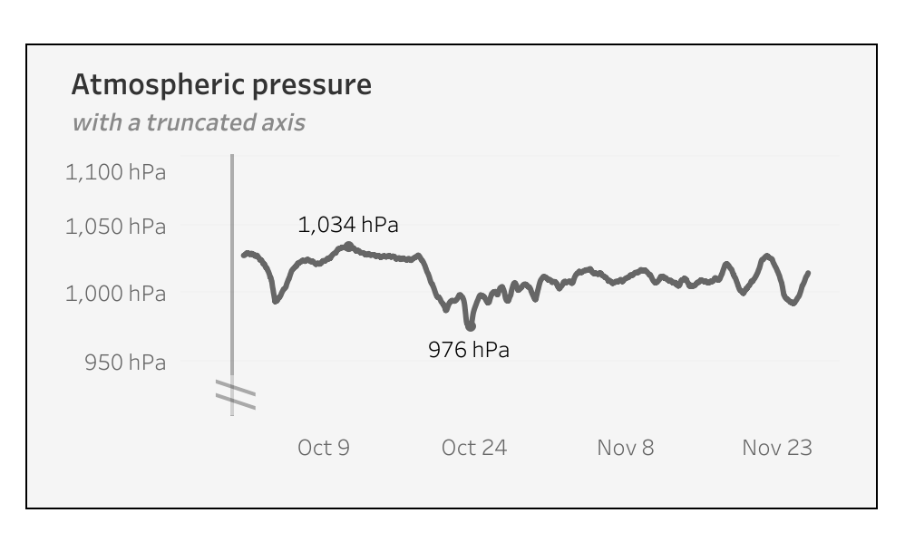
When working with high-value metrics – like atmospheric pressure, energy usage, or financial KPIs – starting a chart at zero often flattens the trend and hides important variation. Simply removing zero can help, but it can also exaggerate small fluctuations, making lines appear more dramatic than they really are. In this guide, I’ll show how to visualize high-baseline data in Tableau using dynamic axis adjustments, reference lines, and buffer zones to create accurate, readable, and visually balanced charts.

[Read more…] about How to Visualize High-Value Metrics in Tableau Without Starting at Zero

Add ‘All’ and more options to a Dynamic Parameter

2025-09-18 by Johan de Groot

A couple of years ago, Tableau introduced one of its most highly requested features ever: Dynamic Parameters. This feature made it possible to populate a parameter with values directly from a data source, rather than being limited to static, manually entered values.

This works great, but as soon as this was available a new request came up: adding manual values to the list – especially the ‘All’ value.

[Read more…] about Add ‘All’ and more options to a Dynamic Parameter

Abbreviate long text in Tableau

2025-06-19 by Johan de Groot

When working with text data in Tableau, you’ll often need to clean or reshape strings to better fit your analysis or visual presentation.

Abbreviating text is a common challenge when designing dashboards, reports, or any interface where space is limited. Whether you’re working with long product names, category labels, or freeform text fields, overly long strings can clutter layout and make visualizations harder to read.

[Read more…] about Abbreviate long text in Tableau

Two Pie Chart Alternatives

2025-06-12 by Johan de Groot

Pie charts — they seem to be everywhere. They show up in presentations, reports, and in every stockphoto about business meetings.

They’re colorful, round, and look super friendly… but despite being one of the most popular chart types, they’re also one of the most frustrating to actually read.

[Read more…] about Two Pie Chart Alternatives

Area Funnel chart in Tableau: Visualizing the Drop-Off

2025-05-15 by Johan de Groot

In the world of digital analytics and customer journeys, not every user makes it to the finish line. Some browse a product, others add it to their cart, but only a fraction complete a purchase. Understanding where users drop off—and how many—can offer crucial insights for optimizing your process. That’s where funnel visualizations come in.

Funnel charts are a powerful way to illustrate step-by-step attrition across a defined process. Whether you’re tracking sales, onboarding, or lead conversions, a funnel view can make complex user behavior immediately digestible. Each stage visually narrows to reflect fewer participants, highlighting friction points and conversion opportunities.

[Read more…] about Area Funnel chart in Tableau: Visualizing the Drop-Off

Animated icons in Tableau

2025-05-01 by Johan de Groot

An old but very efficient way to point the attention to a row in a table is to add a small text-based icon in front of it. A subtle dot in front of a bar can help you tell the story of data.
But you might want to use less-subtle ways to highlight data?

Animation is such a way – and can even add some more fun to a dashboard. In Tableau, this is really easy to accomplish using Image Roles.

[Read more…] about Animated icons in Tableau

Improve Titles on Small Multiples

2025-02-27 by Johan de Groot

Small multiples charts (also known as trellis charts or panel charts) are a great way to visualize trends across different categories while maintaining consistency. They display multiple variations of the same chart, often sharing a common axis, which allows for easier comparison across groups.

While effective, these charts can suffer from poor readability if titles are not thoughtfully applied. Let’s look at some ways to enhance labels for better clarity and user experience.

[Read more…] about Improve Titles on Small Multiples

Easier date drop-down in Tableau

2025-02-20 by Johan de Groot

This small tip is on how to add a filter to a dashboard with the current month on top, so it is easier to navigate for users.

Not one which will drastically change your dashboard, but a ‘quality of life’ usability tip.

[Read more…] about Easier date drop-down in Tableau

Drill Down in Tight Spaces

2025-02-06 by Johan de Groot

A different way to make drill down possible/usable in a small sheet.

Sometimes you don’t have all the space to do what you want.

Or you are almost finished with a dashboard, and suddenly someone mentions: “Wouldn’t it be nice if we could drill down on this chart…” – but the sheet is just too small for another column. There are multiple ways so solve this issue – each with its own pros and cons. Viz-in tooltip (hard to read on larger drill-downs), hiding nearby sheets (tedious), enlarging the row-height (ugly when not drilled-down), misusing totals (even uglier), …

In this article I describe a different solution – which definitely has its disadvantages, but can be useful in certain situations where the drill down functionality is important.

[Read more…] about Drill Down in Tight Spaces

Deep Cleaning Barcharts – part 2: Punctuated Bar Chart

2025-01-16 by Johan de Groot

[part of the ‘Datafam London 2024 series]

In part 1 we took a look at a basic bar chart, and ended with the lollypop chart. A fun chart with one major issue: the dot obfuscates the real datapoint.

Punctuated Bar Chart

One solution for it the Punctuated Bar Chart:
We highlight the end of each bar, instead of enlarging the endpoint.

[Read more…] about Deep Cleaning Barcharts – part 2: Punctuated Bar Chart

Deep Cleaning Barcharts – part 1: the basics

2025-01-16 by Johan de Groot

[part of the ‘Datafam London 2024 series]

On DataFam 2024 in London I gave a presentation / workshop on deep cleaning dashboards.

Why cleaning dashboards?

  • Make it look better ▶ Users want to use it
  • Less clutter on your dashboard ▶ Less clutter in your brain
  • Making your dashboard more actionable ▶ Focusing on what’s important.

Dashboard cleaning is about: Removing, adding , re-arranging, and replacing stuff. In Tableau, it’s about: Table calculations, extra sheets, changing images, talking to users, being critical to yourself, … Is hard work – and a lot of fun!

[Read more…] about Deep Cleaning Barcharts – part 1: the basics

Primary Sidebar

Antichaos Services

  • Need Tableau Help ?
  • Basic, Advanced and Custom Training

Recent Blogposts

  • MeasureCamp Amsterdam 2026: the power of the blank board
  • Datafam Day 2026 – Amsterdam
  • How to create pill-style navigation in Tableau
  • Tableau Visionary 2026
  • Tableau REST API Connector: Add Live Web Data to Your Dashboards
  • Rounded Corner Maps in Tableau
  • Improving Radar Charts: Showing Overview and Details
  • Create a Radarchart in Tableau – Modular and Simple
  • Radar Charts: Practical tips for when and how to use them
  • Smarter dashboard design – with fewer tooltips

Follow & Connect on

Antichaos

Copyright © 2026 Antichaos

  • Antichaos
  • Privacy
  • Contact