• Skip to primary navigation
  • Skip to main content
  • Skip to primary sidebar
Antichaos

Antichaos

Data Visualisation, Tableau & Data Services

  • Home
  • Blog
  • Services
  • Training
  • Portfolio
  • Contact
  • Nederlands
  • Show Search
Hide Search

Tableau Calculations

Animated icons in Tableau

2025-05-01 by Johan de Groot

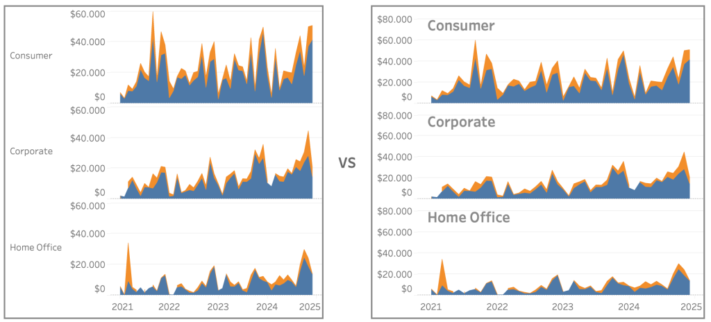
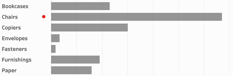
An old but very efficient way to point the attention to a row in a table is to add a small text-based icon in front of it. A subtle dot in front of a bar can help you tell the story of data.
But you might want to use less-subtle ways to highlight data?

Animation is such a way – and can even add some more fun to a dashboard. In Tableau, this is really easy to accomplish using Image Roles.

[Read more…] about Animated icons in Tableau

Improve Titles on Small Multiples

2025-02-27 by Johan de Groot

Small multiples charts (also known as trellis charts or panel charts) are a great way to visualize trends across different categories while maintaining consistency. They display multiple variations of the same chart, often sharing a common axis, which allows for easier comparison across groups.

While effective, these charts can suffer from poor readability if titles are not thoughtfully applied. Let’s look at some ways to enhance labels for better clarity and user experience.

[Read more…] about Improve Titles on Small Multiples

Easier date drop-down in Tableau

2025-02-20 by Johan de Groot

This small tip is on how to add a filter to a dashboard with the current month on top, so it is easier to navigate for users.

Not one which will drastically change your dashboard, but a ‘quality of life’ usability tip.

[Read more…] about Easier date drop-down in Tableau

Drill Down in Tight Spaces

2025-02-06 by Johan de Groot

A different way to make drill down possible/usable in a small sheet.

Sometimes you don’t have all the space to do what you want.

Or you are almost finished with a dashboard, and suddenly someone mentions: “Wouldn’t it be nice if we could drill down on this chart…” – but the sheet is just too small for another column. There are multiple ways so solve this issue – each with its own pros and cons. Viz-in tooltip (hard to read on larger drill-downs), hiding nearby sheets (tedious), enlarging the row-height (ugly when not drilled-down), misusing totals (even uglier), …

In this article I describe a different solution – which definitely has its disadvantages, but can be useful in certain situations where the drill down functionality is important.

[Read more…] about Drill Down in Tight Spaces

Deep Cleaning Barcharts – part 2: Punctuated Bar Chart

2025-01-16 by Johan de Groot

[part of the ‘Datafam London 2024 series]

In part 1 we took a look at a basic bar chart, and ended with the lollypop chart. A fun chart with one major issue: the dot obfuscates the real datapoint.

Punctuated Bar Chart

One solution for it the Punctuated Bar Chart:
We highlight the end of each bar, instead of enlarging the endpoint.

[Read more…] about Deep Cleaning Barcharts – part 2: Punctuated Bar Chart
  • « Go to Previous Page
  • Page 1
  • Page 2
  • Page 3
  • Go to Next Page »

Primary Sidebar

Antichaos Services

  • Need Tableau Help ?
  • Basic, Advanced and Custom Training

Recent Blogposts

  • Smarter dashboard design – with fewer tooltips
  • Top 2000 in Perspective – Behind the Scenes
  • How to Visualize High-Value Metrics in Tableau Without Starting at Zero
  • Why is COUNTD so slow – and how can I fix this?
  • Visualizing ‘Dynamic’ Data using a Sine Wave
  • Add ‘All’ and more options to a Dynamic Parameter
  • Tableau Container Art – 4 examples of formatting dashboards without images
  • Letting Users Choose Their Visual
  • The Tableau VizQL Data Service: What It Is, What It Can Do, and When to Use It
  • Abbreviate long text in Tableau

Antichaos

Copyright © 2026 Antichaos

  • Antichaos
  • Privacy
  • Contact