• Skip to primary navigation
  • Skip to main content
  • Skip to primary sidebar
Antichaos

Antichaos

Data Visualisation, Tableau & Data Services

  • Home
  • Blog
  • Services
  • Training
  • Portfolio
  • Contact
  • Nederlands
  • Show Search
Hide Search

Tableau Desktop

Visualizing ‘Dynamic’ Data using a Sine Wave

2025-10-25 by Johan de Groot

Recently I ran into a small but surprisingly tricky problem: how do you visualize something that’s in progress? A standard bar chart works usually perfectly for completed values, but what about the final bar isn’t finished yet because e.g. the year isn’t finished yet,

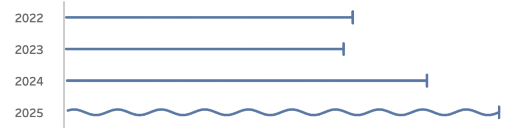
Fading it out, changing the shape or adding a label like “in progress” didn’t feel right. I wanted something that instantly communicates “this is still ongoing”.

Inspired by how Spotify shows an ongoing song I started experimenting with using a sine wave to bring that bar alive. Instead of a static column, the last bar gently oscillates – hinting that it’s active, not finished.

In this post, I’ll walk through how to create this effect in Tableau step by step.
If you don’t need an ‘in progress’ viz, you can always use it for something else….

[Read more…] about Visualizing ‘Dynamic’ Data using a Sine Wave

Show/Hide – but better

2025-05-29 by Johan de Groot

The default Show/Hide button in Tableau offers a quick way to toggle dashboard elements, but it comes with limitations—especially when dealing with larger components like full-screen visualizations or help panels that can obscure the toggle itself.

In this guide, I show a smarter approach using Dynamic Zone Visibility and Parameter Actions. By setting up separate “show” and “hide” buttons, you gain full control over what appears and when, all without compromising the user experience. This reasults in a cleaner layout and/or more intuitive interactions, this method provides a flexible, user-friendly alternative to Tableau’s built-in toggle.

[Read more…] about Show/Hide – but better

5 Tableau Desktop Tips

2025-03-27 by Johan de Groot

Tableau is packed with small but powerful features that can make your workflow smoother and more efficient. However, some of these tricks aren’t immediately obvious—even for experienced users.

Whether you’re troubleshooting a calculation, improving collaboration, or just trying to reset your workspace, these tips will help you work smarter in Tableau.

Here are five tips for using Tableau Desktop:

[Read more…] about 5 Tableau Desktop Tips

Easier date drop-down in Tableau

2025-02-20 by Johan de Groot

This small tip is on how to add a filter to a dashboard with the current month on top, so it is easier to navigate for users.

Not one which will drastically change your dashboard, but a ‘quality of life’ usability tip.

[Read more…] about Easier date drop-down in Tableau

A better date-filter in Tableau

2024-06-13 by Johan de Groot

When building a dashboard, one of the most common elements is a date-filter. And the most used date filter is probably the infamous ‘Range of Dates’.

[Read more…] about A better date-filter in Tableau
  • Page 1
  • Page 2
  • Go to Next Page »

Primary Sidebar

Antichaos Services

  • Need Tableau Help ?
  • Basic, Advanced and Custom Training

Recent Blogposts

  • Smarter dashboard design – with fewer tooltips
  • Top 2000 in Perspective – Behind the Scenes
  • How to Visualize High-Value Metrics in Tableau Without Starting at Zero
  • Why is COUNTD so slow – and how can I fix this?
  • Visualizing ‘Dynamic’ Data using a Sine Wave
  • Add ‘All’ and more options to a Dynamic Parameter
  • Tableau Container Art – 4 examples of formatting dashboards without images
  • Letting Users Choose Their Visual
  • The Tableau VizQL Data Service: What It Is, What It Can Do, and When to Use It
  • Abbreviate long text in Tableau

Antichaos

Copyright © 2026 Antichaos

  • Antichaos
  • Privacy
  • Contact