Formatting matters.
Inconsistent formatting in your Tableau visualizations can will confuse your audience and make your dashboard look unpolished.
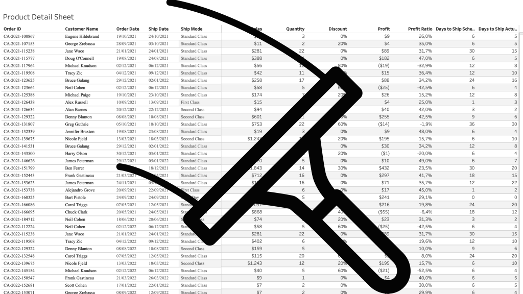
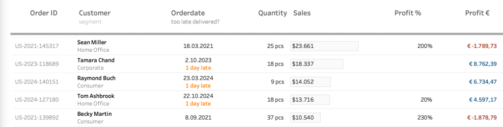
A well-structured dashboard is not just about the right data—it’s about making that data easy to read and interpret. Inconsistent date formats, poorly formatted numbers, percentages, and currency values can make your insights less clear. Especially in tables.
In this post, I’ll walk you through essential but simple formatting techniques in Tableau, from setting a default date format to custom number formats. You’ll learn how to hide unnecessary zero values, align text for better readability, and use custom formatting to create intuitive and informative visualizations.
Date Formatting
Make sure all dates in your visualization look the same. Avoid a combination of ‘2025-04-03’, ‘3 Apr 2025′, ’04/03/2025’, ‘3 April 2025’, etc.
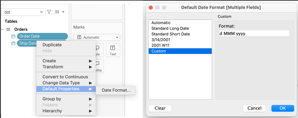
To enforce the right formatting, start by setting a default format on all date fields on your dataset. Select all dates in your dataset (with Control/Command – Click), Right-mouse click, select ‘Default Properties > Data Format…
You can choose between different predefined styles, but I like to use ‘Custom’ and set the Format exactly to my liking. For example: d MMM yyyy for:
- d: day without leading zero
- MMM: abbreviated month
- yyyy: full year
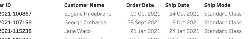
Everytime you use one of these date fields on a sheet it will show as ‘3 Apr 2025’ – and if you want to change it for a specific reason, use custom formatting on the data-fill itself to change the format.
Right-align the date values to make them easier to read:
Hide “0” values
If the value ‘0’ (zero) is the most common value in a table, you might want to hide this, and only show the ‘non-zero’ values – for example on discounts.
You can use an extra calculation for this – or just use the custom formatting in Tableau:
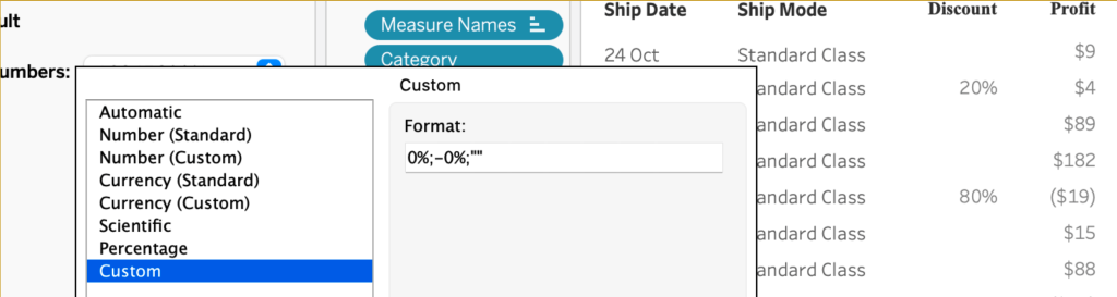
The ‘Custom’ option is not very well documented, but is a powerful option to add value to the tableau formatting.
The syntax of it is like this:
Positive number format;Negative number format;Zero values I can (and will) write a complete blog post on this, but for now I will show you how the formatting in this example works:
- positive number format:
0% – the value (0) followed by a percentage sign - negative number format:
-0% – a minus sign, the value and the percentage sign - zero values:
“” – an empty string between quotes
separated by a semicolon.
Make values easy to interpret
A user must immediately know what kind of value is shown. On a sheet with all kinds of values, format these values accordingly. Currency as currency, percentage as percentage.
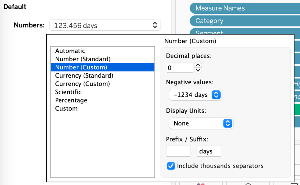
And using formatting you can create your own ‘logical’ format, like adding ‘days’ to ‘Days to Ship’:

Convert your table for much more options
A standard table in Tableau looks like this: dimensions on the Rows, and Measures in the Measure shelf:

For really advanced formatting you have to let this structure go, so every measure is represented by a dummy measure:

The conversion from ‘regular’ to ‘advanced’ table will be described in detail in a separate blogpost, but I already want to tease you with the possibilities. Besides all kinds of visualizations inside the table, you can also combine columns into one, use custom formatting, and so much more
Follow this blog to keep up-to date!
Currently the best way to keep updated is to connect with me on LinkedIn; soon new tips, articles and more can be delivered to your mailbox!