After year in Tableau Desktop, I sometimes forget the minor features that make the program so powerful. They’re the small moves: searching data fields, creating calculations on the fly, editing pills – that you do dozens of times a day without thinking.
Half of these tips I only realized were worth writing down because someone stopped me mid-explanation while I was teaching and asked “Wait. How did you just do that?”
After the first round went down well, here are five more, this time all centered on fields, calculations, and pills.
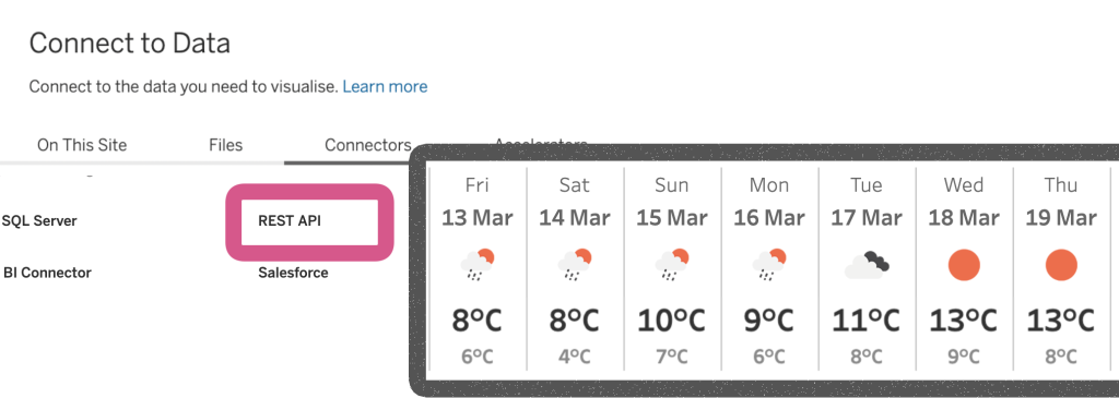
Missed the first batch? Start with the first five Tableau Desktop tips.
[Read more…] about 5 more Tableau Desktop Tips: Fields, Calculations & Pills