The Top 2000 of Radio 2 (a populair Dutch radio station) has been broadcast for the 25th time – and traditionally I am trying to turn this into a ‘different’ interactive data visualization…

Antichaos
Data Visualisation, Tableau & Data Services
The Top 2000 of Radio 2 (a populair Dutch radio station) has been broadcast for the 25th time – and traditionally I am trying to turn this into a ‘different’ interactive data visualization…
De 25e keer is de Top 2000 van Radio 2 uitgezonden – en traditiegetrouw probeer ik hier weer een ‘andere’ interactieve datavisualisatie van te maken…
Now and then you encounter data with ‘extreme values’. Values which are much larger than the other ones – and so hard to analyse.

A dataset which is skewed like that needs to have a special treatment when visualized, because otherwise the individual values can’t be identified correctly.
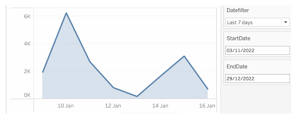
[Read more…] about How to visualize extreme values?Datefilters are one of the most common filters on any dashboard. They are needed to see trends, make decisions on the right period, and analyse within the right context. But most of the times these filters are not optimal – so let’s make them better (and prettier)
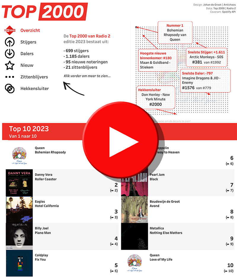
I visualized the Top 2000 as broadcast by Radio 2 for the 11th time (I believe) in a different way using Tableau.
[Read more…] about The Radio Top 2000 visualised – edition 2022De Top 2000 zoals uitgezonden door Radio 2 heb ik gevisualiseerd met behulp van Tableau.
Dit jaar wat minder nadruk op een de vorm (hoewel ik heb gekozen voor een gedempte sinus, wat niet bepaald een veelgebruikte manier van weergeven is…).
[Read more…] about De Top 2000 van 2022 gevisualiseerdThe order of operations in Tableau refers to the sequence in which the software processes the data and calculations in a given worksheet or visualization.
The order of operations in Tableau is the order in which Tableau performs its various actions. An action is mostly identified as a filter, but can also be a calculation or another Tableau feature which is computed.
This is Tableau’s Order of Operations:
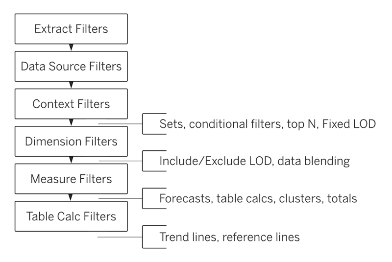
It shows in which sequence filters are handled with by Tableau: first extract filters, than datasource, context, dimension, measure and table calculation filters.
The ‘inserts’ on the right are calculations themselves.
It’s that time of year again… – the Visualisation of the Top 2000 of Radio 2!
One of my traditions is to visualize the Top 2000 as being broadcasting by the Dutch radio station Radio 2 using Tableau.
This time I choose a circular visualisation of the list, with a detailed/zoomed-in look at the chose title inside the circle. Changing a title can be done via the drop-down, but also by clicking in the circle (either one) or in the list of entries of the artist.
Het is weer die tijd van het jaar – de Visualisatie van de Top 2000 van Radio 2…
De Top 2000 zoals uitgezonden door Radio 2 heb ik voor de 10e keer (geloof ik) op een andere manier gevisualiseerd met behulp van Tableau.
Dit keer is er gekozen voor een circulaire weergave van de lijst van dit jaar, met een ‘detail’ van het gekozen nummer in de cirkel. Je kunt een nummer kiezen uit het dropdown menu, maar ook klikken in de cirkel of in de lijst met noteringen van de desbetreffende artiest.
The most talked about topic in the world is probably the weather. And if you want to talk about, you need to know the data 😉
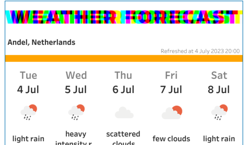
This dashboard show the weather forecast in my location for today and the next 4 days.
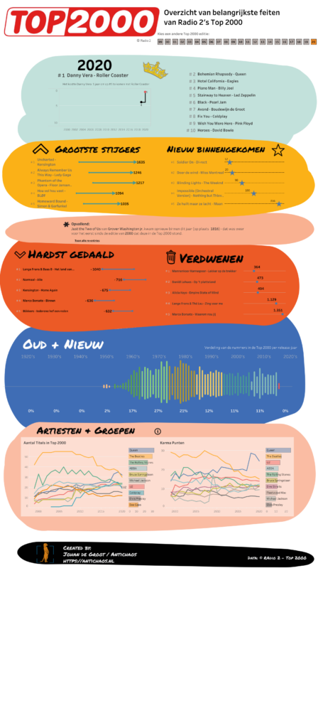
[Read more…] about Weather Forecast in TableauThe Top 2000 edition of 2020 isn’t a fancy data visualisation with extensive data-preparation and/or mathematical formulas like last year, but a visualisation with the emphasis on what you can do with relative simple graphical elements. This approach can change the look and feel of a ‘standard’ dashboards significantly
Click on the screenshot to view – and use! – the data visualisation fullscreen.
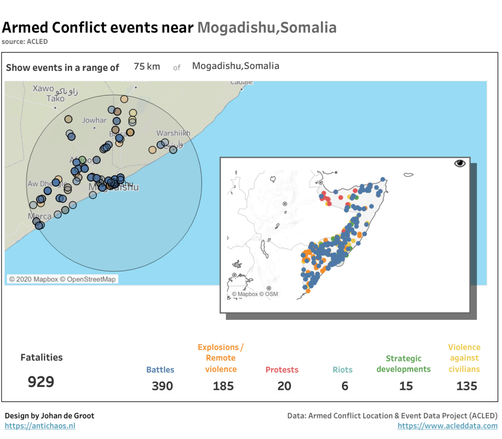
The Tableau 2020.4 release comes fully-loaded with tons of great features, including several key updates to boost your geospatial analysis. In particular, the new multiple marks layers feature lets you add an unlimited number of layers to the map. This means you can visualize multiple sets of location data in context of one another, and there’s no need for external tools to build custom background maps.
When you are creating a calculated field in Tableau Desktop, Server of Prep you might want to create some comments to help others see what the purpose of this field is, or explain the calculation that you made. In other situations you might want to test a line of code, and disable a previously written block of code without deleting it.
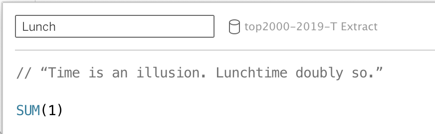
This is all possible using comments in calculated fields.
[Read more…] about Comments in TableauIf you experience 502 errors when downloading large datasets from Tableau Server – either in a browser or Tableau Desktop – you might occur problems not related to Tableau Server, but a proxy or gateway in front of the server.
[Read more…] about 502 errors on datasource downloads from TableauA small tip for a situation that is occurring once in a while to me (probably Mac specific):
If you have been working on a Tableau dashboard for quite a while, you suddenly can’t save the workbook anymore. ‘Save’ results in a popup which disappears very quickly, and ‘Save as’ shows the ‘save as’ dialog for a few milliseconds before disappearing again. Odd behavior – but especially annoying because you really want to save the changes you have made in the last two hours…
[Read more…] about Save a Tableau workbook if you can’t save it