
Every serious dashboard has them: icons. They are small, but they do a lot on a dashboard. Good icons let users recognize elements on a dashboard – filter panels, info buttons, navigation – without having to read a single word.
Bad ones make a dashboard feel unfinished and uncomfortable, even when you don’t exactly know why.
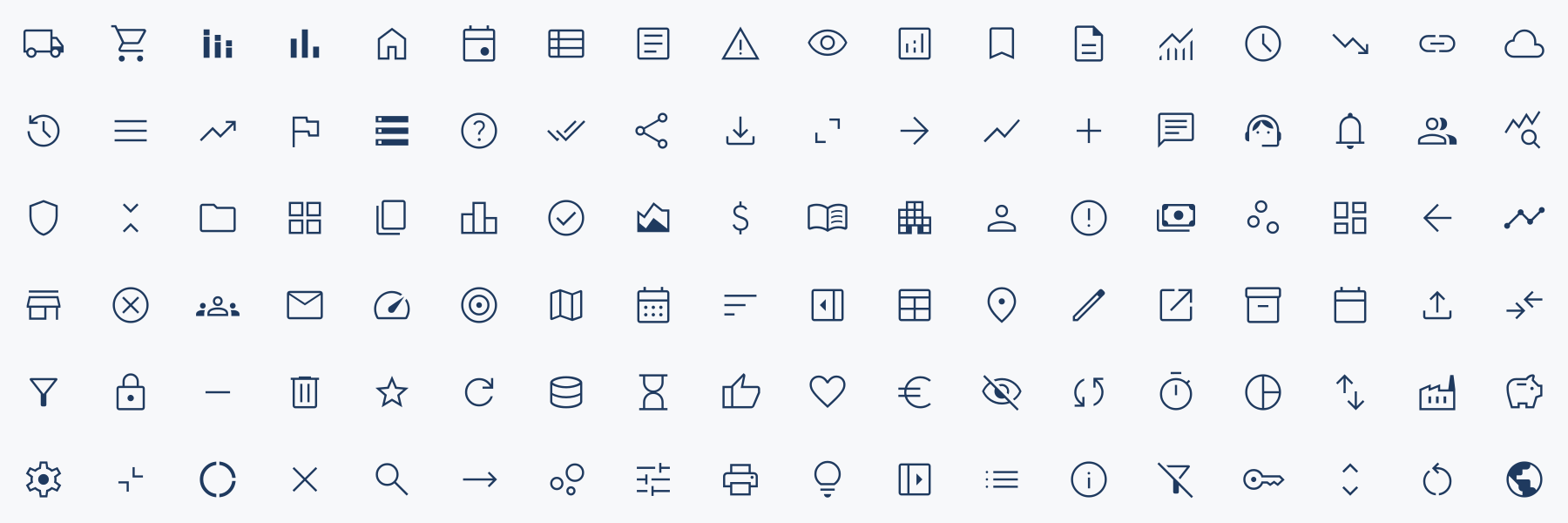
This article is not a comparison list of icon sets – you can find these already. It’s guidance on how to use icons for dashboards: pick a general set, know when to look further, and when to draw your own.
Why icons matter on a dashboard
Dashboards are dense. Users scan rather than read, and icons give them anchors to scan for. That makes them useful for three things in particular:
Navigation

Home, back, next page, switch view. Users learn these once and then stop thinking about them.
Actions and controls

Filter, reset, download, show/hide a container, open the info panel.
Labeling content

A small icon next to a KPI or section header (revenue, customers, orders) makes a busy layout easier to parse.
The rule that follows from this: icons are functional first. If a user needs more than just a glance to understand what an icon means, it’s not helping.
Stick to the metaphors everyone already knows – a funnel for filters, a house for home, an “i” for information – and don’t get creative with them.
Don’t settle for defaults – from Tableau or even company guidelines!
Tableau’s default toggle uses a hamburger icon to show/hide containers. But in web and app UI standards, a hamburger icon is the standard for a global navigation menu – not a filter or settings pane. Swap the default for a gear icon for settings, or a funnel for filters. And take some time to evaluate which ‘close’ button to use.
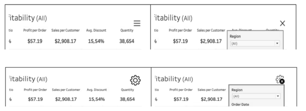
Similarly, dare to override company UI guidelines which force you into using specific icons (and colors). These rules are often made by IT specialists or marketeers – not UI experts. Make the case for function instead of branding.
Icons on a Tableau Dashboard
Where do we put icons on a dashboard?
Show/Hide
Icons are ideal as show/hide buttons for floating containers. Put anything that doesn’t need to be on screen all the time in a container and toggle it: a filter panel, an alternative view (table instead of chart), settings and parameters, an info or help layer. The dashboard stays clean, and users get the extra options when they ask for them.
Whichever you choose, apply it the same way on every dashboard in the workbook, so users learn the pattern once.


Shapes

With the Shape mark type, icons become part of the viz itself: status indicators, up/down arrows next to a KPI, a symbol per category in a legend or a table. Tableau’s built-in shape palettes are limited, so add your own.
Custom shapes are saved into the workbook once you use them, so colleagues and Tableau Server don’t need the files.
Image Roles
Heavily underused. With an image role you give a field containing the URL of an image the role Image, and Tableau shows the image instead of the text in row and column headers. Add a column with an icon URL to your data – flag, product category, status – and the icons are data-driven.
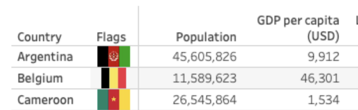
Compared with shapes, the advantages are:
- No manual mapping. Shapes have the annoying property that you have to assign them manually. Icons set by Image Roles are controlled by the data.
- New members work right away. A new category in the data is visualized correctly from the start, without editing the workbook.
- One place to change. An update of the icon behind the URL will change all workbooks.
The disadvantage: the images have to be hosted on a URL that Tableau can reach, and doesn’t go away suddenly. So host your icons on a reliable server or service – preferably your own.
Navigation
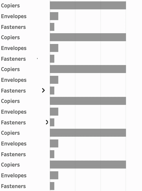
The Navigation object can also be set to an image instead of text. A home icon back to the overview, arrows for previous/next in a guided flow, or as ‘decoration’ next to a text label. Be aware of using just icons without text: an icon alone often doesn’t tell you which detail page you’re going to.
Images
And of course you can just use icons as images on your dashboard. An icon next to a section title helps users find their way on a busy layout. Give an image a target URL and it becomes a link to documentation, definitions, or a related system outside Tableau. No shapes with URL actions needed.
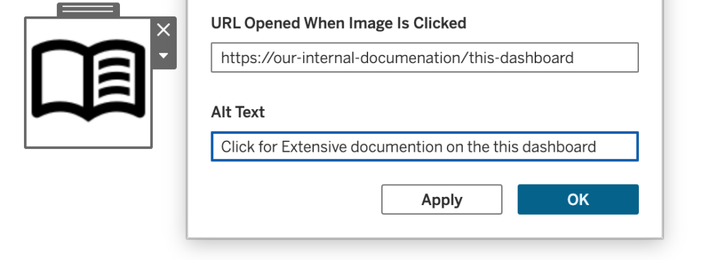
Choose an icon that signals that it leads somewhere else — open_in_new, menu_book for documentation, support_agent for help — so users aren’t surprised when a browser tab opens. The image is either stored in the workbook -so nothing needs to be hosted – or a link – which is easier maintainable if used on multiple dashboards.

Better a good general set than a mixed collection
The most common issue regarding icons on a dashboard is not a bad icon – it is a mix of miscellaneous icons grabbed from a Google Image search, a screenshot from a PowerPoint and one from a random free site. The icons themselves are not bad; the combination of different styles, weights, colors and proportions makes it uneven, unprofessional and in the end: less usable.
So choose one good general-purpose set of icons, and stay inside it as much as possible. Look for a set which is:
- large enough for common use
- consistent, using the same grid, stroke logic and visual weight
- able to export to the formats you actually use – PNG and/or SVG
- usable in commercial work without attribution
My default: Google Material Symbols

For dashboard work I usually start with Google Material Symbols. Not because it’s the prettiest set around, but because it’s very practical for how I work in Tableau. It’s part of Google Fonts, and kind of a hidden gem.
▶ Large and consistent set
Several thousand icons drawn in one system, and very configurable. For everyday usage – navigation, filters, alerts, etc – I can usually find a good icon. Because it focuses on app UI, specialized icons are missing, but almost all functional icons I need are present.
Most important: because it’s a single design system, every icon matches every other icon on your dashboard.
▶ Finetune: Fill, weight, color and optical size
Every icon can be tuned before you download it:
- Outlined or Filled
- Weight from thin to bold in 7 levels (100 – 700)
- Grade to fine-tune thickness without changing the size
- Optical size adjusts the icon for the size, so small icons still look good
- Color to set the hex color


▶ PNG and SVG export
Each icon can be downloaded as either SVG or PNG.
PNGs with transparent background are used for Tableau shapes, SVGs are very lightweight for use in images, buttons and image roles.
Older versions of Tableau don’t support SVG as well as newer versions, so always test.
There is not an official way to directly link to the images, only downloading is supported. I stumbled onto a project which enables hotlinking, but since this is not from Google themselves it can break anytime – so probably don’t use it.
▶ The settings are in the filename
This is such a great feature I didn’t recognize from the start. Each download is named something like:
filter_alt_24dp_1F3A5F_FILL0_wght300_GRAD0_opsz24.pngIcon name, size, color, fill, weight, grade and optical size – all in the filename. This makes it extremely easy to add a matching icon 6 months later, even for someone other than you.
▶ Good UI, including a good search
It is easy to find icons, and easy to edit them. The search functionality understands all kinds of synonyms and related terms, not just the exact filename. ‘Money’ returns the money icon, but also the dollar and euro signs, shopping cart, savings. That feature alone saves so much time.
▶ Open Source – free and open
Material Symbols is open source under the Apache 2.0 license, so you can use it in client work without attribution, and also change individual icons without legal issues.
▶ The known shortcomings
The set is definitely not perfect. Some of the issues:
- No brand logos. No LinkedIn or other social icons, no Mercedes or Starbucks. You’ll need another source for those.
- It is the look from Google. The Material style is recognizable as the Google style, and some find it old-fashioned. Personally I like this; it does not feel too Android-ish, but you might feel differently.
- Gaps in specialized domains. General business concepts are well covered, but it is hard to find icons for e.g. logistics, automotive or pharma.
- Settings are baked in the filename. The advantage can also be a disadvantage. Keep the source file with its original name, copy it to a generic name for the hosted file:
home_30dp_0000F5_FILL1_wght600_GRAD0_opsz40.svg->home.svg
None of these are reasons for me to skip it, just be aware of these.
Other options are Phosphor Icons and Tabler. Phosphor offers icons in six weights, plus a duotone style. Tabler has over 6,000 icons with an adjustable stroke width, and has more chart, data and admin styles. Both are free under the MIT license and export to PNG and SVG.
Specialized icons
Sometimes the general set doesn’t have what you need: a specific medical device, a type of vehicle, a company logo. Then look elsewhere, but do it deliberately:
- Brand logos: use the organization’s own brand or press page where possible; it’s the official version and usually comes with usage rules.
Otherwise a collection like Simple Icons is a good resource. - Odd or specific concepts: large community libraries such as The Noun Project have almost everything, but styles vary by creator and the free tier requires attribution.
- Client-supplied icons: many organizations have their own icon set in their house style. If it exists, it wins over anything you’d pick yourself.
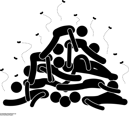
I once needed an icon for a very specific crime category – and was surprised to find one online. Not sure if I was happy or sad someone created such an image.
Whatever the source, make these ‘outsiders’ look like your base set: same color, similar visual weight. Also try to keep the number of outsiders small. If you need to borrow a large part of your icons from somewhere else, your base icon set might not be the right one.
Home-made icons
When nothing fits, draw it yourself. That sounds like more work than it is, as long as you don’t start from a blank canvas:
- Start from the closest existing icon. Download the SVG from your base set and adapt it in a tool like Figma, Illustrator or Inkscape. That way you keep your base style.
- Stick to the grid. Material Symbols is drawn on a 24×24 grid with some padding. Use the same grid with the same stroke weight.
- Keep it simple. Too much detail makes an icon difficult to understand.
- Use the same naming convention. Encode the settings just like Google names its exports.

My most common ‘home made’ icons are crossed-out buttons, which I use in Tableau as hide or close button for Dynamic Zone Visibility.
In short
- Icons on dashboards are functional first: use familiar metaphors.
- Pick one general set and stay inside it. Consistency matters much more than any individual icon.
- Don’t settle for given defaults – be critical of someone else’s choices.
- Google Material Symbols is a practical default: large, consistent, adjustable, exports to PNG and SVG, and records its settings in the filename.
- For logos and specialized concepts, look elsewhere – sparingly – and make the result match your base set.
- When you draw your own, start from an existing icon and keep its grid, stroke and naming.