Tableau dashboards often contain functional, but visually not really exciting navigation. Until recently, creating a modern menu meant floating objects, images, and/or tricky workarounds.
With the new rounded corners feature in Tableau 2026.1, you can now build cleaner, intuitive navigation bars that highlight the active item while keeping the others flat, just like the pill-style menus common on the web. In this post, I’ll show you how to set it up step by step and avoid the common pitfalls along the way.
Instead of the classic, rigid button layouts, you can now create modern navigation bars that feel much closer to what users expect from contemporary web and app design.
It’s a subtle change, but it makes dashboards feel more polished, more intentional, and ultimately more user-friendly.
Better and fancier Navigation buttons
In web design, there are countless approaches to navigation. One pattern I like (both for functional and esthetically) is the “pill” style, where the active menu item is visually highlighted, while the others remain subtle and flat.
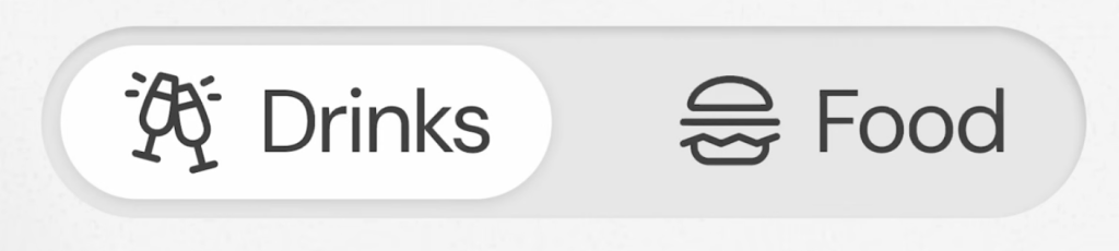
This “pill-style” navigation highlights the active item with a rounded background, while inactive items remain flat, creating a clear visual hierarchy.
Tableau dashboards often lack polished navigation patterns out of the box. With the new rounded corners feature (2026.1), we can finally recreate modern “pill-style” navigation: clean, intuitive, and visually aligned with web UI patterns.
10 steps in Tableau
Before version 2026.1 this could only be accomplished in Tableau using extra background images or extensions, but now this can be done native and more maintainable.
The trick for Tableau is that the rounded effect is not only coming from the button itself, but also from the container background in the layout. This allows the selected state to visually “merge” with the navigation bar.
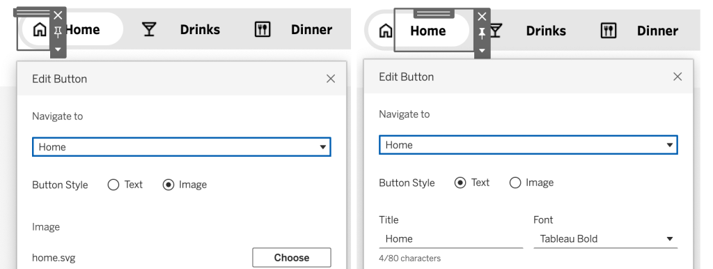
To re-create the style with ‘icon + text’ I use two navigation buttons per navigation item: one for the icon, one for the text.
- Add a horizontal container to your dashboard
- Set the background to light-gray
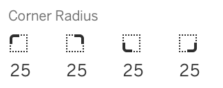
- Change the ‘Corner Radius’ to half the height of the container.
For a perfectly symmetric pill, set the corner‑radius = 0.5 × container height (e.g., 25px on a 50px tall bar).
- add navigation-buttons inside the container – two for every navigation-item you need: one for the image, one for the text. Set the background-color to ‘none’

- Configure each “un-even” navigation button (first, third, fifth,…) to:
- the right ‘Navigate to’ sheet,
- Button Style “Image”
- Choose an appropriate icon image (png or svg)
- Configure each “even” navigation button (second, fourth, sixth,…) to:
- the right ‘Navigate to’ sheet,
- Button Style “Text”
- Set the title of the menu to on ‘Title’
- Configure the right Font (I choose Tableau bold black, 12px, no background color)
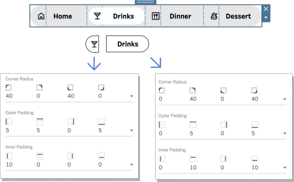
- Set the padding/radius for every “un-even” navigation button:
- radius: 40, 0, 40, 0 (to create an oval shape to the left)
- outer padding: 5, 5, 0, 5 (to create distance from the pill to the container)
- inner padding: 10, 0, 0, 0 (to make sure the icon fits)
and the even navigation buttons: - radius: 0, 40, 0, 40 (to create the oval shape to the right)
- outer padding: 0, 5, 0, 5 (to create distance from the pill to the container)
- inner padding: 0, 10, 0, 10 (to make sure the text aligns)
- Copy this menubar to each dashboard you want to navigate to.
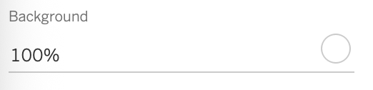
- On each dashboard, set the currently selected navigation items (both buttons) to white. Use the background color from the Layout pane – not the button formatting itself – otherwise the effect breaks.
Common pitfalls
There are quite a lot of steps and sub-steps, but most of them are repetitive. It is not very difficult, but you need to be very pixel-perfect precise to make it work. These settings will probably need a re-check once you think you are done:
- The background colors (gray for container, transparent for pills except the selected pill which is white)
- Both inner- and outer paddings
- Radius of the rounded corners on each side of the buttons
Interactive endresult
This is the ‘live’ end-result in Tableau: click on the navigation buttons to see how they interact:

I also created a version without icons (so no images needed) – click on the link to the ‘Text only version’ to see and test that one.
Download the workbook and copy the menubar
If you would like to use either version, please download this workbook (it contains both versions) to review the formatting.
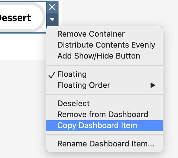
You can also skip most steps: just copy the container Dashboard Item, paste the content into your own file and modify it as needed!