• Skip to primary navigation
  • Skip to main content
  • Skip to primary sidebar
Antichaos

Antichaos

Data Visualisation, Tableau & Data Services

  • Home
  • Services
    • Training
    • Portfolio
  • About Johan
  • Blog
  • Contact
  • Nederlands
  • Show Search
Hide Search

UX

Smarter dashboard design – with fewer tooltips

2026-01-07 by Johan de Groot

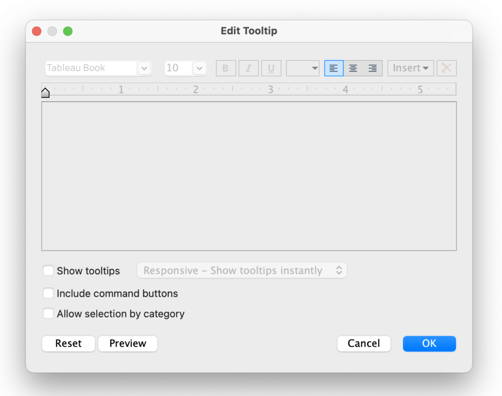
Tooltips can make or break a Tableau dashboard. Used well, they uncover extra detail with a simple hover, keeping your visuals clean but insightful.
But used poorly, they confuse users, slow performance, and hide the very insights you’re trying to show.

Too many tooltips turn a dashboard into a reactive experience instead of an intuitive one, users spend time chasing popups instead of insights.

In this article, I’ll show how to use tooltips smartly: when to reveal detail, when to stay silent, and how these small choices can make your dashboards clearer, faster, and far more actionable.

[Read more…] about Smarter dashboard design – with fewer tooltips

Primary Sidebar

Antichaos Services

  • Need Tableau Help ?
  • Basic, Advanced and Custom Training

Recent Blogposts

  • How to create pill-style navigation in Tableau
  • Tableau Visionary 2026
  • Tableau REST API Connector: Add Live Web Data to Your Dashboards
  • Rounded Corner Maps in Tableau
  • Improving Radar Charts: Showing Overview and Details
  • Create a Radarchart in Tableau – Modular and Simple
  • Radar Charts: Practical tips for when and how to use them
  • Smarter dashboard design – with fewer tooltips
  • Top 2000 in Perspective – Behind the Scenes
  • How to Visualize High-Value Metrics in Tableau Without Starting at Zero

Follow & Connect on

Antichaos

Copyright © 2026 Antichaos

  • Antichaos
  • Privacy
  • Contact