• Skip to primary navigation
  • Skip to main content
  • Skip to primary sidebar
Antichaos

Antichaos

Data Visualisation, Tableau & Data Services

  • Home
  • Blog
  • Services
  • Training
  • Portfolio
  • Contact
  • Nederlands
  • Show Search
Hide Search

Top 2000

De Top 2000 van 2022 gevisualiseerd

2023-01-10 by Johan de Groot

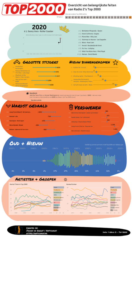
De Top 2000 zoals uitgezonden door Radio 2 heb ik gevisualiseerd met behulp van Tableau.

Dit jaar wat minder nadruk op een de vorm (hoewel ik heb gekozen voor een gedempte sinus, wat niet bepaald een veelgebruikte manier van weergeven is…).

[Read more…] about De Top 2000 van 2022 gevisualiseerd

Top 2000 of Radio 2 – Edition 2021

2022-01-01 by Johan de Groot

It’s that time of year again… – the Visualisation of the Top 2000 of Radio 2!

One of my traditions is to visualize the Top 2000 as being broadcasting by the Dutch radio station Radio 2 using Tableau.
This time I choose a circular visualisation of the list, with a detailed/zoomed-in look at the chose title inside the circle. Changing a title can be done via the drop-down, but also by clicking in the circle (either one) or in the list of entries of the artist.

[Read more…] about Top 2000 of Radio 2 – Edition 2021

Top 2000 van Radio 2 – Editie 2021

2021-12-30 by Johan de Groot

Het is weer die tijd van het jaar – de Visualisatie van de Top 2000 van Radio 2…

De Top 2000 zoals uitgezonden door Radio 2 heb ik voor de 10e keer (geloof ik) op een andere manier gevisualiseerd met behulp van Tableau.
Dit keer is er gekozen voor een circulaire weergave van de lijst van dit jaar, met een ‘detail’ van het gekozen nummer in de cirkel. Je kunt een nummer kiezen uit het dropdown menu, maar ook klikken in de cirkel of in de lijst met noteringen van de desbetreffende artiest.

[Read more…] about Top 2000 van Radio 2 – Editie 2021

Top 2000 visualisation – edition 2020

2021-01-04 by Johan de Groot

The Top 2000 edition of 2020 isn’t a fancy data visualisation with extensive data-preparation and/or mathematical formulas like last year, but a visualisation with the emphasis on what you can do with relative simple graphical elements. This approach can change the look and feel of a ‘standard’ dashboards significantly

Click on the screenshot to view – and use! – the data visualisation fullscreen.

Top 2000 visualisatie – editie 2020

2021-01-04 by Johan de Groot

(In Dutch) Voor de editie van 2020 heb ik dit keer niet gekozen voor een extreem fancy datavisualisatie met uitgebreide data-preparatie en/of ingewikkelde wiskundige formules, maar wat meer nadruk gelegd over hoe je met relatief eenvoudige grafische elementen je een dashboard een compleet ander uiterlijk kunt geven dan een ‘standaard’ dashboard.

[Read more…] about Top 2000 visualisatie – editie 2020
  • « Go to Previous Page
  • Page 1
  • Page 2
  • Page 3
  • Page 4
  • Page 5
  • Go to Next Page »

Primary Sidebar

Antichaos Services

  • Need Tableau Help ?
  • Basic, Advanced and Custom Training

Recent Blogposts

  • Smarter dashboard design – with fewer tooltips
  • Top 2000 in Perspective – Behind the Scenes
  • How to Visualize High-Value Metrics in Tableau Without Starting at Zero
  • Why is COUNTD so slow – and how can I fix this?
  • Visualizing ‘Dynamic’ Data using a Sine Wave
  • Add ‘All’ and more options to a Dynamic Parameter
  • Tableau Container Art – 4 examples of formatting dashboards without images
  • Letting Users Choose Their Visual
  • The Tableau VizQL Data Service: What It Is, What It Can Do, and When to Use It
  • Abbreviate long text in Tableau

Antichaos

Copyright © 2026 Antichaos

  • Antichaos
  • Privacy
  • Contact