• Skip to primary navigation
  • Skip to main content
  • Skip to primary sidebar
Antichaos

Antichaos

Data Visualisation, Tableau & Data Services

  • Home
  • Services
    • Training
    • Portfolio
  • About Johan
  • Blog
  • Contact
  • Nederlands
  • Show Search
Hide Search

Top 2000

Top 2000 in Perspective – Behind the Scenes

2025-12-30 by Johan de Groot

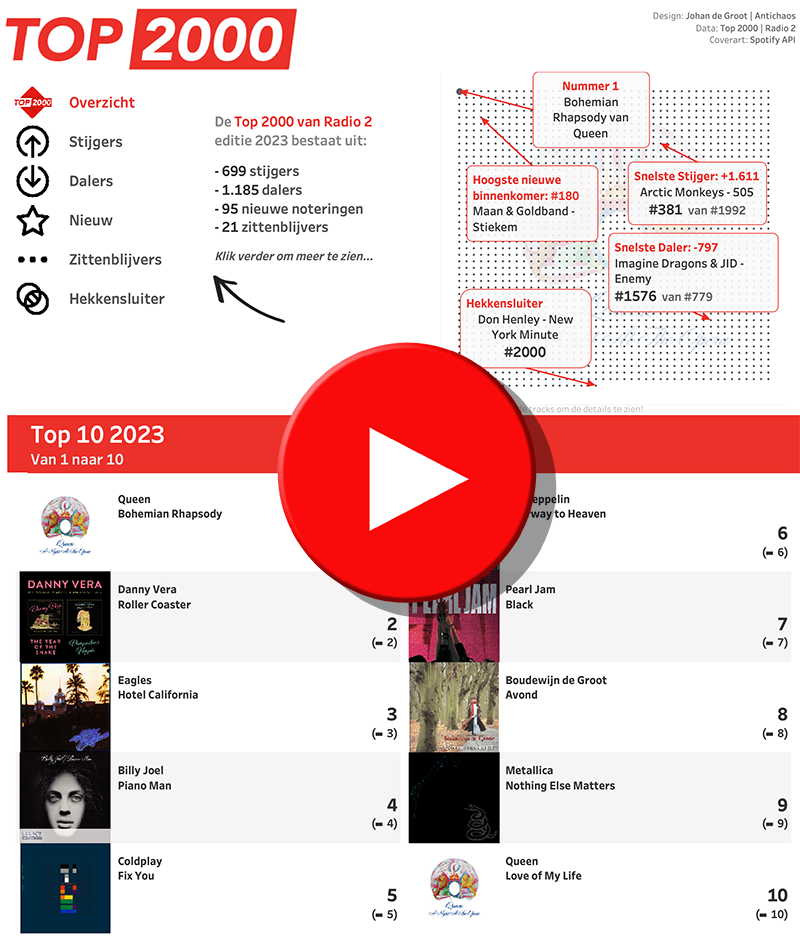
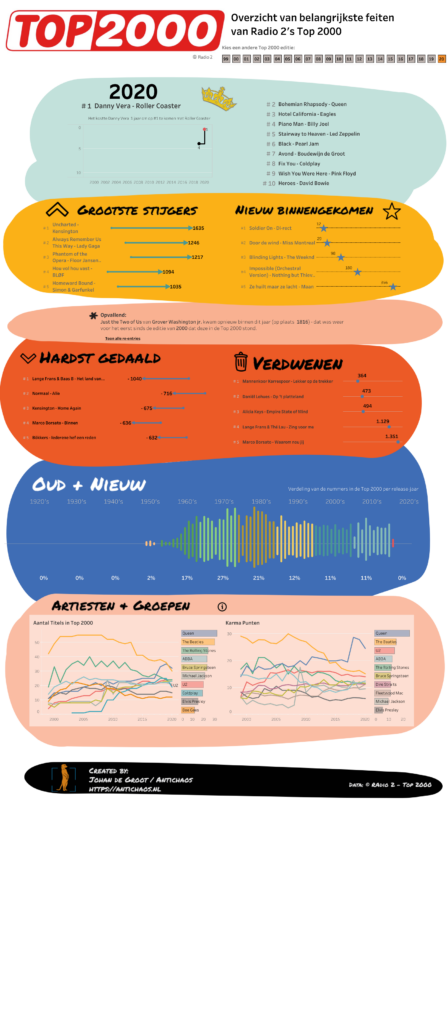
Every year, the Dutch Radio 2 Top 2000 offers an updated dataset with 2000 songs – and every year, it challenges me to create a completely perspective on it.

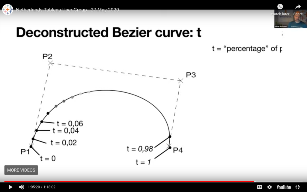
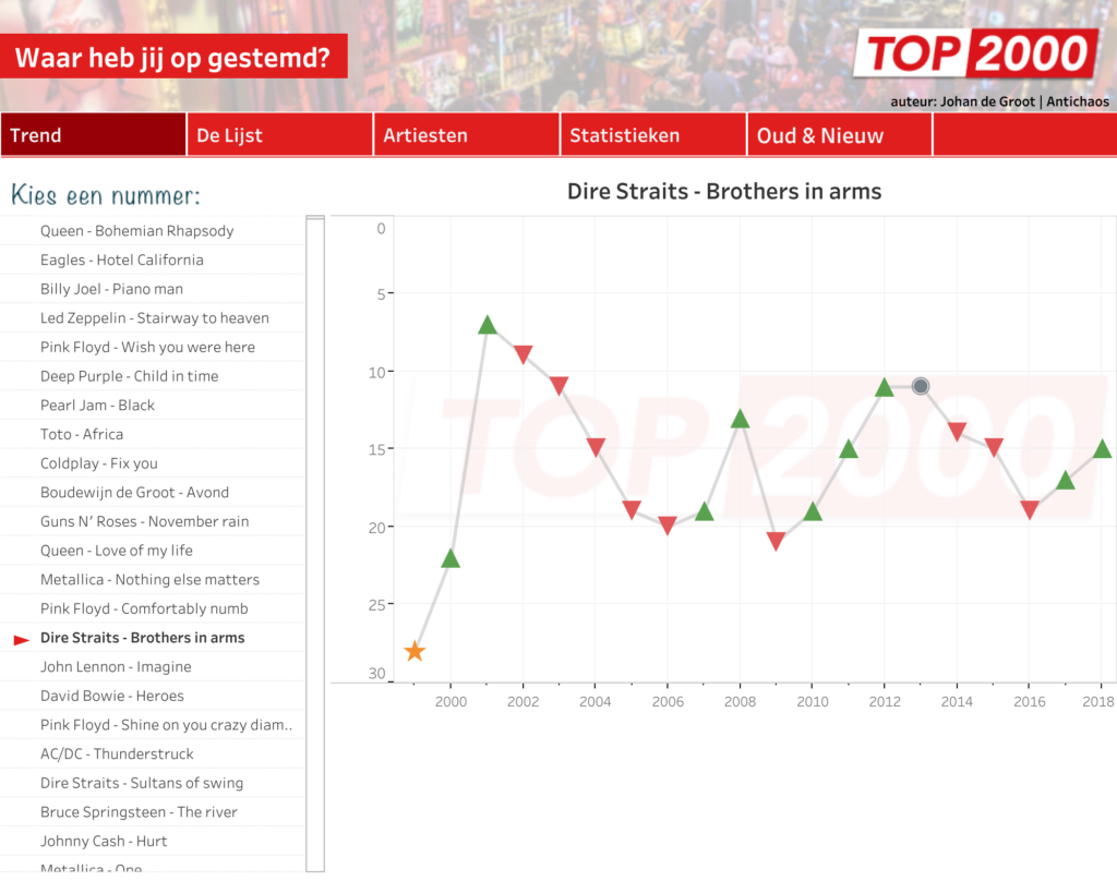
The challenge to me isn’t what the data is, but how to see it again with fresh eyes. After 14 years of exploring bar charts, Bézier-inspired snow globes, and long-form dashboards, this year I opted for a 3D grid.

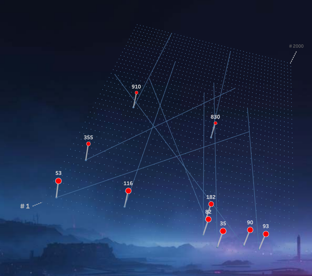
This post looks behind the scenes of that process: the design choices, technical constraints, and small visual tricks that shaped this year’s visualization. For the TL;DR people: the interactive dashboard can be found here.

[Read more…] about Top 2000 in Perspective – Behind the Scenes

Top 2000 – Edition 2024: Snow Globes

2024-12-29 by Johan de Groot

It’s my personal yearly end-of-December Christmas tradition: visualizing the Top 2000 hitlist of NPO Radio 2 (a Dutch national radio station).

(you can also view the interactive visualization on Tableau Public)

[Read more…] about Top 2000 – Edition 2024: Snow Globes

Top 2000 of 2023 – what stood out?

2023-12-31 by Johan de Groot

The Top 2000 of Radio 2 (a populair Dutch radio station) has been broadcast for the 25th time – and traditionally I am trying to turn this into a ‘different’ interactive data visualization…

[Read more…] about Top 2000 of 2023 – what stood out?

Top 2000 van 2023 – wat viel er op in de lijst?

2023-12-31 by Johan de Groot

De 25e keer is de Top 2000 van Radio 2 uitgezonden – en traditiegetrouw probeer ik hier weer een ‘andere’ interactieve datavisualisatie van te maken…

[Read more…] about Top 2000 van 2023 – wat viel er op in de lijst?

The Radio Top 2000 visualised – edition 2022

2023-01-10 by Johan de Groot

I visualized the Top 2000 as broadcast by Radio 2 for the 11th time (I believe) in a different way using Tableau.

[Read more…] about The Radio Top 2000 visualised – edition 2022
  • Page 1
  • Page 2
  • Page 3
  • Interim pages omitted …
  • Page 5
  • Go to Next Page »

Primary Sidebar

Antichaos Services

  • Need Tableau Help ?
  • Basic, Advanced and Custom Training

Recent Blogposts

  • How to create pill-style navigation in Tableau
  • Tableau Visionary 2026
  • Tableau REST API Connector: Add Live Web Data to Your Dashboards
  • Rounded Corner Maps in Tableau
  • Improving Radar Charts: Showing Overview and Details
  • Create a Radarchart in Tableau – Modular and Simple
  • Radar Charts: Practical tips for when and how to use them
  • Smarter dashboard design – with fewer tooltips
  • Top 2000 in Perspective – Behind the Scenes
  • How to Visualize High-Value Metrics in Tableau Without Starting at Zero

Follow & Connect on

Antichaos

Copyright © 2026 Antichaos

  • Antichaos
  • Privacy
  • Contact