In previous posts, I explored when to use radar charts and how to build them flexible and modular in Tableau. But as we’ve seen, this format has a notorious ‘blind spot.’ While it works well for showing a recognizable shape, the granular details often get drowned out in the overall picture.
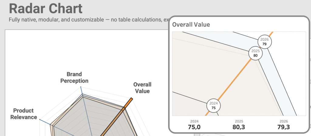
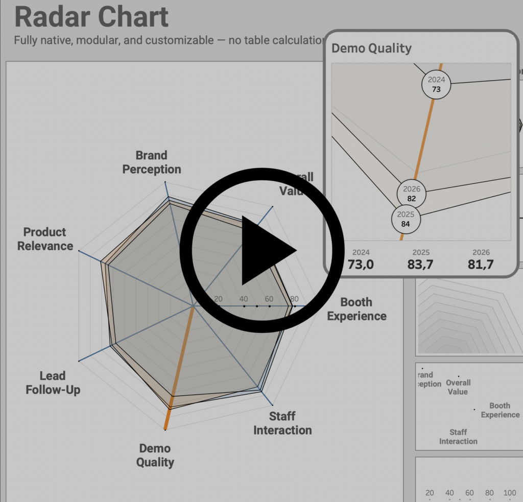
Now we are taking the next step: improving the legibility of the radar chart by zooming in on individual spoke values without losing the context of the whole.
Solving the lack of detail
Even with a technical well-built radar chart, the data itself often obfuscates the analysis.
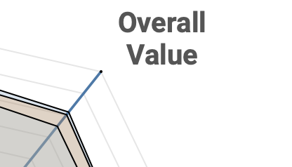
For example, it is really difficult to identify the precise differences between points on the polygon. While it’s easy to see that these values are close to each other, it’s almost impossible to tell how close.
The common fix for this lack of detail is to switch to a different chart type entirely, but that means losing the unique characteristics of a radar chart. Instead of distracting the viewer with a new visual, I wanted to find a way to maintain the integrity of the chart while bringing the data into focus.
My solution is a dynamic ‘zoom’ feature: by keeping the main radar chart as our anchor and adding a dedicated, magnified view of the individual spokes, we can make those crowded values readable the moment you hover over them.
How to create this Radar Chart in Tableau
Two calculations, one parameter, one parameter action – but quite some steps to create this.
0. The Thinking Progress
Before we touch a single calculation, we have to rethink how Tableau handles this idea. A normal filter would destroy the idea of a radar chart (because only one spoke/dimension is left). To create a “zoom” we have to exploit three specific Tableau behaviors (and strengths):
- Spatial Layering
By using Map Layers, we aren’t just drawing lines; we are placing data on a coordinate plane. This allows us to “turn off” the visibility of certain layers while keeping them in the background, and use different kind of marks (lines, circles, …) in the same visualization. - “Zoom Extent”
Tableau’s map marks have a property called “Add to Zoom Extent.” If we tell Tableau to ignore the background layers and only focus on the “Selected Spoke” layer, the map will naturally “magnify” these points to fill the entire sheet when it appears. - The Dynamic Overlay
By using a Floating Container with Dynamic Zone Visibility, we create a “Head-Up Display” (pop-up) effect. The detail sheet sits invisibly on top of the main chart, only appearing when your parameter action gives it a reason to exist.
The goal is to create a ‘magnifying glass’ effect. We want the user to feel like they are simply zooming into the existing radar chart, rather than being forced to shift their mental model or navigate to a different dashboard.
1. Duplicate the original Radar Chart sheet to a new sheet
Exactly the same visualization as the base radar-chart is used – with some minor tweaks. Rename the sheet to e.g. “Detail Radar”.
2. Create Parameter which identifies detailed Dimension
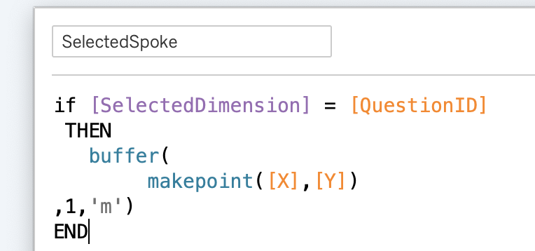
A new parameter, SelectedDimension, is used to identify which Dimension get the focus.
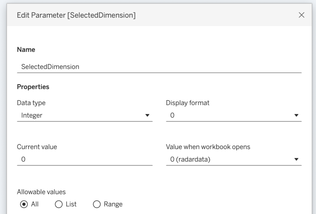
The ‘Value when workbook opens’ is set to 0 so the detail view remains hidden until an interaction occurs (this is explained in step 6)
3. Remove all map layers from the Zoom Extent
This is a very important step for this solution – and one of the major reasons of using map layers for this visualization. The focus will be on a selected dimension, but we don’t want to hide the other ones per se; they just don’t need focus.
Removing all map layers from the Zoom Extent (de-select the default ‘Add to Zoom Extent’) for this.
By removing these from the Zoom Extent, Tableau ignores these layers when calculating the ‘frame’ of the map, allowing the single selected dimension to dictate the zoom level.
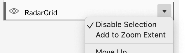
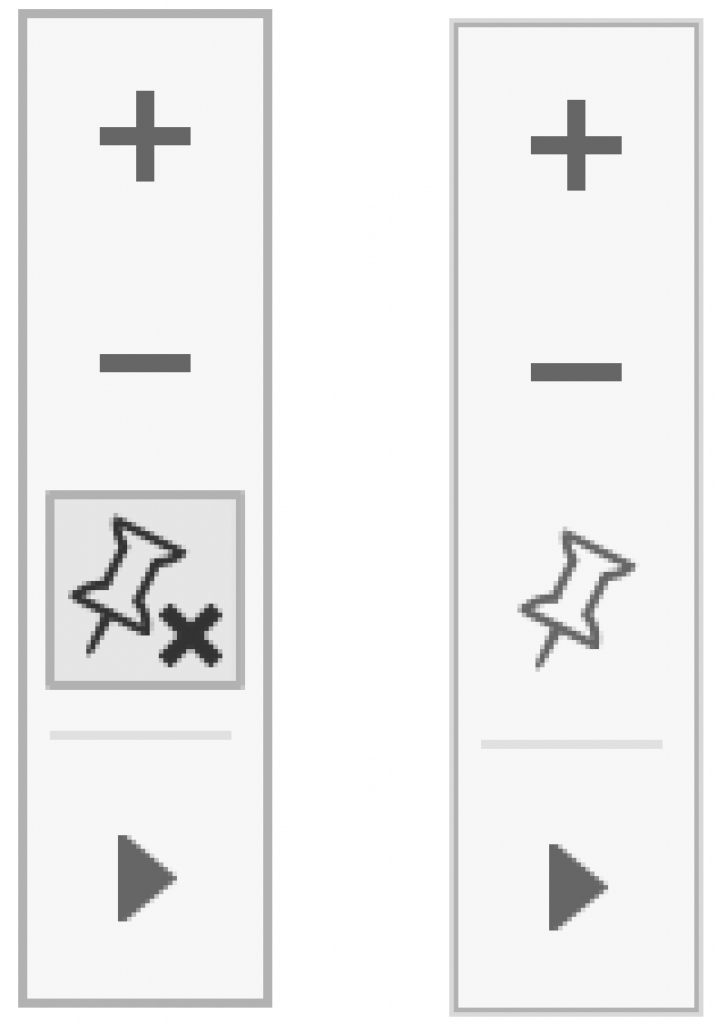
Make sure the viewport is not fixed: if the pinpoint of the View Toolbar contains a ‘x’, click on it to “unfix” it.
4. Add a Map layer which show the Selected Dimension
Besides all the other map layers created in the ‘base’ version a new map-layer is used to show the marks of the selected dimension. A spatial buffer works more reliable than just a point, so both MAKEPOINT and BUFFER are used:
Add this map layer to the visualization by dragging it onto the sheet:
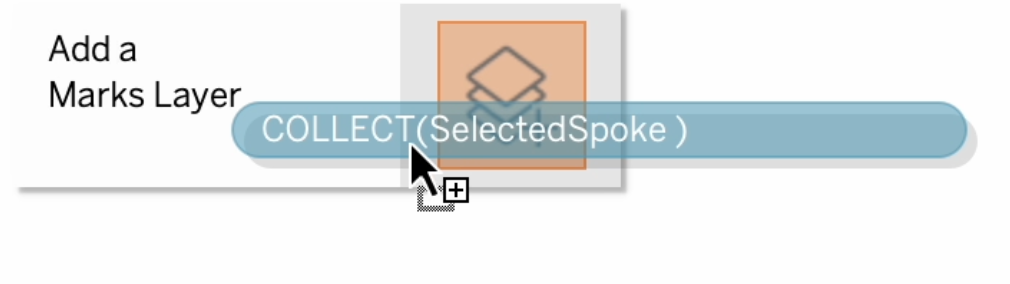
Unlike the other map layers, this keeps the ‘Add to Zoom Extent’!
5. Set the new Map Layer mark type to ‘circle’, and add labels
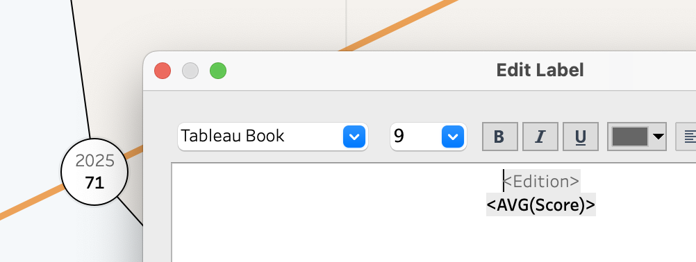
To add detail to the marks, change the mark type to circle so they are much better visible, and add labels to these marks with the values. In the example, both the year and the value are shown
6. Add the sheet as popup to the dashboard – and hide it using Zone Visibility
On the main dashboard, place the ‘detail’ sheet as a floating element. This allows the underlying radar chart to remain fully visible while providing the extra context right where it’s needed.
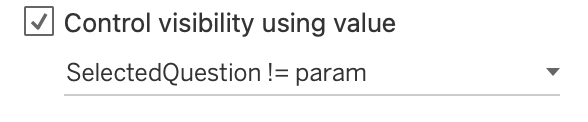
To show and hide it, an extra very simple calculation is needed. The sheet should not be visible when the parameter has the value 0 – or: should be visible when the value is not 0. This calculation returns TRUE when the parameter is not 0.
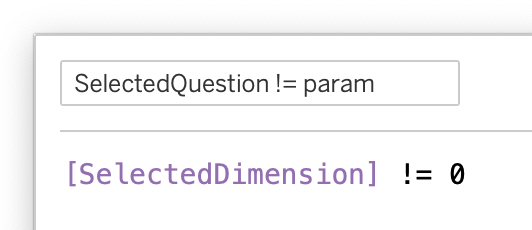
This calculation is used in the ‘Control visibility using value’ configuration on the dashboard:
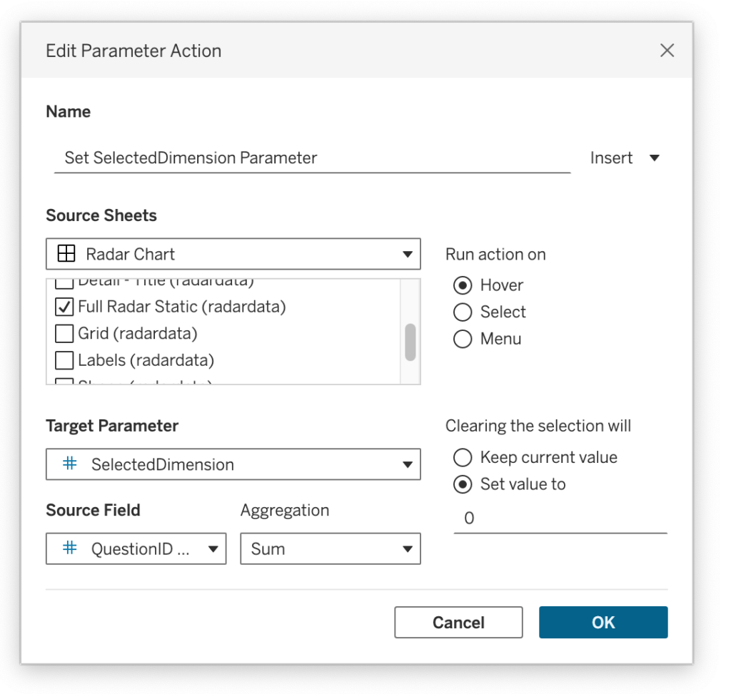
7. Trigger the popup using a Parameter Action
The final step is a Parameter Action. When you hover over a spoke, the SelectedDimension parameter updates to that DimensionID, triggering the zoom. Once the cursor moves away, the value resets to 0, hiding the popup and returning the dashboard to its clean, original state.
A Foundation for Customization
Think of the above mentioned steps as a blueprint rather than a final destination. The underlying logic of using parameter-driven visibility is incredibly flexible, and can therefor be customized in any way you want:
- Add a clear title to the detail (see example)
- Add a table with the exact values (see example)
- Swap the points with a historical trend line
- Compare against a benchmark
- Use a different kind of visual
- Put the sheet in a tooltip (in my example I found the tooltip too small and jittery to be useful in my example)
- …
The Radar Chart
view the full interactive chart on Tableau Public
Concluding
There is an ongoing challenge between ‘big picture’ overviews and ‘small-scale’ details in data visualization. While radar charts are often dismissed for their lack of precision, this dynamic zoom shows that we don’t have to choose between a beautiful visualization and accurate analysis.
By leveraging Tableau’s interactive features, we can transform a ‘low detail – even ‘fuzzy’ – visual into a high-performance analytical tool. Use this technique to give your audience the best of both worlds: the unmistakable signature of the radar chart, with the absolute clarity of a focused data point.
I’d love to see how you adapt this “magnifying glass” approach to your own dashboards. If you build something using this foundation, tag me or share a link in the comments of this LinkedIn post!