• Skip to primary navigation
  • Skip to main content
  • Skip to primary sidebar
Antichaos

Antichaos

Data Visualisation, Tableau & Data Services

  • Home
  • Blog
  • Services
  • Training
  • Portfolio
  • Contact
  • Nederlands
  • Show Search
Hide Search
Home » Blog

Blog

Line-chart: betters ways to compare years

2025-01-23 by Johan de Groot

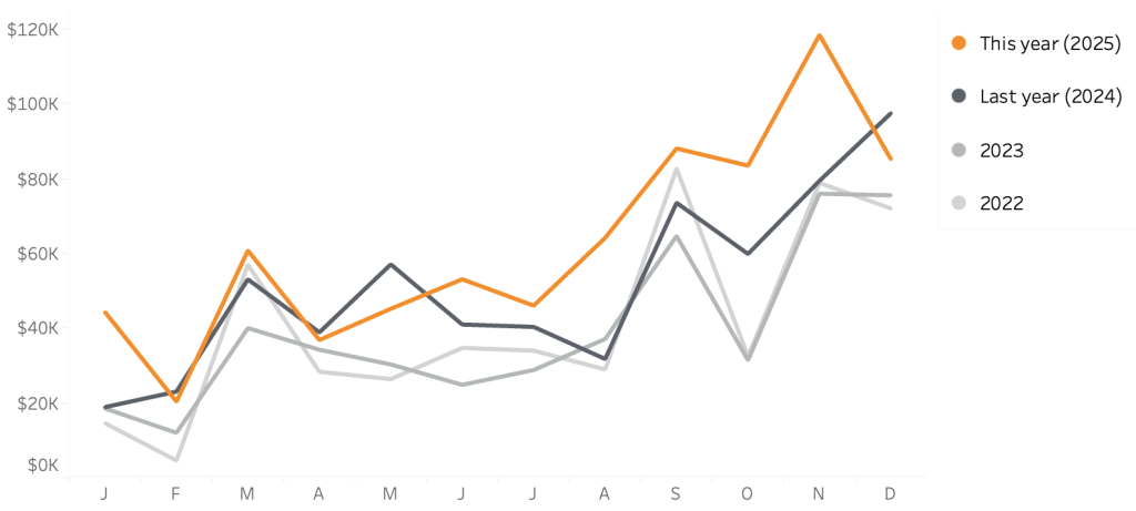
Line charts are one of the best and popular ways to show how data has developed over time. It’s a simple graph that is familiar to anyone, but the default generated can often be improved – either in Tableau, Excel or any other tool.

In this blog post I want to show how a relative small change in a line chart can result in a big improvement.

[part of the ‘Datafam London 2024 – Deepcleaning your dashboard’ series]

[Read more…] about Line-chart: betters ways to compare years

Deep Cleaning Barcharts – part 2: Punctuated Bar Chart

2025-01-16 by Johan de Groot

[part of the ‘Datafam London 2024 series]

In part 1 we took a look at a basic bar chart, and ended with the lollypop chart. A fun chart with one major issue: the dot obfuscates the real datapoint.

Punctuated Bar Chart

One solution for it the Punctuated Bar Chart:
We highlight the end of each bar, instead of enlarging the endpoint.

[Read more…] about Deep Cleaning Barcharts – part 2: Punctuated Bar Chart

Deep Cleaning Barcharts – part 1: the basics

2025-01-16 by Johan de Groot

[part of the ‘Datafam London 2024 series]

On DataFam 2024 in London I gave a presentation / workshop on deep cleaning dashboards.

Why cleaning dashboards?

  • Make it look better ▶ Users want to use it
  • Less clutter on your dashboard ▶ Less clutter in your brain
  • Making your dashboard more actionable ▶ Focusing on what’s important.

Dashboard cleaning is about: Removing, adding , re-arranging, and replacing stuff. In Tableau, it’s about: Table calculations, extra sheets, changing images, talking to users, being critical to yourself, … Is hard work – and a lot of fun!

[Read more…] about Deep Cleaning Barcharts – part 1: the basics

Top 2000 – Edition 2024: Snow Globes

2024-12-29 by Johan de Groot

It’s my personal yearly end-of-December Christmas tradition: visualizing the Top 2000 hitlist of NPO Radio 2 (a Dutch national radio station).

(you can also view the interactive visualization on Tableau Public)

[Read more…] about Top 2000 – Edition 2024: Snow Globes

Christmas Movie Marathon using a Image based bar-chart

2024-12-16 by Johan de Groot

You can use to create your own Christmas Movie Marathon in Tableau using this dashboard!
Based on the IMDB dataset ‘100 best Christmas movies of all time’ and some nice Tableau techniques you can determine which movies you want to watch this holiday.

Start by entering the time you can spend on movies this holiday on Step 1 (from a couple of hours to several days), and then use step 2 to select all the movies you want to see during this time.
Selections can be made on plot, but also runtime, genre and/or IMDB rating.

[Read more…] about Christmas Movie Marathon using a Image based bar-chart
  • « Go to Previous Page
  • Page 1
  • Interim pages omitted …
  • Page 5
  • Page 6
  • Page 7
  • Page 8
  • Page 9
  • Interim pages omitted …
  • Page 19
  • Go to Next Page »

Primary Sidebar

Antichaos Services

  • Need Tableau Help ?
  • Basic, Advanced and Custom Training

Recent Blogposts

  • Smarter dashboard design – with fewer tooltips
  • Top 2000 in Perspective – Behind the Scenes
  • How to Visualize High-Value Metrics in Tableau Without Starting at Zero
  • Why is COUNTD so slow – and how can I fix this?
  • Visualizing ‘Dynamic’ Data using a Sine Wave
  • Add ‘All’ and more options to a Dynamic Parameter
  • Tableau Container Art – 4 examples of formatting dashboards without images
  • Letting Users Choose Their Visual
  • The Tableau VizQL Data Service: What It Is, What It Can Do, and When to Use It
  • Abbreviate long text in Tableau

Antichaos

Copyright © 2026 Antichaos

  • Antichaos
  • Privacy
  • Contact