(In Dutch) Voor de editie van 2020 heb ik dit keer niet gekozen voor een extreem fancy datavisualisatie met uitgebreide data-preparatie en/of ingewikkelde wiskundige formules, maar wat meer nadruk gelegd over hoe je met relatief eenvoudige grafische elementen je een dashboard een compleet ander uiterlijk kunt geven dan een ‘standaard’ dashboard.
[Read more…] about Top 2000 visualisatie – editie 2020Blog
Map Layers in Tableau – step by step (or layer by layer)
The Tableau 2020.4 release comes fully-loaded with tons of great features, including several key updates to boost your geospatial analysis. In particular, the new multiple marks layers feature lets you add an unlimited number of layers to the map. This means you can visualize multiple sets of location data in context of one another, and there’s no need for external tools to build custom background maps.
Comments in Tableau
When you are creating a calculated field in Tableau Desktop, Server of Prep you might want to create some comments to help others see what the purpose of this field is, or explain the calculation that you made. In other situations you might want to test a line of code, and disable a previously written block of code without deleting it.
This is all possible using comments in calculated fields.
[Read more…] about Comments in Tableau502 errors on datasource downloads from Tableau
If you experience 502 errors when downloading large datasets from Tableau Server – either in a browser or Tableau Desktop – you might occur problems not related to Tableau Server, but a proxy or gateway in front of the server.
[Read more…] about 502 errors on datasource downloads from TableauSave a Tableau workbook if you can’t save it
A small tip for a situation that is occurring once in a while to me (probably Mac specific):
If you have been working on a Tableau dashboard for quite a while, you suddenly can’t save the workbook anymore. ‘Save’ results in a popup which disappears very quickly, and ‘Save as’ shows the ‘save as’ dialog for a few milliseconds before disappearing again. Odd behavior – but especially annoying because you really want to save the changes you have made in the last two hours…
[Read more…] about Save a Tableau workbook if you can’t save itBohemian Rhapsody: From Top 2000 to jump-chart
Watch my presentation of the Top 2000 jumpchart, held on the Virtual User Group meeting on May 27th 2020:

Use Python as an Alteryx connector
Many people are kind of scared of using programming language. And sure, if you haven’t any experience using these ‘command line’ tools the learning curve may seem steep. And why should you learn a language like Python, if you have a fantastic tool like Alteryx to process your data?

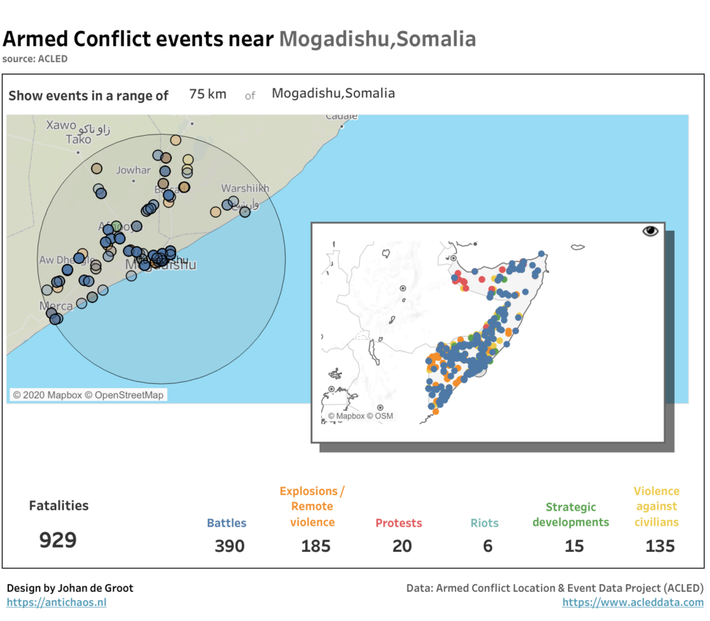
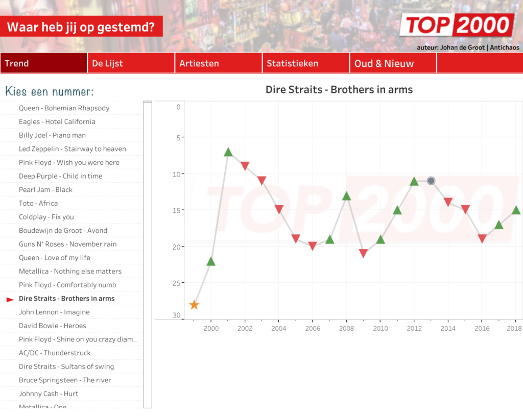
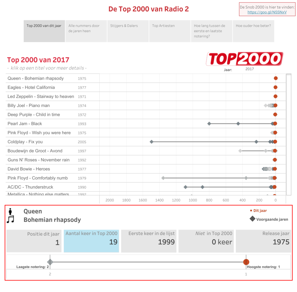
Top 2000 van Radio 2 — 2019
Ieder jaar maak ik op basis van de laatste Top 2000 lijst van Radio 2 een nieuw (aantal) visualisaties.. De lijst zelf is niet heel erg spannend, dus is het interessant om te zien wat je met de data kunt doen…

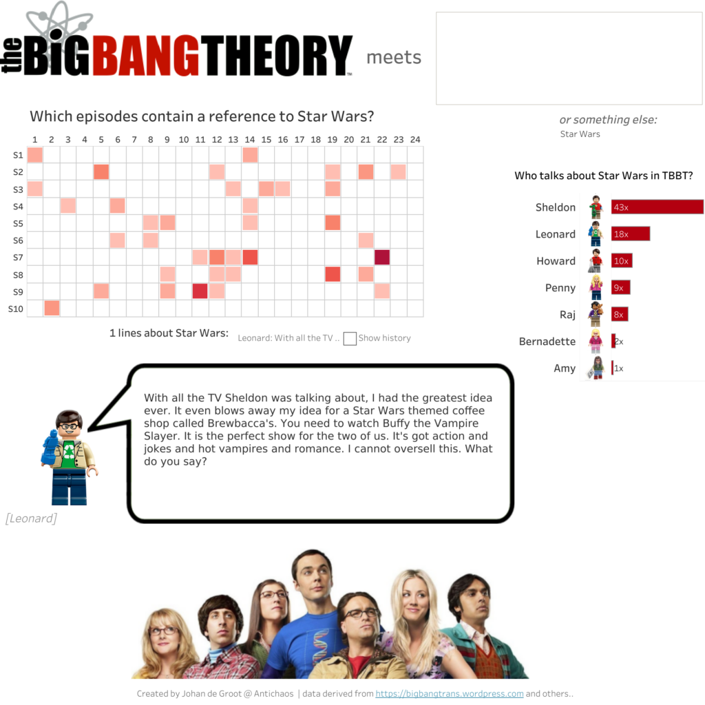
The Big Bang Theory meets other shows
Top 2000 van 2018
Top 2000 – 2018
In my annual exercise of visualizing the Dutch Top 2000 I made use of a couple new Tableau tricks, like navigation buttons (a lot of work to create the on all dashboards, but well worth it) and transparent sheets:
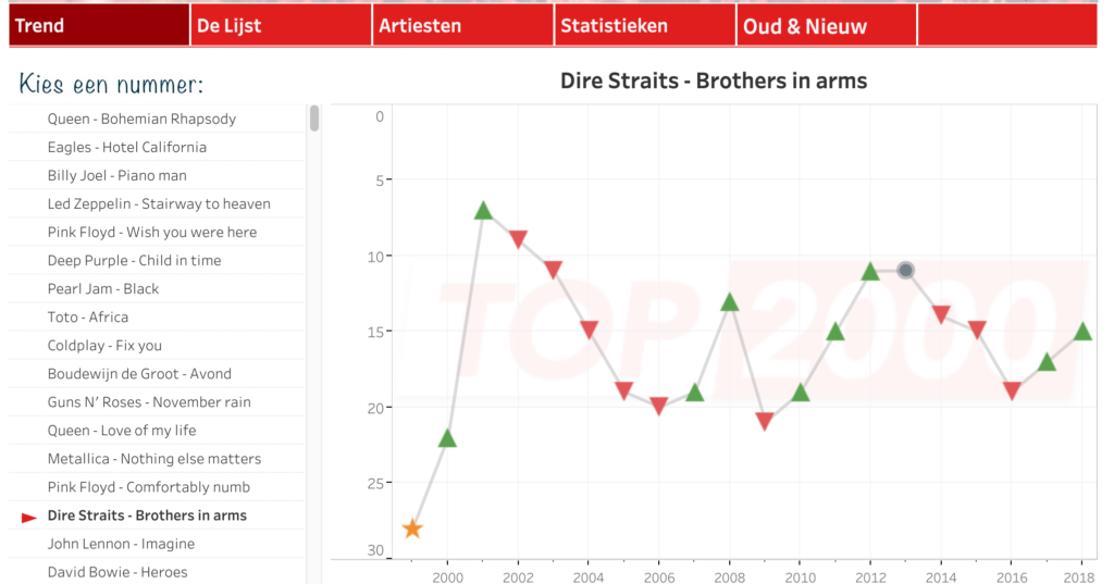
Top 2000 Radio 2 – editie 2017
Year-to-date in Tableau
If you want to compare last year to this year ‘to date’, you have to take into account that a leap-year adds 1 extra date to the year – so you can’t just compare the day-of-year from this and last year.
Often this filter is used:
DATEPART('dayofyear',[Date]) <= DATEPART('dayofyear',TODAY())
But this is a better one, since this compares day and month:
YEAR([Date]) >= YEAR(TODAY())-1
AND (MONTH([Date]) < MONTH(TODAY())
OR
(MONTH([Date]) == MONTH(TODAY())
AND DAY([Date]) <= DAY(TODAY())))
If you want to have a ‘year to date’ until today (so today excluded), use this one:
YEAR([Date]) >= YEAR(TODAY()-1)-1
AND (MONTH([Date]) < MONTH(TODAY()-1)
OR
(MONTH([Date]) == MONTH(TODAY()-1)
AND DAY([Date]) <= DAY(TODAY()-1)))
ISO weeks in Tableau
Tableau can handle all kind of dates and dateformats very well – but one option is lacking: the use of ISO8601 weeknumbers, the one which is used all over the world, especially in Europe.

Calculate last day of month
Sometimes you need to calculate how many days a certain month – like the current month. With some nested date-calculations this isn’t that hard to calculate…