• Skip to primary navigation
  • Skip to main content
  • Skip to primary sidebar
Antichaos

Antichaos

Data Visualisation, Tableau & Data Services

  • Home
  • Services
    • Data Analysis
    • Training
    • Portfolio
  • Blog
  • About Johan
  • Contact
  • Nederlands
  • Show Search
Hide Search
Home » Blog

Blog

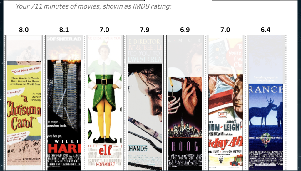
Christmas Movie Marathon using a Image based bar-chart

2024-12-16 by Johan de Groot

You can use to create your own Christmas Movie Marathon in Tableau using this dashboard!
Based on the IMDB dataset ‘100 best Christmas movies of all time’ and some nice Tableau techniques you can determine which movies you want to watch this holiday.

Start by entering the time you can spend on movies this holiday on Step 1 (from a couple of hours to several days), and then use step 2 to select all the movies you want to see during this time.
Selections can be made on plot, but also runtime, genre and/or IMDB rating.

[Read more…] about Christmas Movie Marathon using a Image based bar-chart

Tableau ‘CountTo’ Extension

2024-12-11 by Johan de Groot

Ever wanted to count up or down in Tableau?
Now you can using the CountTo Viz Extension – for free!

Count up and down inside Tableau

Using this extension a dashboard will count up or down to a certain value.

[Read more…] about Tableau ‘CountTo’ Extension

DataFam 2024 – London

2024-12-02 by Johan de Groot

On the 11th and 12th of November of this year a complete new Tableau event was held in the center of London: DataFam 2024.

Tableau Datafam 2024 London
[Read more…] about DataFam 2024 – London

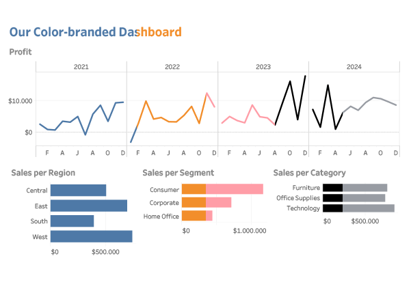
Change all colors at once

2024-07-26 by Johan de Groot

One of the most impactful development tips I got during TC24 was a very small one, but I have used it a lot since then.

What is you have just finished your dashboard, and your manager/client/voice in you head tells you: I think the color of the charts need to be changed to pink…

[Read more…] about Change all colors at once

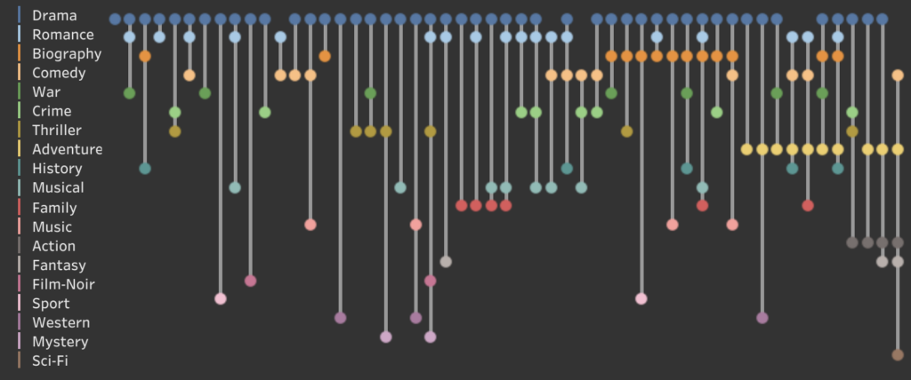
Let there be Drama! Genres of Oscar winners

2024-07-03 by Johan de Groot

Using the great dataset ‘Data and Movies‘.- with lots of IMDB data from movies until 2022 – I created a dashboard about the different Genres of Academy Award Winners for Best Picture.

[Read more…] about Let there be Drama! Genres of Oscar winners

Tableau Hyper API now on Apple Silicon

2024-06-23 by Johan de Groot

The June 2024 release of the Hyper API (version 0.0.19484) is available – and it now finally supports Apple Silicon!

[Read more…] about Tableau Hyper API now on Apple Silicon

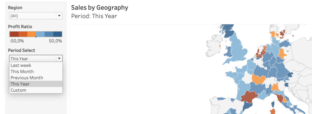
A better date-filter in Tableau

2024-06-13 by Johan de Groot

When building a dashboard, one of the most common elements is a date-filter. And the most used date filter is probably the infamous ‘Range of Dates’.

[Read more…] about A better date-filter in Tableau

Weather Forecast dashboard in Tableau

2024-04-03 by Johan de Groot

It’s just a couple of weeks before TC24 in San Diego… So we want to know what the weather is out there!

Or at home. Or any other place in the world.
What better than building your own weather forecast in Tableau!?

[Read more…] about Weather Forecast dashboard in Tableau

Custom Tableau Shapes on maps – beware!

2024-01-28 by Johan de Groot

The ‘shapes’ functionality in Tableau is a nice way to enhance and personalize a visualization. But be aware what exactly you are decoration – especially on maps.

[Read more…] about Custom Tableau Shapes on maps – beware!

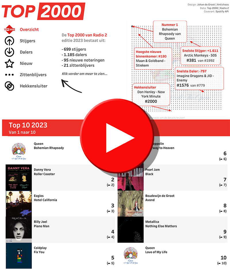
Top 2000 of 2023 – what stood out?

2023-12-31 by Johan de Groot

The Top 2000 of Radio 2 (a populair Dutch radio station) has been broadcast for the 25th time – and traditionally I am trying to turn this into a ‘different’ interactive data visualization…

[Read more…] about Top 2000 of 2023 – what stood out?

Top 2000 van 2023 – wat viel er op in de lijst?

2023-12-31 by Johan de Groot

De 25e keer is de Top 2000 van Radio 2 uitgezonden – en traditiegetrouw probeer ik hier weer een ‘andere’ interactieve datavisualisatie van te maken…

[Read more…] about Top 2000 van 2023 – wat viel er op in de lijst?

How to visualize extreme values?

2023-12-03 by Johan de Groot

Now and then you encounter data with ‘extreme values’. Values which are much larger than the other ones – and so hard to analyse.

A dataset which is skewed like that needs to have a special treatment when visualized, because otherwise the individual values can’t be identified correctly.

[Read more…] about How to visualize extreme values?

Improve layout of percentags – Better labels in Tableau

2023-11-21 by Johan de Groot

Often improving a dashboard is about small changes. Have a look a this chart:

[This blogpost is part of a series tips tricks, as being presented at VizIt Berlin 2023]

[Read more…] about Improve layout of percentags – Better labels in Tableau

Dynamic value format – Better labels in Tableau

2023-11-19 by Johan de Groot

Labels are often an after-thought for many users – we don’t like them, but are necessary. Using some simple steps we can create better labels which are easier to interpret for the users of the dashboard.


[This blogpost is part of a series tips tricks, as being presented at VizIt Berlin 2023]

[Read more…] about Dynamic value format – Better labels in Tableau

VizIt Berlin 2023: Tableau Conference by the Community

2023-11-18 by Johan de Groot

This week the “DataFam” was reuniting in Berlin. Two days of great talks, great people in a wonderful atmosphere!

[Read more…] about VizIt Berlin 2023: Tableau Conference by the Community
  • « Go to Previous Page
  • Page 1
  • Page 2
  • Page 3
  • Page 4
  • Page 5
  • Page 6
  • Page 7
  • Go to Next Page »

Primary Sidebar

Antichaos Services

  • Need Tableau Help ?
  • Basic, Advanced and Custom Training

Recent Blogposts

  • The Tally extension: CountTo renewed
  • 5 more Tableau Desktop Tips: Fields, Calculations & Pills
  • MeasureCamp Amsterdam 2026: the power of the blank board
  • Datafam Day 2026 – Amsterdam
  • How to create pill-style navigation in Tableau
  • Tableau Visionary 2026
  • Tableau REST API Connector: Add Live Web Data to Your Dashboards
  • Rounded Corner Maps in Tableau
  • Improving Radar Charts: Showing Overview and Details
  • Create a Radarchart in Tableau – Modular and Simple

Follow & Connect on

Antichaos

Copyright © 2026 Antichaos

  • Antichaos
  • Privacy
  • Contact