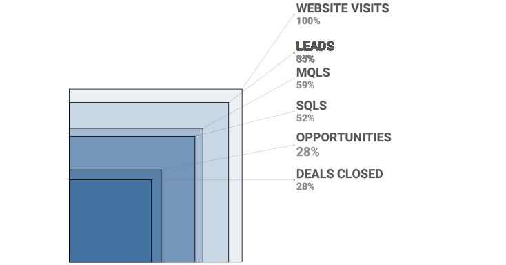
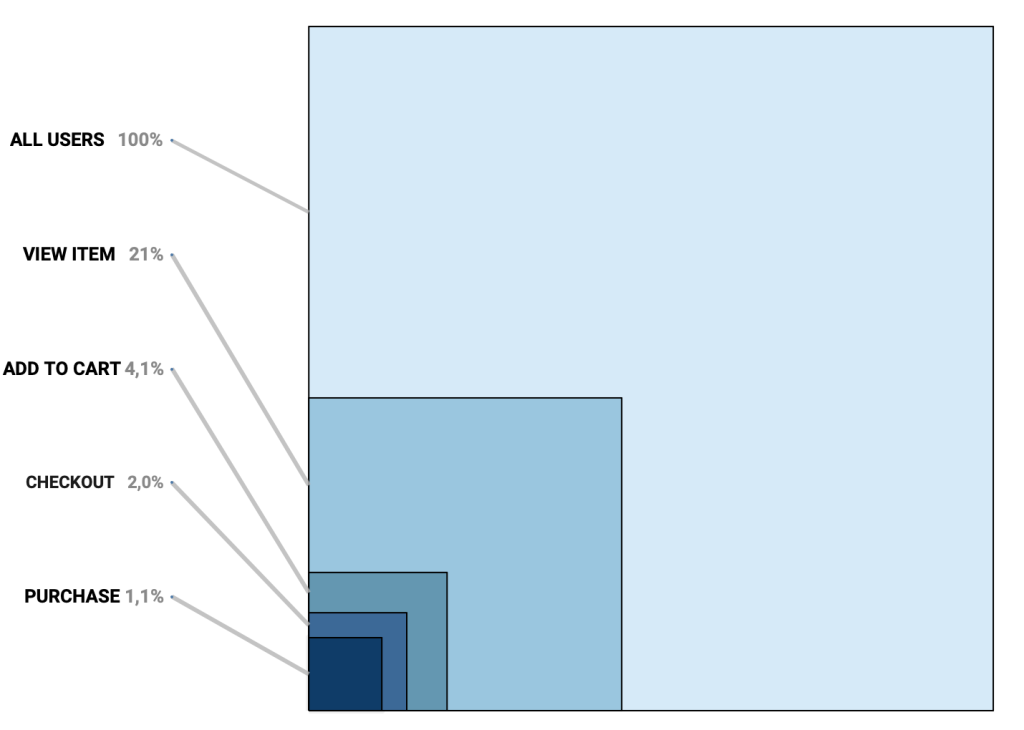
Tableau containers don’t exactly have the best reputation. Most people either ignore them or wrestle with them. But once you actually get along with containers (and their friends: borders, background colors, and padding), they turn into your dashboard’s interior designers.
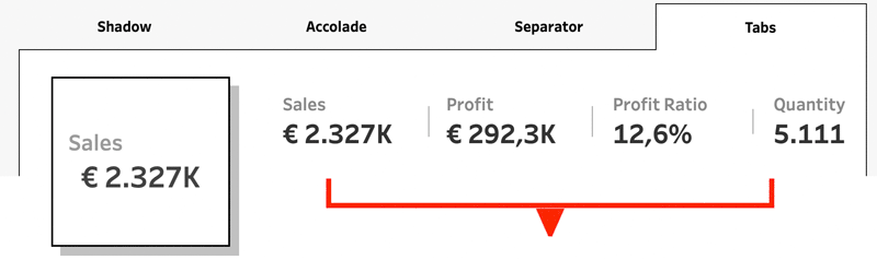
In this post, I’ll show you four small but powerful ways to use the Tableau containers to make your dashboards look sharper, cleaner, and maybe even a little more fun.
[Read more…] about Tableau Container Art – 4 examples of formatting dashboards without images