In an earlier post, Radar Charts: Practical tips for when and how to use them, I explored when radar charts work well, when they don’t, and the common pitfalls that make them misleading or hard to read. This article builds on that foundation.
Instead of revisiting the theory, I’ll focus on how to construct a radar chart in Tableau in a different way than usual. The new way is is more modular, provides more options, and might be easier.
Radar charts in Tableau
Radar charts are powerful tools for comparing multiple metrics at a glance. But building them in Tableau often requires complex table calculations or background images, both of which can be tricky to manage. A different approach is using map layers to create radar charts. This method is modular, easier to maintain, and doesn’t require table calculations.
Advantages of this version:
- Avoids table calculations, which can be daunting.
- Avoids background images
- Fully native Tableau
- Easier to maintain en extend
The technical concept
At their core, radar charts are just polygons. Each vertex is defined by two values:
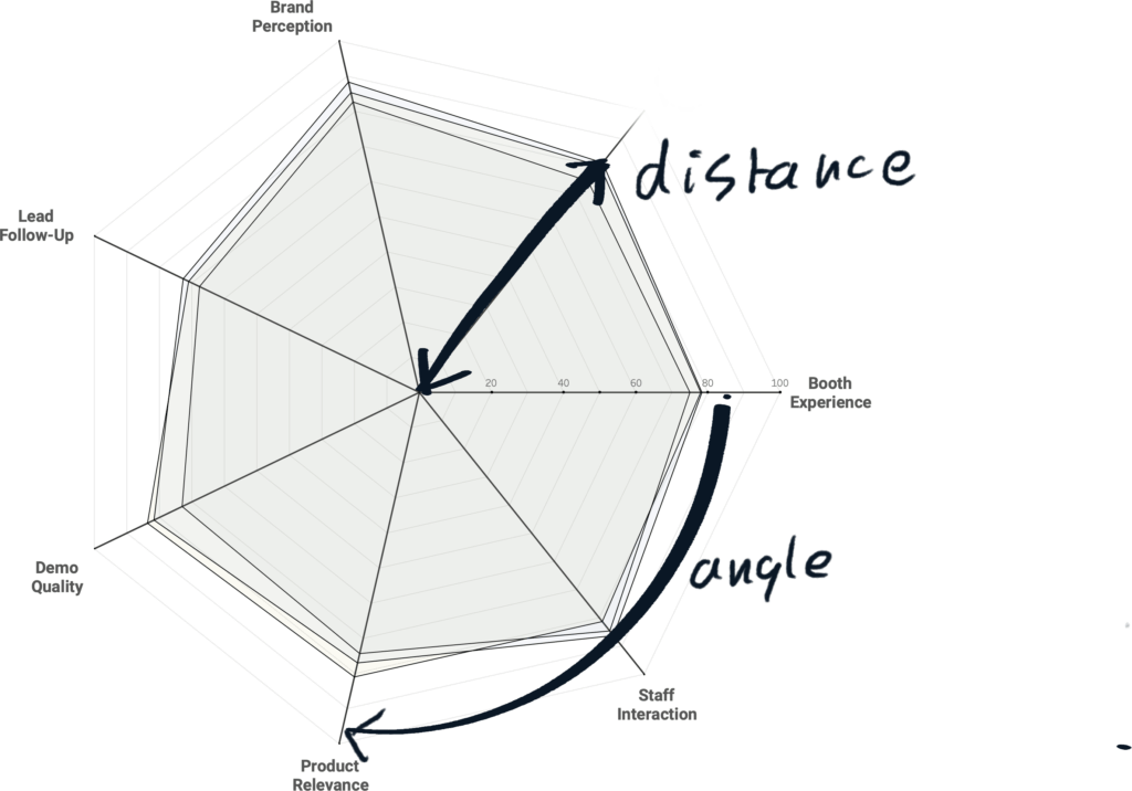
- Angle: Determines which dimension is plotted around the circle.
- Distance to the center: Represents the value of that metric.
If we can calculate X and Y coordinates from these two values, Tableau can draw the radar chart naturally.
1. Preparing the data
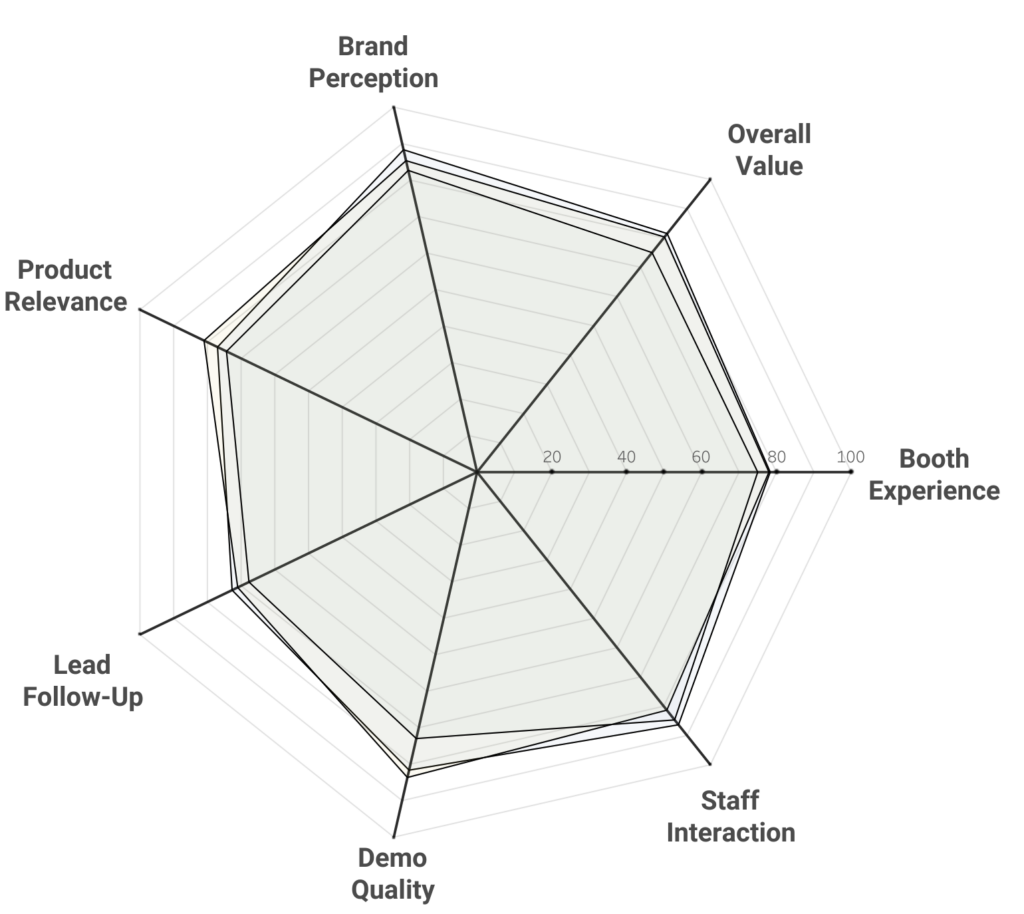
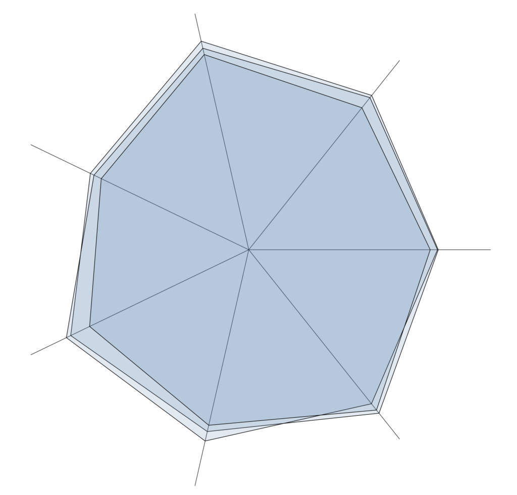
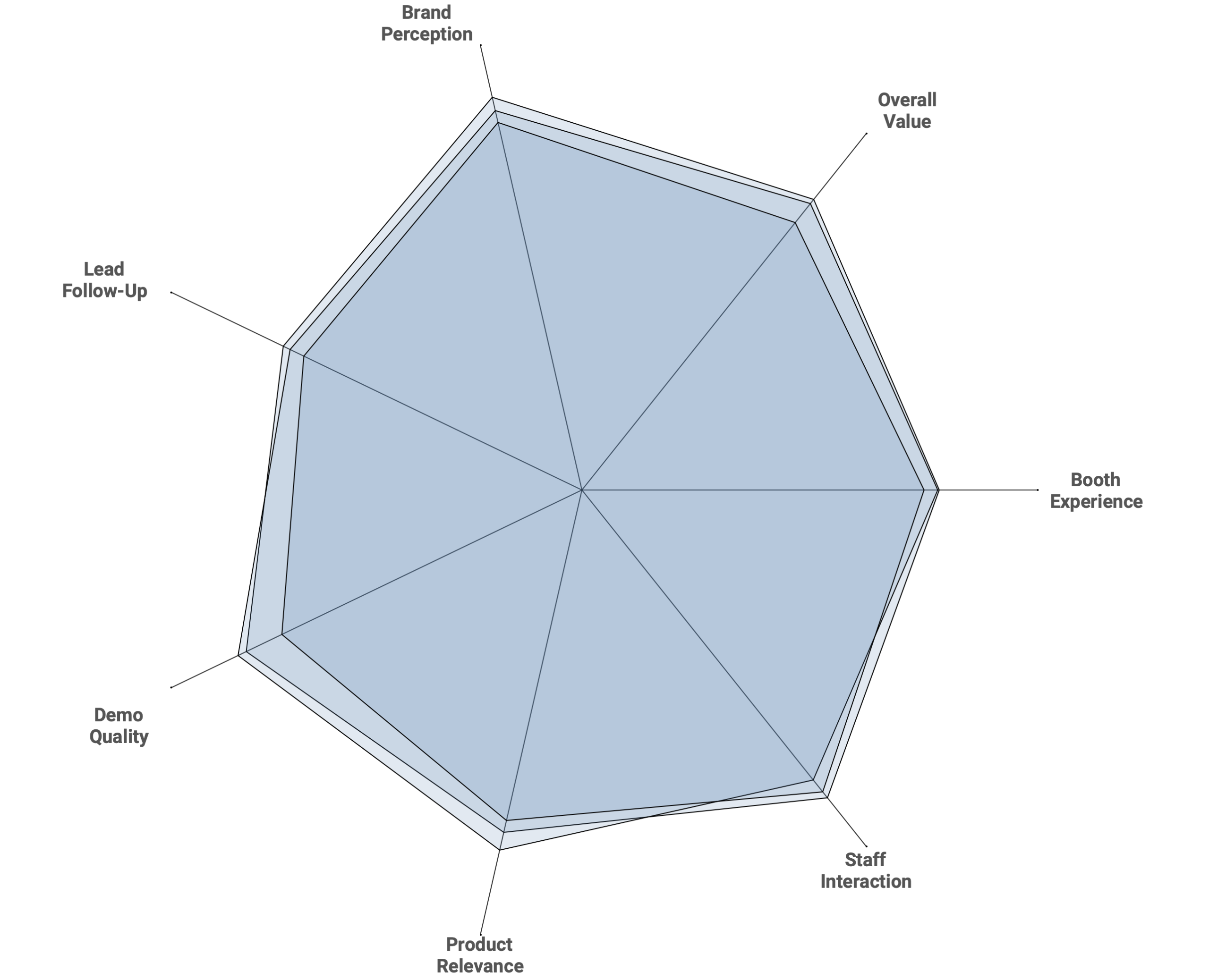
In this example, I’m using survey data collected at a tradeshow. Questions are grouped into dimensions such as:
- Booth Experience
- Staff Interaction
- Demo Quality
- Lead Follow-Up
- Product Relevance
- Brand Perception
- Overall Value
Together these survey questions give a good overview on the ‘human’ performance of a show, and we can compare these values to other editions (e.g. previous years), or to different kind of visitors (e.g. Existing Customers, Partners, Prospects)
Assigning an Order
Each dimension (Question) needs a unique numeric ID to determine its order around the radar. If your dataset doesn’t have one, you can create a calculation with a simple CASE statement:
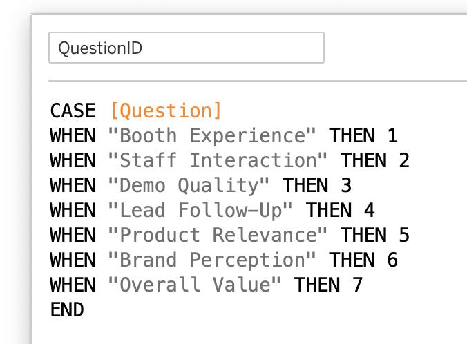
This gives each question a [QuestionID] for further calculations.
2. Calculating the Coordinates
Next, we calculate the position of each point on the radar using Pi and trigonometry. This looks intimidating, but the calculations are straightforward.
Angle
The angle is defined by the order of the questions, evenly distributed around a circle.
([QuestionID]-1) * (2 * PI()) / {FIXED: COUNTD([QuestionID])} + (PI() / 2)
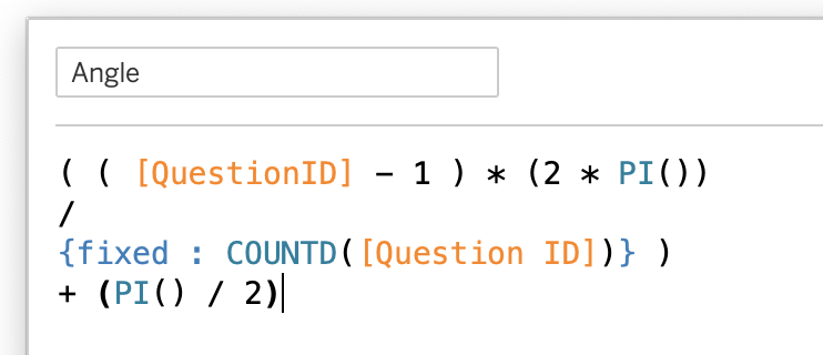
(the +(PI()/2) tilts the chart so the first one is always horizontal)
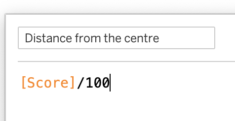
Distance to Center
The length of each radar-spoke is equal to the normalized value of each dimension. Because we are using map-layers the size should be kept rather small – therefore scale the value to max 1.
My ‘score’ is between 0-100, so I divide the value by 100:
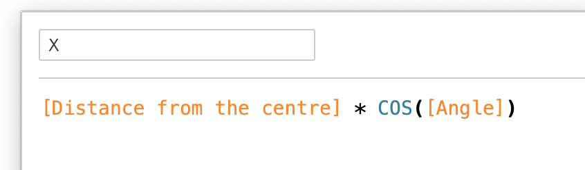
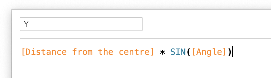
X and Y
Now we are defining the values on the view – and this is the moment you can finally use sine en cosine functions for the first time again since you left high school…
For X we use the cosine of the angle, combined with the distance:
The Y values is calculated using the sine of the angle:
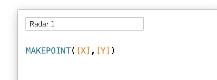
Spatial Point
The radar chart will be built using map layers. The MAKEPOINT function combines the X and Y coordinates:
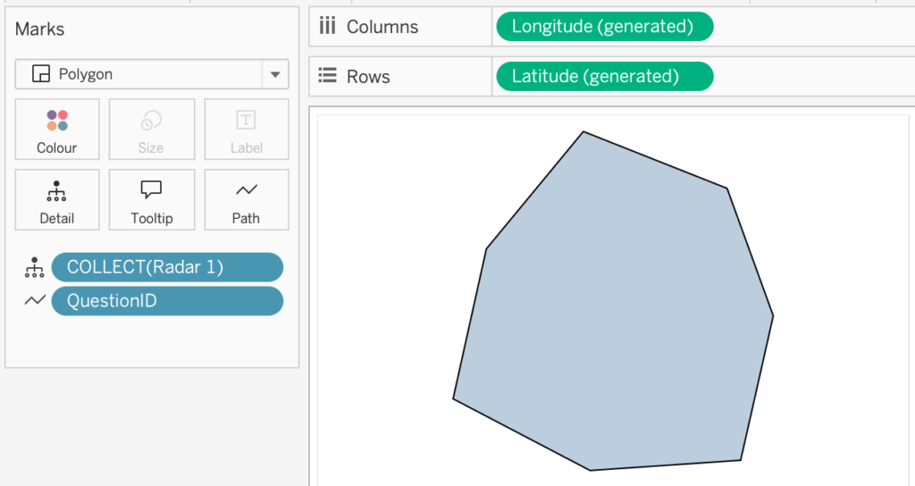
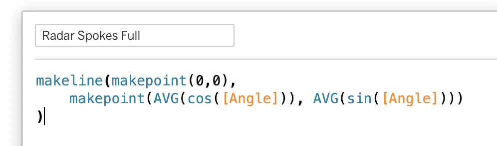
3. Building the radar chart
Using two calculations – Radar 1 and QuestionId, the visualization can be build.
- Drag [Radar] to the detail shelf
- Automatically the ‘generated’ Longitude and Latitude appear on Columns and Rows, and one dot per dimensions are shown in the view
- Change the Marks to ‘Polygon’
- Put ‘QuestionId’ on the ‘Path’ mark
You should now see a basic radar shape
Fine-tune this by:
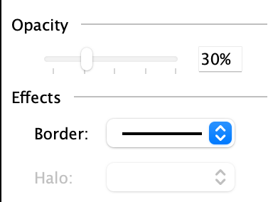
- changing the color options: set the opacity to a low percentage, like 30%.
- Set the Effects Border to black.
- Configure the Background Layers (Maps > Background Layers) to show nothing: untick all, set ‘Washout’ to 0%
- Uncheck all options on the Map Layers > Background Layers to remove the Mapbox / Openstreetmap copyright mark
Now you have created the most basic radar-chart.
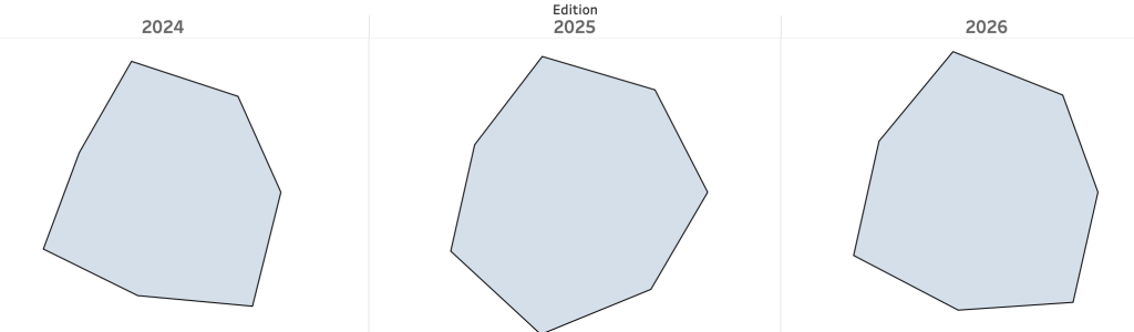
4. Comparing multiple series
A radar chart enables enable comparing different dimensions (the spokes), but also different series, like editions, models or persons.
Next to each other different editions show the difference in ‘shapes’:
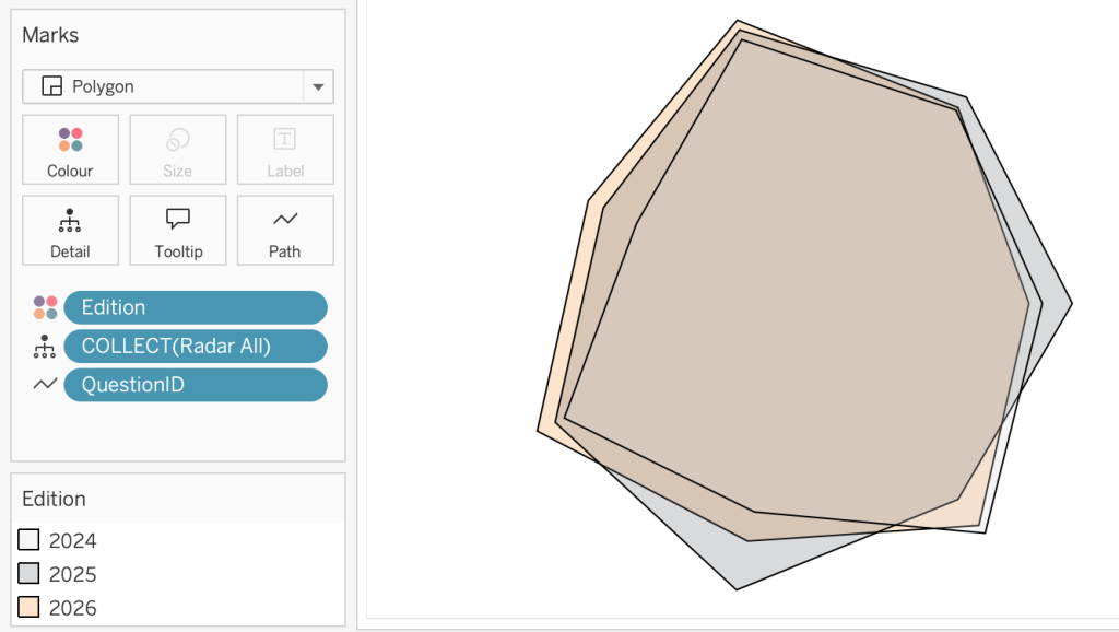
but comparison between series is usually done by stacking these onto each other. Adding [Edition] to color will show the individual shapes:
Further steps
At this point, you already have a functioning radar chart that shows the shape of your data and allows basic comparisons between series.
However, this basic chart can be significantly improved with a few additional layers and formatting tweaks.
Each of the following steps is modular (and optional), so you can add them one at a time and see immediate improvements without breaking the underlying chart.
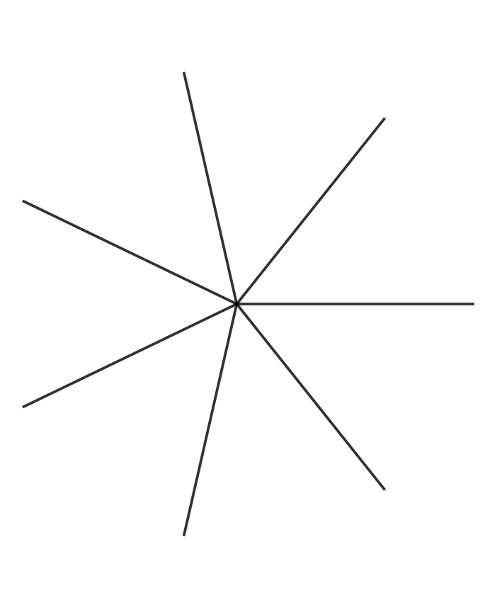
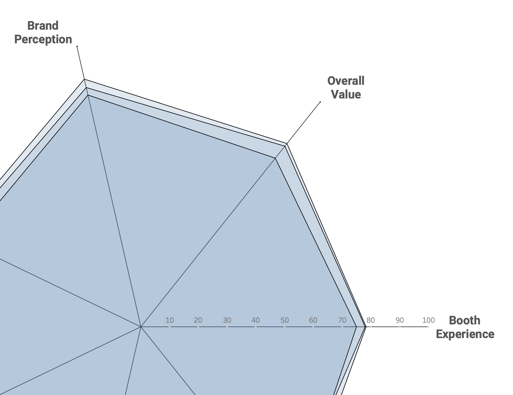
5. Adding Radar Spokes
A radar chart requires one axis per dimension. Each dimension is assigned an angle, and from that angle a radial line is drawn from the center of the chart outward to the edge of the radar.
For each dimension a line is drawn from the center to the maximum end:
Drag this onto the view as a map layer, and add [QuestionID] to Detail.
6. Display the Dimension Labels
Radar charts need dimension labels at the end of each spoke. Another map layer is used for this: the calculation ‘Radar Outer Points’ generates the points at the end of the spokes, which can be labeled.
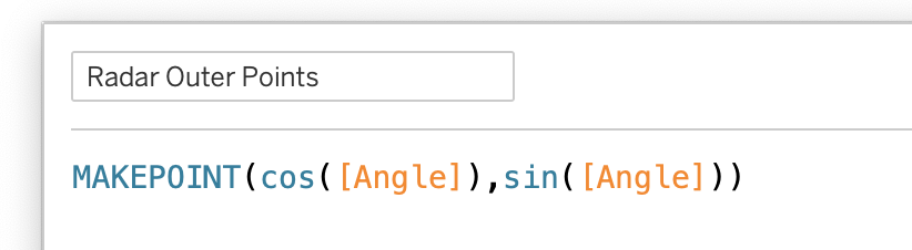
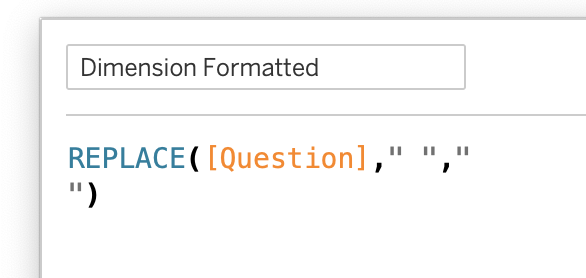
Tip: To create labels which use minimal horizontal space as possible, another calculation replaces all spaces with newlines:
Add ‘Radar Outer Points” as map-layer on the sheet, together with the QuestionId, and put the new label ‘Dimension Formatted’ on the Label
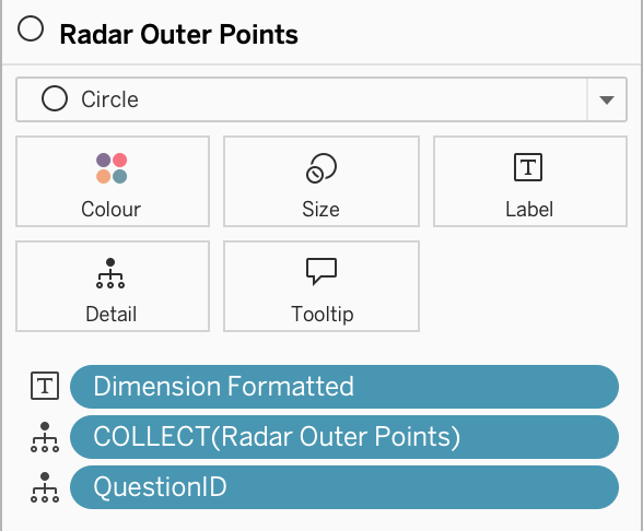
Set the Mark to ‘Circle’, with Colour Opacity to 0% (so these are not visible). You probably have to move the labels manually for the best alignment to the spokes.
7. Axis Labels

Optional, but recommended: axis labels for the spokes.
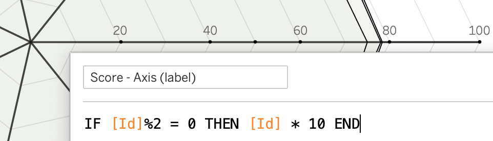
Rather subtle, but useful to get more context of the radar chart. A new calculation [Radar Labels] as circle on a map layer, with size to minimum, and a ‘Score – Axis’ which shows the axis ticks.
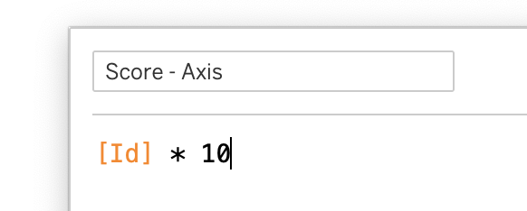
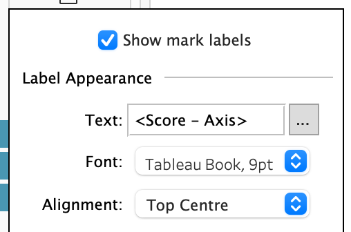
Add the [Radar Labels] as a map layer to the sheet, switch the viz-type of this layer to ‘circle’, and minimize the size. Then add the [Score – Axis] to the label, and set the Alignment to ‘Top Centre’ to make it really look like an axis.
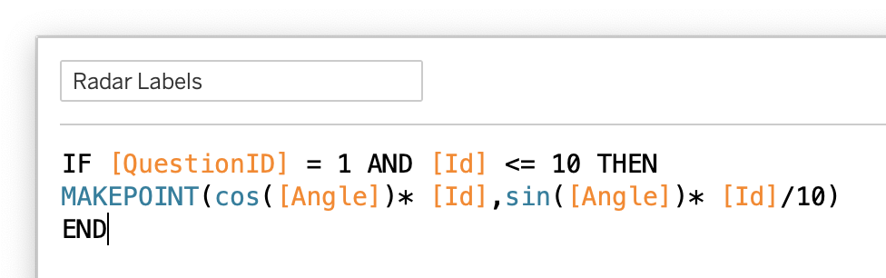
To minimize clutter, I only show the even ids by using a slightly different calculation:
8. Grid-lines
Grid lines make values easier to interpret and compare.
The creation of grid lines on the radar chart without a custom background image requires some data preparation, but is definitely worth it!
For this you need a table with numbers between 1-10 (at least the number of parallel grid-lines).
Use a simple csv file with just one column ‘id’ and the numbers 1-10, or (preferably when using a database) generate the ids using a query (e.g. SELECT generate_series(1, 10) AS id; in PostgreSQL or SELECT explode(sequence(1, 10, 1)) AS id; in Databricks SQL)
‘Relate’ this file to your dataset using a 1=1 relationship (dropdown -> Edit Calculation -> 1 on both tables).
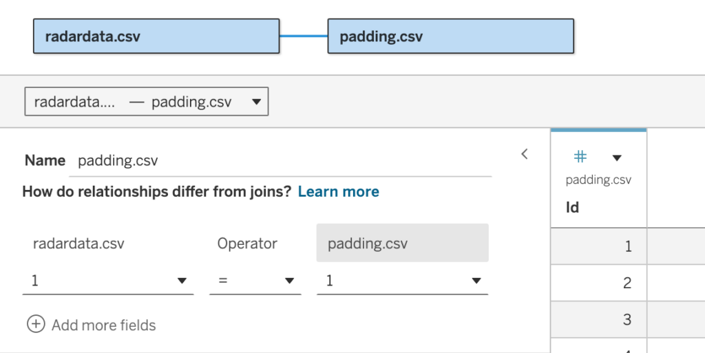
The relationship is easy to add, and enables scaffolding of the geometry.
This change in the datasource makes it possible to automatically create the grid-lines. If you want 10 gridlines, filter until Id = 10, and divide the id by 10.
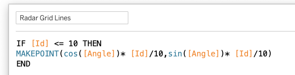
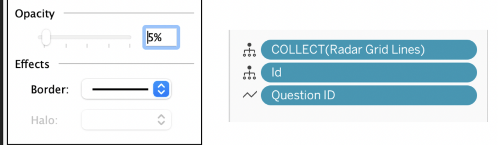
Add this field as a new map layer to the view, change the marks to ‘Polygon’, add Id to detail and QuestionId to the Path. The choices on ‘color’ are important: set the border, and decrease the opacity to a low value (like 5%) or even 0%. Experiment with these values and options to suit your preferences en needs.
Final Thought – and improvements
Like mentioned in the previous blogpost on the theory of radar charts , they are most effective when used carefully:
- Keep the number of dimensions limited
- Use consistent scales
- Focus on shape comparison rather than exact values
When applied in the right context, they can be a powerful visual tool, are much easier to build and maintain in Tableau than many people expect.
Follow-up
A common headache with radar charts is comparing series when their values are close together, like in our example. Don’t worry though, there’s a clever trick to make these comparisons much clearer, and I’ll reveal it in the next post on radar charts!