Tooltips can make or break a Tableau dashboard. Used well, they uncover extra detail with a simple hover, keeping your visuals clean but insightful.
But used poorly, they confuse users, slow performance, and hide the very insights you’re trying to show.
Too many tooltips turn a dashboard into a reactive experience instead of an intuitive one, users spend time chasing popups instead of insights.
In this article, I’ll show how to use tooltips smartly: when to reveal detail, when to stay silent, and how these small choices can make your dashboards clearer, faster, and far more actionable.
Tooltips Can Make or Break a Dashboard
Tooltips are one of Tableau’s most powerful features. They let you tuck away extra detail behind a simple hover, keeping dashboards clean while still offering depth. Personally, I use them all the time to give more insight on data.
But overused or poorly designed tooltips can confuse users, create clutter, and even slow down performance.
Why This Matters
Even small choices in tooltip design have a big impact on how users interact with your dashboard. Too many pop-ups or redundant information forces users to hunt for insights, increases cognitive load, and makes the story your data is telling harder to follow.
Thoughtful use of tooltips keeps your dashboards clear, intuitive, and actionable, so your audience can focus on what really matters.
Simple rules on Tooltips
Without diving too deep (that’s a topic for another post), ask yourself three simple questions for every piece of data:
- Is it vital to the conclusion?
Then it belongs on the screen. - Is it supplemental?
Then it belongs in a tooltip. - Is it redundant?
Then it doesn’t belong anywhere.
These three questions proved invaluable in a recent dashboard I built, helping me cut clutter and highlight what mattered.
Real World Example:
Abbreviating Strings of Performers
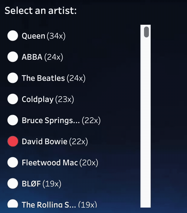
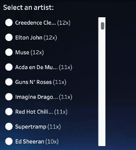
When building my Top 2000 of 2025 visualization, I faced a common challenge: a long list of strings (artists) in a narrow column. With limited real estate, I had to truncate performer names longer than 20 characters. For example, ‘Coldplay ft. Little Simz, Burna Boy, Elyanna’ (44 characters) was shortened to ‘Coldplay ft. Litt…’ using a simple string calculation
(just ‘cutting of’ text – a more intelligent way to shorten text can be found in this article on abbreviating text in Tableau!)
Putting the full (not abbreviated) name in the tooltip is a great example of using tooltip: the full name is really supplemental to the data – not vital, definitely not redundant.
UX dilemma
While the tooltip is the perfect place to reveal the full, unabbreviated name, it also introduces a UX dilemma. If a name is already short – like ‘Adele’ or ‘Queen’ – the tooltip provides zero new information. In these cases, the tooltip is just redundant noise that clutters the interface.
The dashboard got more ‘nervous’, because it reacted to every mouse movement without purpose. Even these small, redundant tooltips increase cognitive load. When a user’s eye jumps to the next hover popup instead of the view itself, the data story gets fragmented.
If a tooltip simply repeats what you already can see, it’s just a flickering distraction that makes the user experience feel cluttered and twitchy.
So the tooltip on long strings is useful – but not on the short ones. How to distinguish these two in Tableau?
Easy: create a calculation which only returns the full name if the underlying string is too long – otherwise don’t do anything.
IF LEN([Artist]) > 20 THEN LEFT([Artist],18) + "..." ENDOnly show full text when it adds value, otherwise nothing“
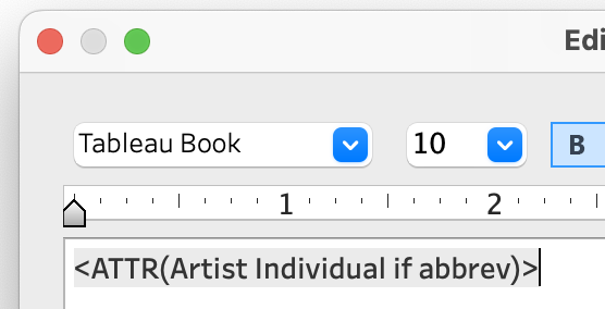
Using this calculation as the tooltip is sufficient. When no data is returned, Tableau hides the tooltip automatically, keeping the interface clean and reducing visual clutter.
The result is a much less nervous, more user-friendly interface:
It’s a really small thing, but in dashboard design, small things matter.
Asking the three simple questions — Is it vital, supplemental, or redundant? — helps you decide what belongs on the canvas, what goes in a tooltip, and what can be left out entirely.
Paying attention to these details keeps dashboards clean, intuitive, and actionable. In the end, it’s the small decisions that make the biggest impact.