• Skip to primary navigation
  • Skip to main content
  • Skip to primary sidebar
Antichaos

Antichaos

Data Visualisation, Tableau & Data Services

  • Home
  • Blog
  • Services
  • Training
  • Portfolio
  • Contact
  • Nederlands
  • Show Search
Hide Search
Home » Blog » Top 2000 of Radio 2 – Edition 2021

Top 2000 of Radio 2 – Edition 2021

2022-01-01 by Johan de Groot

It’s that time of year again… – the Visualisation of the Top 2000 of Radio 2!

One of my traditions is to visualize the Top 2000 as being broadcasting by the Dutch radio station Radio 2 using Tableau.
This time I choose a circular visualisation of the list, with a detailed/zoomed-in look at the chose title inside the circle. Changing a title can be done via the drop-down, but also by clicking in the circle (either one) or in the list of entries of the artist.
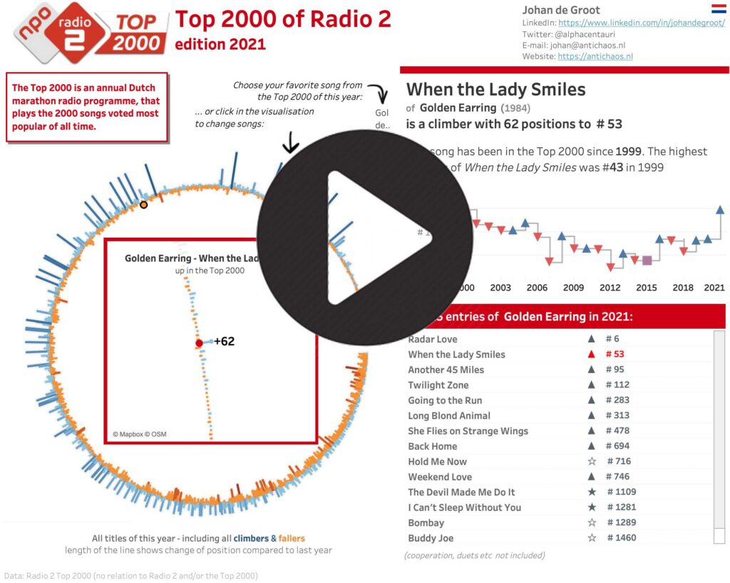
Click on the visualisation to interact with it – and find your own favorite songs!

Used Tableau techniques are – among others – Map Layers, parameter actions, Level of Detail calculations and a little bit of Tableau Prep.

Biggest challenges of this dataset are – like each year:

  • getting the data
  • cleaning the data

but also:

  • how to visualize a ranking list (best on #1, but ‘capped’ on 2000 entries each year)
  • how to make sure all the names of both artists and titles are being showed correctly, independent of the length of these?
  • what is the correct way to get a circular visualisation with these pesky sine, cosine and angle…

and – a small pet-peeve of mine:

  • can you make the used texts dynamically to make sure they don’t look too automated?

Let me know what you think of it via mail of Twitter!

Tableau, Top 2000 Top2000

Primary Sidebar

Antichaos Services

  • Need Tableau Help ?
  • Basic, Advanced and Custom Training

Recent Blogposts

  • Smarter dashboard design – with fewer tooltips
  • Top 2000 in Perspective – Behind the Scenes
  • How to Visualize High-Value Metrics in Tableau Without Starting at Zero
  • Why is COUNTD so slow – and how can I fix this?
  • Visualizing ‘Dynamic’ Data using a Sine Wave
  • Add ‘All’ and more options to a Dynamic Parameter
  • Tableau Container Art – 4 examples of formatting dashboards without images
  • Letting Users Choose Their Visual
  • The Tableau VizQL Data Service: What It Is, What It Can Do, and When to Use It
  • Abbreviate long text in Tableau

Antichaos

Copyright © 2026 Antichaos

  • Antichaos
  • Privacy
  • Contact