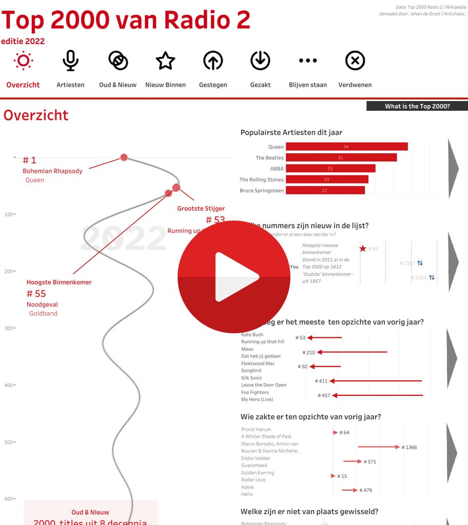
I visualized the Top 2000 as broadcast by Radio 2 for the 11th time (I believe) in a different way using Tableau.
Click on the screenshot to see the entire visualization, and click through the dashboard, find your favorite song from this Top 2000, scroll through the list (it’s long…), and explore all the tooltips with your mouse!
This year less emphasis on the shape (although I opted for a damped sine wave, which is not exactly a common way of displaying…).
Muted Sinus
The shape of the Top 2000 list is special: a ‘swirl’ downwards. This was chosen because it looks nice, but also because a straight line down with 2000 titles is very long. In this way, the highest quotations get a little more space (because they are positioned more widely), but everything is on it.
For the enthusiasts: I used this formula for the horizontal position:
exp(-0.2*([X])/60) * SIN(1*([X])/30)… where [X] is the position of the title – minus 1, to start exactly at the top center with Queen’s Bohemian Rhapsody, rather than just slightly to the right.
Challenges and Tableau techniques
Since this is the 11th (?) time I’ve visualized this list, I’ve become a bit more handy with getting the data. The biggest gain compared to ‘before’ is that there is now a Wikipedia page with all the titles of all artists who have ever been in the list. As a result, I am sure that the same title is used every year and the same name for the artist (“Beatles”, “The Beatles”, “Beatles, The”, …). This goes via Excel to Tableau Prep, where I clean and pivot the data (top 2000 years from columns to rows), and it turns it into an efficient hyper file that Tableau can ‘talk’ to.
New this year in Tableau techniques are Image Roles – where you can dynamically put images in a table (works very well, but with some quirks you’ll have to find out), and my favorite feature of the past year: “Control Visibility using value”, which allows you to a calculation can show or hide part of the dashboard.
(More on this subjects soon!)
I’d love to hear what you think – let me know via email or in a comment below!