
Similar to titles on small multiples, showing title only in the axis on multiple-measure charts is not user friendly. The visuals distance between title and the data is too large, and vertical text is never easy to read:
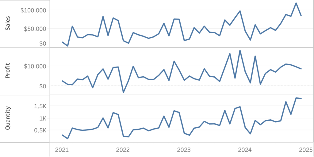
Let’s look at an easy ways to enhance the labels for better clarity and user experience.
[part of the ‘Datafam London 2024 – Deepcleaning your dashboard’ series]
It would be much better if every measure has its own large title on top of the data. On the small-multiples we needed to use a dual-axis to make this possible. On multiple-measure charts we use reference lines. I divided this method in 5 little steps, with one custom calculation and one reference line per measure:
1. Create table-calculations for every measure
For every horizontal measure in the viz we will be plotting the title above the highest value. To make this possible we create a small calculation which return the maximum value of that measure. To create some extra space between the line and the title, we add 20% of that value:
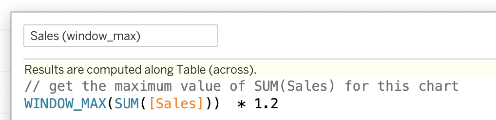
Create one window_max calculation for every measure:
Profit (window_max), Quantity (window_max) and Sales (window_max) in this example.
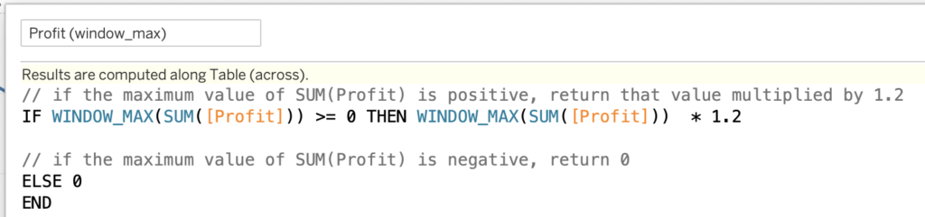
If negative values are possible, change the calculation
This simple calculation won’t work if the maximum value is a negative number: if the maximum value is -10.000, the calculation would return -12.000 – which might overlap with the values in the visualization. For Sales and Quantity negative values should not be possible; for Profit we need to take this risk into account
This fix is rather easy:
if the maximum value is below zero, return zero to put the title on the zero-axis:
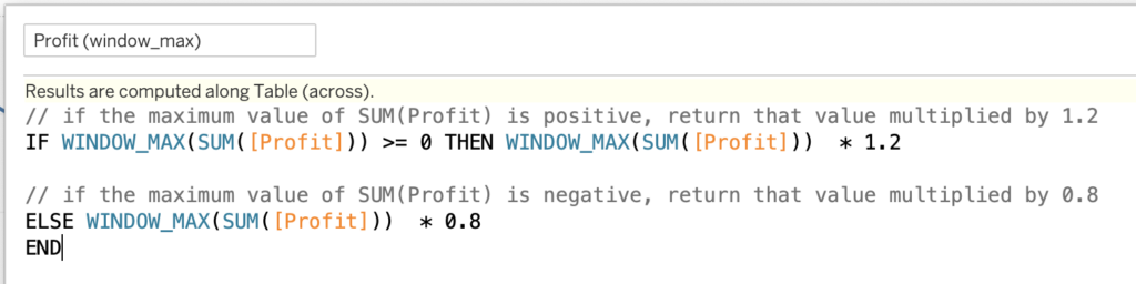
And if you don’t use a zero-line, deduct 80% of the maximum value:
2. Add these calculation to the sheet
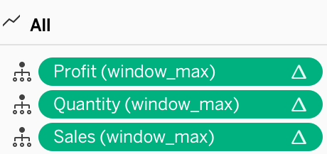
All the calculations – three in my example – needs to be added to the detail pane of the viz. You can add them on Detail mark of ‘All’
3. Add a reference line per measure
Right-click on the axis of the first measure, and choose ‘Add Reference Line’. Set the option to these settings:
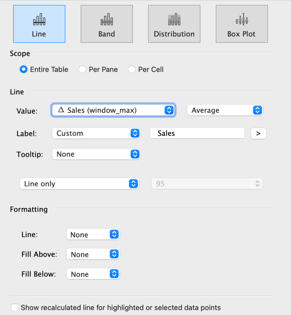
- Type: Line
- Scope: Entire Table
- Line: Value:
△ Sales (window_max)
or whatever calculation if applicable for this axis - Label: Custom – and. add the name of the title here.
Add three spaces in front of the name to add some space between the axis and the title - Tooltip: None
- Line: None
- Fill Above: None
- Fill Below: None
4. Format each reference line
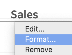
The configuration of reference lines – and its labels – needs to be done on two separate locations: ‘edit’ and ‘format’.
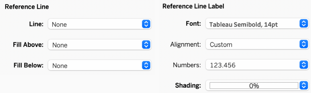
If you choose ‘format’ (right-click on the reference line), the formatting pane opens on the left. Set:
- All Reference line drop-downs to ‘None’
- Font to a decent title size, like Tableau Semibold 14pt
- Shading to 0%
5. Hide the axis titles
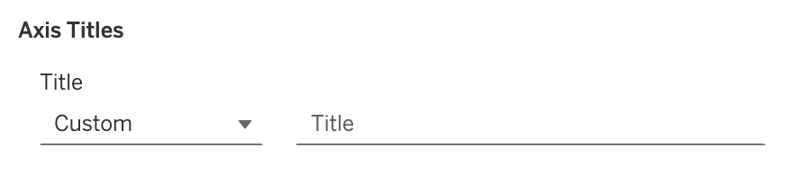
We are almost there – the titles are still visible in the axis. Edit the axis (right-click), and remove any text in ‘Title’:
Done!
Compare the two versions: first the titles in the axis, afterwards with the titles on top of the chart.

Much easier to read with just some simple steps!