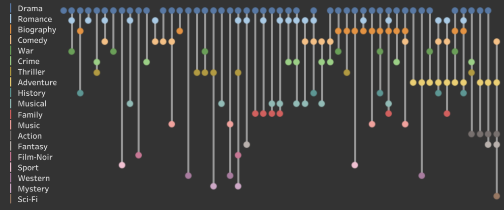
Using the great dataset ‘Data and Movies‘.- with lots of IMDB data from movies until 2022 – I created a dashboard about the different Genres of Academy Award Winners for Best Picture.
Antichaos
Data Visualisation, Tableau & Data Services
Using the great dataset ‘Data and Movies‘.- with lots of IMDB data from movies until 2022 – I created a dashboard about the different Genres of Academy Award Winners for Best Picture.
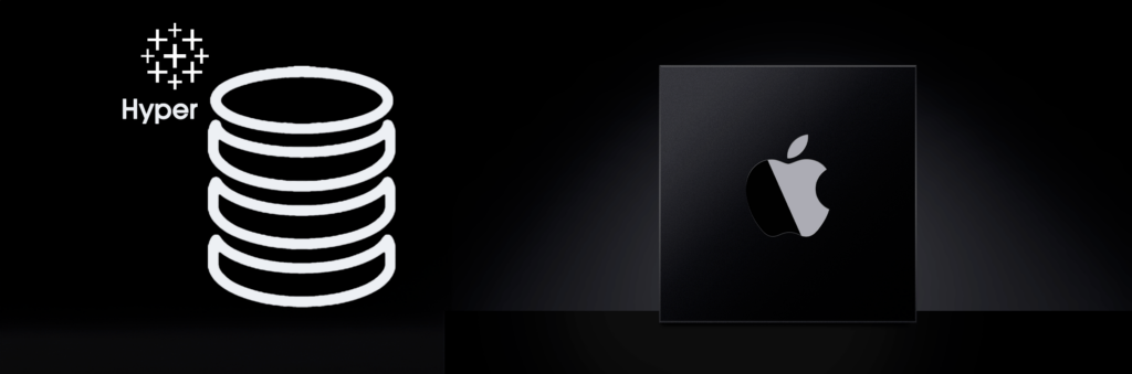
The June 2024 release of the Hyper API (version 0.0.19484) is available – and it now finally supports Apple Silicon!
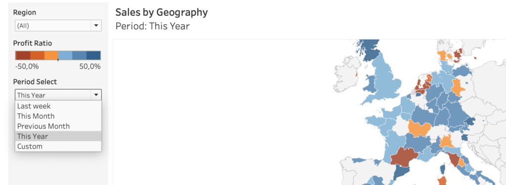
When building a dashboard, one of the most common elements is a date-filter. And the most used date filter is probably the infamous ‘Range of Dates’.
It’s just a couple of weeks before TC24 in San Diego… So we want to know what the weather is out there!

Or at home. Or any other place in the world.
What better than building your own weather forecast in Tableau!?
The ‘shapes’ functionality in Tableau is a nice way to enhance and personalize a visualization. But be aware what exactly you are decoration – especially on maps.