
• Skip to primary navigation
  • Skip to main content
  • Skip to primary sidebar
Antichaos

Antichaos

Data Visualisation, Tableau & Data Services

  • Home
  • Services
    • Training
    • Portfolio
  • About Johan
  • Blog
  • Contact
  • Nederlands
  • Show Search
Hide Search

Visualization

Area Funnel chart in Tableau: Visualizing the Drop-Off

2025-05-15 by Johan de Groot

In the world of digital analytics and customer journeys, not every user makes it to the finish line. Some browse a product, others add it to their cart, but only a fraction complete a purchase. Understanding where users drop off—and how many—can offer crucial insights for optimizing your process. That’s where funnel visualizations come in.
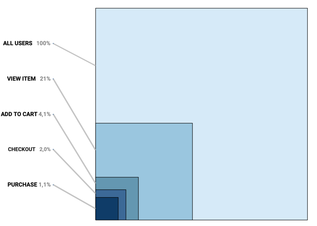
Funnel charts are a powerful way to illustrate step-by-step attrition across a defined process. Whether you’re tracking sales, onboarding, or lead conversions, a funnel view can make complex user behavior immediately digestible. Each stage visually narrows to reflect fewer participants, highlighting friction points and conversion opportunities.

[Read more…] about Area Funnel chart in Tableau: Visualizing the Drop-Off

Primary Sidebar

Antichaos Services

  • Need Tableau Help ?
  • Basic, Advanced and Custom Training

Recent Blogposts

  • MeasureCamp Amsterdam 2026: the power of the blank board
  • Datafam Day 2026 – Amsterdam
  • How to create pill-style navigation in Tableau
  • Tableau Visionary 2026
  • Tableau REST API Connector: Add Live Web Data to Your Dashboards
  • Rounded Corner Maps in Tableau
  • Improving Radar Charts: Showing Overview and Details
  • Create a Radarchart in Tableau – Modular and Simple
  • Radar Charts: Practical tips for when and how to use them
  • Smarter dashboard design – with fewer tooltips

Follow & Connect on

Antichaos

Copyright © 2026 Antichaos

  • Antichaos
  • Privacy
  • Contact