• Skip to primary navigation
  • Skip to main content
  • Skip to primary sidebar
Antichaos

Antichaos

Data Visualisation, Tableau & Data Services

  • Home
  • Services
    • Data Analysis
    • Training
    • Portfolio
  • Blog
  • Extensions
    • Tally
    • Latch
    • How to install
  • Tutorials
  • About Johan
  • Contact
  • Nederlands
  • Show Search
Hide Search

Johan de Groot

Animated icons in Tableau

2025-05-01 by Johan de Groot

An old but very efficient way to point the attention to a row in a table is to add a small text-based icon in front of it. A subtle dot in front of a bar can help you tell the story of data.
But you might want to use less-subtle ways to highlight data?
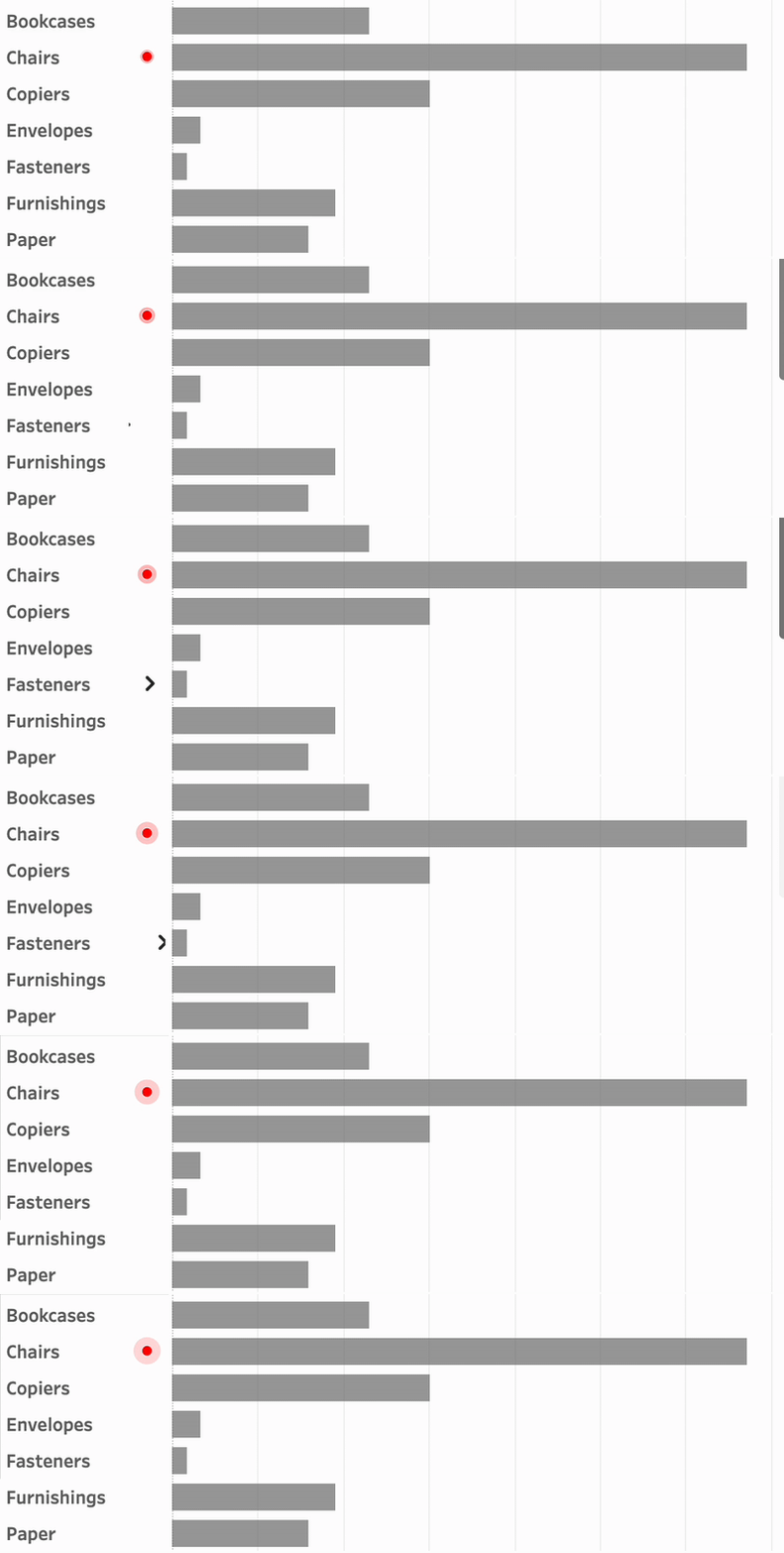
Animation is such a way – and can even add some more fun to a dashboard. In Tableau, this is really easy to accomplish using Image Roles.

[Read more…] about Animated icons in Tableau

Fetch API data real-time in Tableau

2025-04-10 by Johan de Groot

Getting data from external APIs into Tableau often involves several workarounds —manual extracts, middle-ware scripts, or writing to a database. This isn’t bad per se, but if you just want real time data from an API, Table Extensions are a clean and direct solution.

Table Extensions allow you to connect Tableau directly to external data sources like APIs using Python, R, or other analytics engines. This means you can fetch live data—whether it’s weather updates, currency exchange rates, or stock prices—and use it as if it were a regular data source in Tableau.

In this post, I’ll walk you through how to set up your first Table Extension, use Python to pull live data (without storing anything), and explore the benefits and best practices of using this approach—especially when working with real-time or short-lived data.

[Read more…] about Fetch API data real-time in Tableau

Easy Custom Formatting in Tableau

2025-04-03 by Johan de Groot

Formatting matters.
Inconsistent formatting in your Tableau visualizations can will confuse your audience and make your dashboard look unpolished.

A well-structured dashboard is not just about the right data—it’s about making that data easy to read and interpret. Inconsistent date formats, poorly formatted numbers, percentages, and currency values can make your insights less clear. Especially in tables.

In this post, I’ll walk you through essential but simple formatting techniques in Tableau, from setting a default date format to custom number formats. You’ll learn how to hide unnecessary zero values, align text for better readability, and use custom formatting to create intuitive and informative visualizations.

[Read more…] about Easy Custom Formatting in Tableau

5 Tableau Desktop Tips

2025-03-27 by Johan de Groot

Tableau is packed with small but powerful features that can make your workflow smoother and more efficient. However, some of these tricks aren’t immediately obvious—even for experienced users.

Whether you’re troubleshooting a calculation, improving collaboration, or just trying to reset your workspace, these tips will help you work smarter in Tableau.

Here are five tips for using Tableau Desktop:

[Read more…] about 5 Tableau Desktop Tips

Extract custom shapes from Tableau workbook

2025-03-20 by Johan de Groot

Ever got a Tableau workbook with shapes you want to re-use, but weren’t able to because you didn’t have the original files?

You can extract the files from the workbook! Either by hand opening the source code, or using my small Python script.

[Read more…] about Extract custom shapes from Tableau workbook

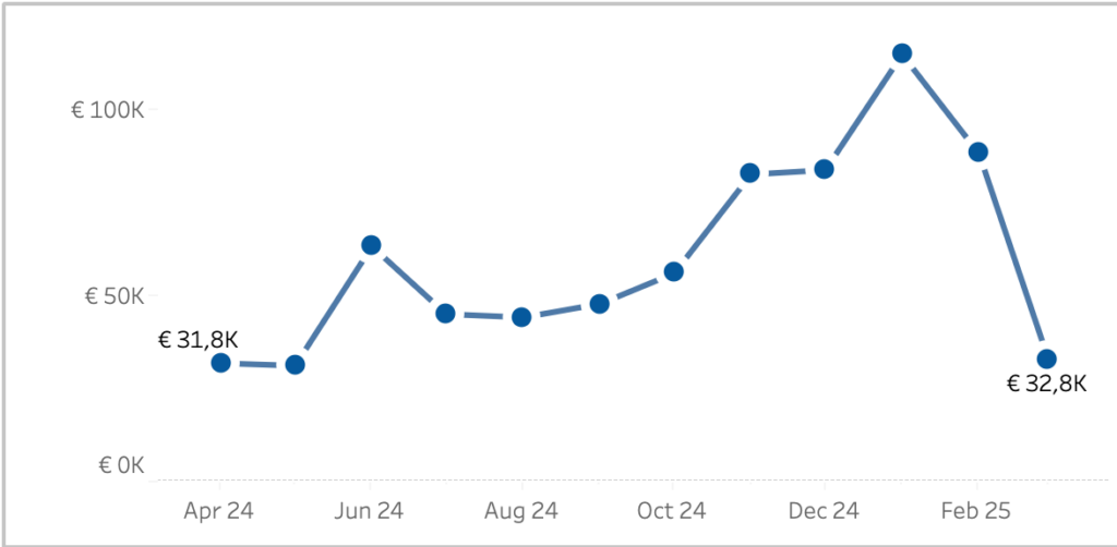
Better Line-charts

2025-03-13 by Johan de Groot

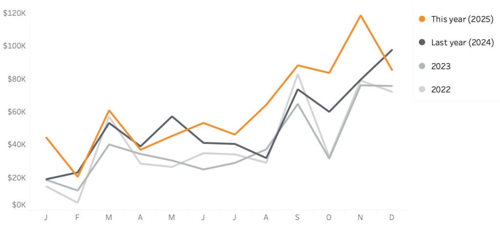
In the endless pursuit of creating better charts, let’s look at the line-chart. Probably the most used chart of all times, since it often shows a metric (sales, quantity, temperature, …) over time.

I already discussed focusing on what is important in the article on “betters ways to compare years“. But how can we improve the default, remove distractions and focus more on the data? Let’s look at some simple steps you should do every time you create a line chart – and finish with a less common but visually pleasing ‘advanced’ one!

[part of the ‘Datafam London 2024 – Deepcleaning your dashboard’ series]

[Read more…] about Better Line-charts

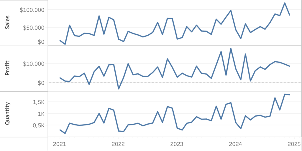
Better Titles on Multiple Measure Panes

2025-03-06 by Johan de Groot

Similar to titles on small multiples, showing title only in the axis on multiple-measure charts is not user friendly. The visuals distance between title and the data is too large, and vertical text is never easy to read:

Let’s look at an easy ways to enhance the labels for better clarity and user experience.

[part of the ‘Datafam London 2024 – Deepcleaning your dashboard’ series]

[Read more…] about Better Titles on Multiple Measure Panes

Netherlands Tableau Usergroup March 2025 @ Nextview Amsterdam

2025-03-06 by Johan de Groot

Tableau User Group Session: Insights, Fun, and Community Spirit!

What happens when you bring together passionate data enthusiasts, a relaxed atmosphere, great food, and a shared love for Tableau? You get an amazing Netherlands Tableau User Group (NLTUG) session on March 4th 2025!

[Read more…] about Netherlands Tableau Usergroup March 2025 @ Nextview Amsterdam

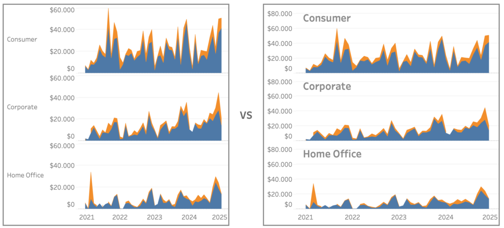
Improve Titles on Small Multiples

2025-02-27 by Johan de Groot

Small multiples charts (also known as trellis charts or panel charts) are a great way to visualize trends across different categories while maintaining consistency. They display multiple variations of the same chart, often sharing a common axis, which allows for easier comparison across groups.

While effective, these charts can suffer from poor readability if titles are not thoughtfully applied. Let’s look at some ways to enhance labels for better clarity and user experience.

[Read more…] about Improve Titles on Small Multiples

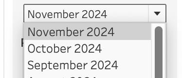
Easier date drop-down in Tableau

2025-02-20 by Johan de Groot

This small tip is on how to add a filter to a dashboard with the current month on top, so it is easier to navigate for users.

Not one which will drastically change your dashboard, but a ‘quality of life’ usability tip.

[Read more…] about Easier date drop-down in Tableau

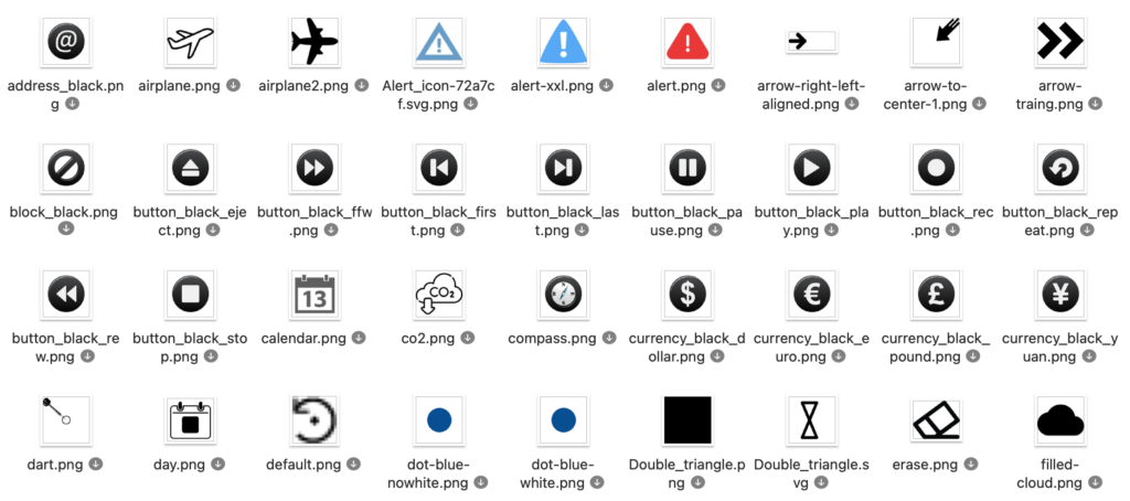
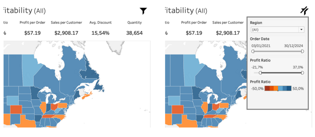
Deep Cleaning: Icons

2025-02-12 by Johan de Groot

Using the right visuals (images) on a dashboard is very important. Icons are often used go guide users into the right direction, so we don’t want to confuse them with unclear images

[part of the ‘Datafam London 2024 – Deepcleaning your dashboard’ series]

[Read more…] about Deep Cleaning: Icons

My Tableau Resources

2025-02-10 by Johan de Groot

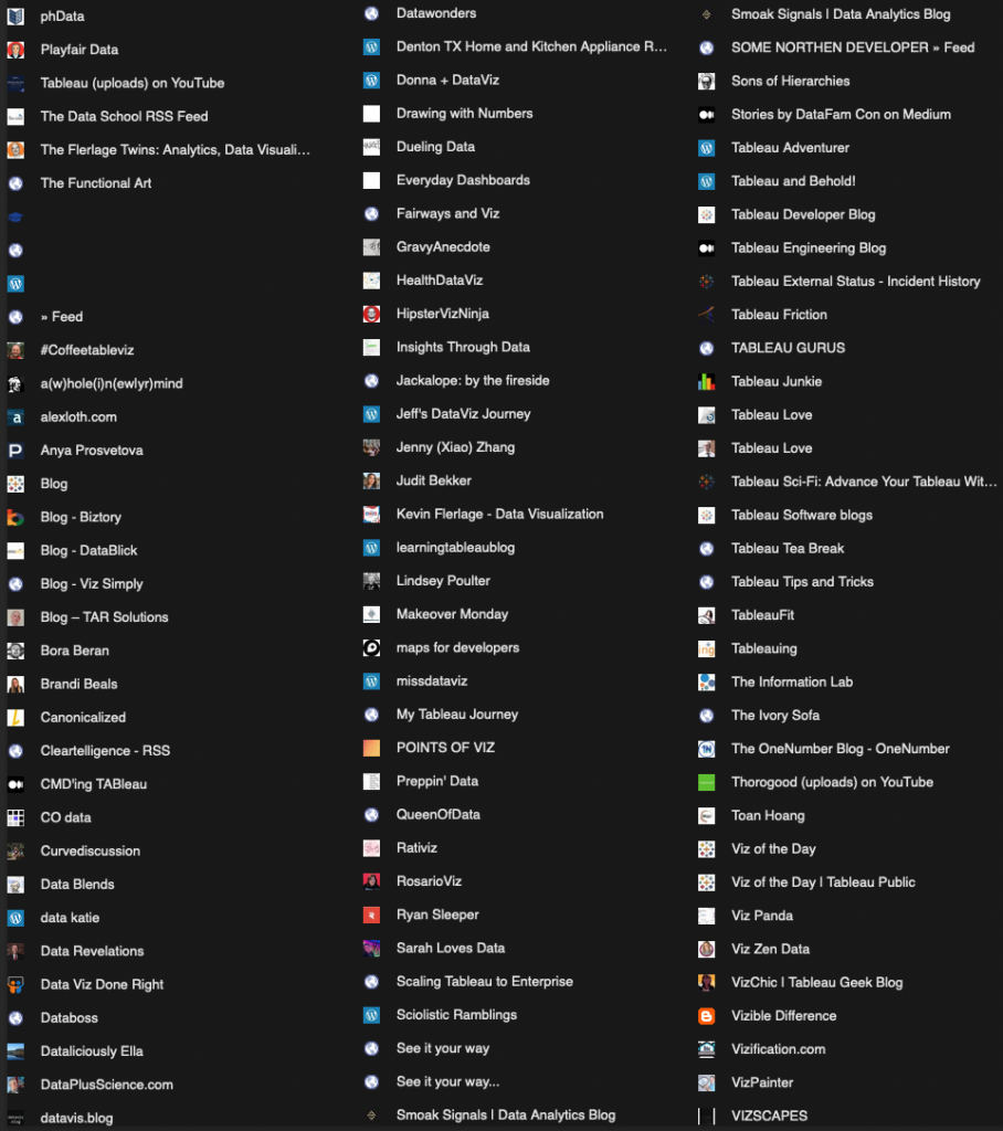
During my Datafam London presentation I briefly showed a slide with a screenshot of my RSS reader – my main source of inspiration on everything Tableau. Afterwards I have got several requests to share this list of website.

Every time I stumble upon an interesting blog (or website with a feed) I add it to my Feedly account.

For this post I have exported all these links, and I will update it regularly. If you want to share an interesting Tableau/Data/Data Visualization blog, please let me know and I will add (and follow) it!

[Read more…] about My Tableau Resources

Drill Down in Tight Spaces

2025-02-06 by Johan de Groot

A different way to make drill down possible/usable in a small sheet.

Sometimes you don’t have all the space to do what you want.

Or you are almost finished with a dashboard, and suddenly someone mentions: “Wouldn’t it be nice if we could drill down on this chart…” – but the sheet is just too small for another column. There are multiple ways so solve this issue – each with its own pros and cons. Viz-in tooltip (hard to read on larger drill-downs), hiding nearby sheets (tedious), enlarging the row-height (ugly when not drilled-down), misusing totals (even uglier), …

In this article I describe a different solution – which definitely has its disadvantages, but can be useful in certain situations where the drill down functionality is important.

[Read more…] about Drill Down in Tight Spaces

Clean your BANs – 3 simple tips

2025-01-28 by Johan de Groot

Three easy to implement tips on BANs: the Big Ass Numbers you put on top of your dashboard.

BANs are a common and good way to display important figures. But while they are seemingly easy to implement, often they can be improved to make them more effective.

[part of the ‘Datafam London 2024 – Deepcleaning your dashboard’ series]

[Read more…] about Clean your BANs – 3 simple tips

Line-chart: betters ways to compare years

2025-01-23 by Johan de Groot

Line charts are one of the best and popular ways to show how data has developed over time. It’s a simple graph that is familiar to anyone, but the default generated can often be improved – either in Tableau, Excel or any other tool.

In this blog post I want to show how a relative small change in a line chart can result in a big improvement.

[part of the ‘Datafam London 2024 – Deepcleaning your dashboard’ series]

[Read more…] about Line-chart: betters ways to compare years
  • « Go to Previous Page
  • Page 1
  • Page 2
  • Page 3
  • Page 4
  • Page 5
  • Interim pages omitted …
  • Page 7
  • Go to Next Page »

Primary Sidebar

Antichaos Services

  • Need Tableau Help ?
  • Basic, Advanced and Custom Training

Recent Blogposts

  • Live News in Tableau – setup in 10 minutes
  • Stop using red vs green in dashboards
  • Tableau Toggle Button: 3 Ways to Build an On/Off Switch
  • The Tally extension: CountTo renewed
  • 5 more Tableau Desktop Tips: Fields, Calculations & Pills
  • MeasureCamp Amsterdam 2026: the power of the blank board
  • Datafam Day 2026 – Amsterdam
  • How to create pill-style navigation in Tableau
  • Tableau Visionary 2026
  • Tableau REST API Connector: Add Live Web Data to Your Dashboards

Follow & Connect on

Antichaos

Copyright © 2026 Antichaos

  • Antichaos
  • Blog
  • Tutorials
  • Privacy
  • Extensions
  • Contact