Often improving a dashboard is about small changes. Have a look a this chart:

[This blogpost is part of a series tips tricks, as being presented at VizIt Berlin 2023]
[Read more…] about Improve layout of percentags – Better labels in Tableau
Antichaos
Data Visualisation, Tableau & Data Services
Often improving a dashboard is about small changes. Have a look a this chart:
[This blogpost is part of a series tips tricks, as being presented at VizIt Berlin 2023]
[Read more…] about Improve layout of percentags – Better labels in TableauLabels are often an after-thought for many users – we don’t like them, but are necessary. Using some simple steps we can create better labels which are easier to interpret for the users of the dashboard.

[This blogpost is part of a series tips tricks, as being presented at VizIt Berlin 2023]
This week the “DataFam” was reuniting in Berlin. Two days of great talks, great people in a wonderful atmosphere!

On the 26th of September the NL Tableau User Group headed to the office of Nextview in Eindhoven.
In this exciting office – dynamic and inspiring – two sessions where presented. Alex Barakov talked about Addressing Enterprise Tableau Challenges and Advancing Your Career, and a project showcase from Nextview by Luuk Martens and Joeri Matthijssen called Empowerment through data: a Salesforce & Tableau
An impressions of the sessions – and the very nice get together afterwards…
For the third year in a row I have been selected Tableau Forum Ambassador.
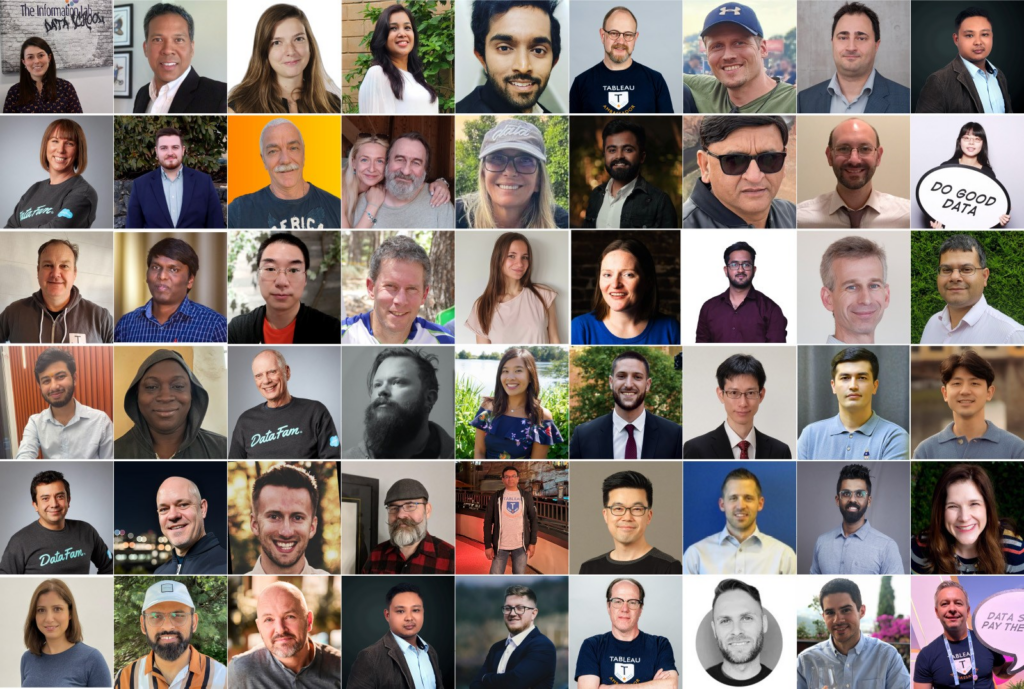

On the 27th of February the Tableau User Group Netherlands organized – together with the Data + Women Netherlands Tableau User Group – the first meeting of 2023. It was a very nice meetup with a perfect reception from Randstad, and two interesting talks:
Watch the Tableau User Group session from the 27th of February:
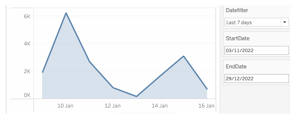
Datefilters are one of the most common filters on any dashboard. They are needed to see trends, make decisions on the right period, and analyse within the right context. But most of the times these filters are not optimal – so let’s make them better (and prettier)
I visualized the Top 2000 as broadcast by Radio 2 for the 11th time (I believe) in a different way using Tableau.
[Read more…] about The Radio Top 2000 visualised – edition 2022De Top 2000 zoals uitgezonden door Radio 2 heb ik gevisualiseerd met behulp van Tableau.
Dit jaar wat minder nadruk op een de vorm (hoewel ik heb gekozen voor een gedempte sinus, wat niet bepaald een veelgebruikte manier van weergeven is…).
[Read more…] about De Top 2000 van 2022 gevisualiseerdTableau has created a nice blog post on Tableau Forum Ambassadors. It describes what these ambassadors do, how they can be used on the Tableau journey,
[Read more…] about Featured Forum AmbassadorThe order of operations in Tableau refers to the sequence in which the software processes the data and calculations in a given worksheet or visualization.
The order of operations in Tableau is the order in which Tableau performs its various actions. An action is mostly identified as a filter, but can also be a calculation or another Tableau feature which is computed.
This is Tableau’s Order of Operations:
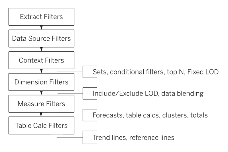
It shows in which sequence filters are handled with by Tableau: first extract filters, than datasource, context, dimension, measure and table calculation filters.
The ‘inserts’ on the right are calculations themselves.
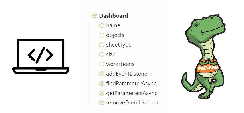
Tableau Extensions are a way to extend the functionality of a dashboard to your own specific needs. Most people using extensions simply grab one of the many offered via the Tableau Exchange (free or paid).
In this post I would like to encourage you to think about another option: creating your own extension!
[Read more…] about Write your own Tableau Extension for your current dashboardIt’s that time of year again… – the Visualisation of the Top 2000 of Radio 2!
One of my traditions is to visualize the Top 2000 as being broadcasting by the Dutch radio station Radio 2 using Tableau.
This time I choose a circular visualisation of the list, with a detailed/zoomed-in look at the chose title inside the circle. Changing a title can be done via the drop-down, but also by clicking in the circle (either one) or in the list of entries of the artist.
Het is weer die tijd van het jaar – de Visualisatie van de Top 2000 van Radio 2…
De Top 2000 zoals uitgezonden door Radio 2 heb ik voor de 10e keer (geloof ik) op een andere manier gevisualiseerd met behulp van Tableau.
Dit keer is er gekozen voor een circulaire weergave van de lijst van dit jaar, met een ‘detail’ van het gekozen nummer in de cirkel. Je kunt een nummer kiezen uit het dropdown menu, maar ook klikken in de cirkel of in de lijst met noteringen van de desbetreffende artiest.
Honored and proud to be selected a 2021 Tableau Ambassador!
Looking forward to work, learn and share ‘all things Tableau’ with even more people. Thanks Tableau, and congratulations to all new and returning Tableau Ambassadors.
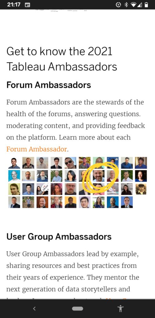
More information on all Tableau Ambassadors 2021 can be found here: https://www.tableau.com/about/blog/2021/9/congratulations-and-welcome-2021-tableau-ambassadors