
So many dashboards show “good vs bad”, or “above vs below target” in a chart or text with green and red. Red means stop, green means go in traffic – so it feels universal. It isn’t.
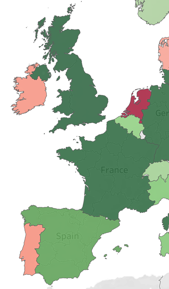
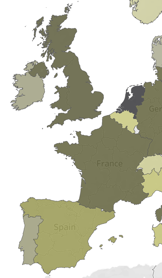
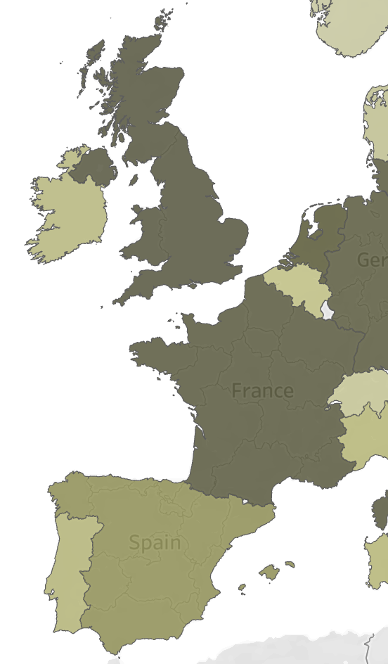
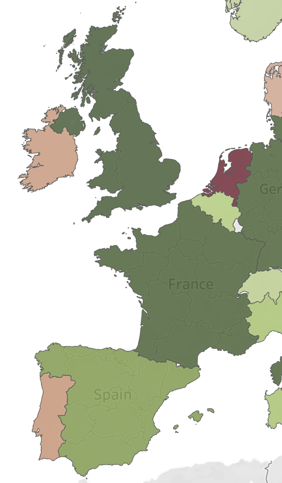
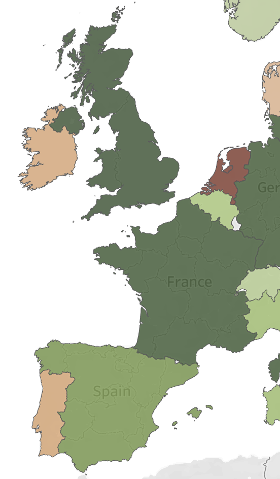
A meaningful part of your users find it really hard to tell apart red and green, which makes this the one of the most common accessibility mistakes in dashboard design.
The biology of color blindness
Color vision deficiency (CVD) – often called ‘color blindness’ – affects roughly 8% of men (1 in 12) and 0.5% (1 in 200) of women. For a company-wide dashboard, that’s a near-certainty that at least someone in the room can’t read a red/green scale reliably.
The two dominant forms, deuteranomaly/deuteranopia and protanomaly/protanopia, both involve the red- and green-sensitive cone cells in the retina. When the sensitivity ranges overlap too much, the difference between red and green is gone. Someone with strong CVD sees both as a similar brown.
Orange can shift toward brown too, and separately, blue/purple, pink/gray, and gray/brown are also unreliable pairings.
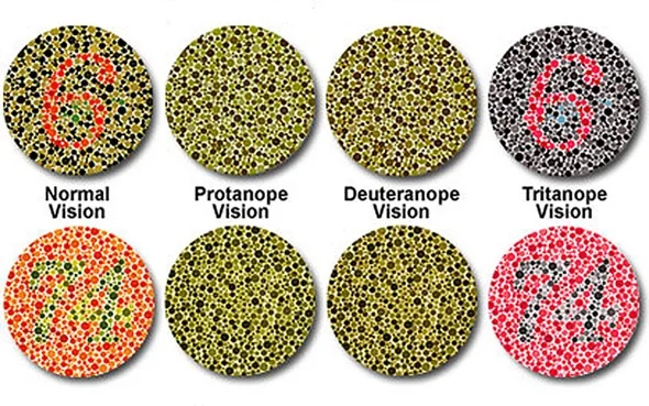
Blue and red are not that susceptible to it. They sit on opposite ends of the visible spectrum and are processed by different cone types entirely (specifically: blue by the short-wavelength cones, red by the long-wavelength ones), so the contrast holds up across essentially all forms of CVD – and also grayscale printing or a bad projector in the meeting room…
If color is the only way to distinguish two values, color blindness is a real barrier. Red and green cells in the same table, two lines on a chart: these are hard to separate. The color choice should be a secondary cue, and should lean on position or symbols instead.
Diverging palettes
A diverging palette (low – midpoint – high) is a good method for anything centered around a meaningful zero or target: profit/loss, actual/budget, sentiment. The choice of the colors at the two ends is important.
- Red/green diverging: fails for about 8% of men, but bad lighting or vague prints makes the difference vanish.
- Red/blue (or orange/blue) diverging: readable across essentially all forms of CVD, holds up in grayscale, and still reads intuitively as “bad vs good”.
Switching away from red/green barely costs you anything.






Fixing this in Tableau
Within Tableau you can use your own color palettes – including CVD/color-blind friendly.
2025.3+ (color palette editor)
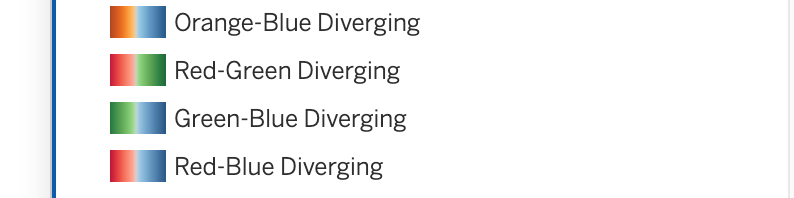
Open the color legend (right-click on the color legend, choose Edit Colors), and pick one of the built-in colorblind-safe diverging palettes: “Orange-Blue Diverging” or “Red-Blue Diverging” are in there ship by default.
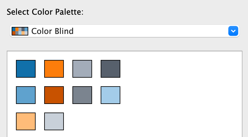
Tableau also has a dedicated “Color Blind” categorical palette for non-diverging use cases (10 colors, designed by Maureen Stone specifically to hold up under the two most common CVD types).
Legacy method (Preferences.tps)
If you’re maintaining a custom palette across a fleet of older workbooks, you define it as XML in the Preferences.tps file:
<color-palette name="Blue-Red Diverging" type="ordered-diverging">
  <color>#2166AC</color>
  <color>#67A9CF</color>
  <color>#F7F7F7</color>
  <color>#EF8A62</color>
  <color>#B2182B</color>
</color-palette>
Drop this into the file My Tableau Repository/Preferences.tps, restart Tableau Desktop, and it appears in every workbook’s color dialog as a custom palette.
(a more extensive description on editing color palettes in Tableau can be found in this tutorial)
If you have to use red/green anyway…
Sometimes you cannot change the palette – due to brand guidelines, or a manager who just wants stoplight colors. While you work on convincing them, do this in the meantime:
- Push the value contrast. CVD affects hue, not brightness. A very light green vs a very dark red still reads as a distinction, even to someone who sees both as brown.
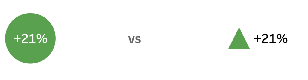
- Add extra signals. Icons, arrows, labels or annotations let a CVD viewer (and everyone else) confirm good vs bad.
- Offer an escape. A nice but more involved option is using a parameter or dashboard action that swaps the whole palette to a colorblind-safe scheme.
Check before shipping
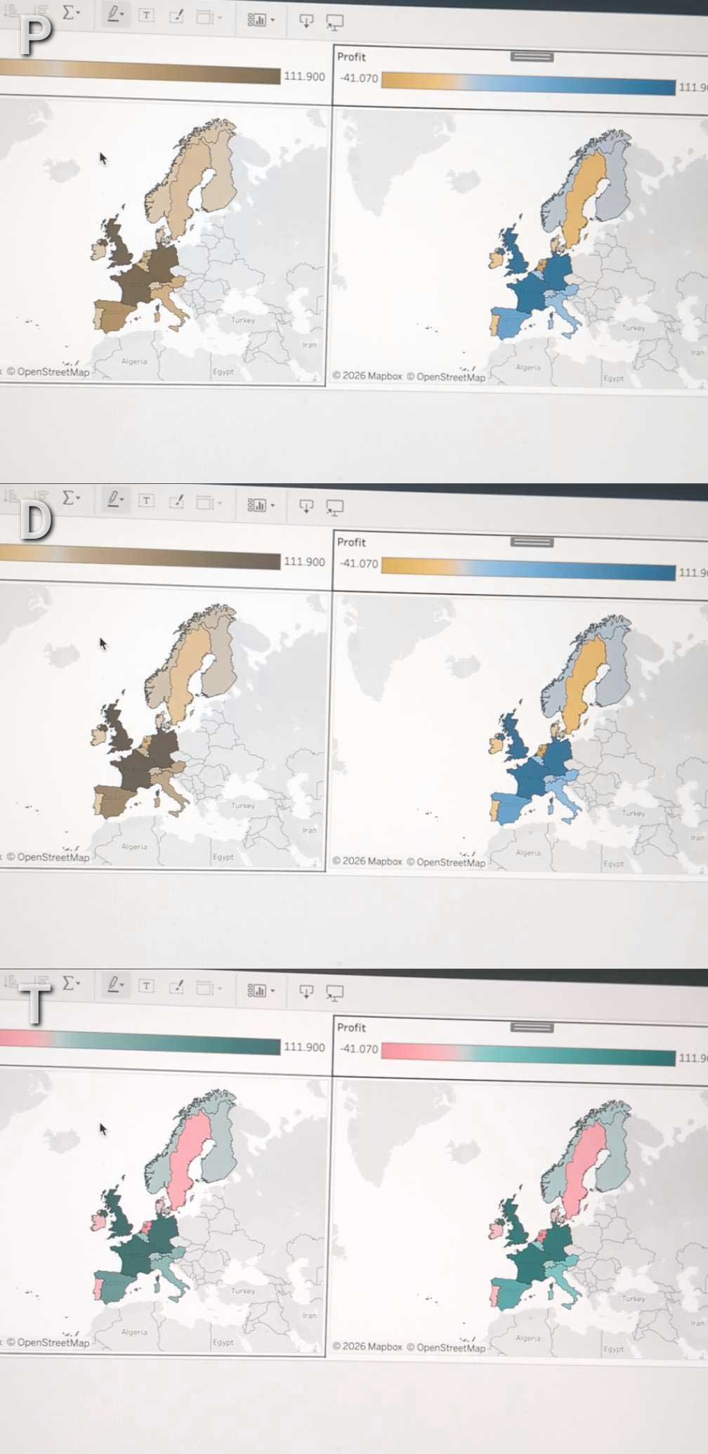
Before shipping a dashboard, run it through a CVD simulator. The ColorBlindly Chrome extension simulates color vision deficiency live in the browser – including dashboards hosted on Tableau Public, Server or Cloud. Or use a mobile app like Chromatic Vision Simulator to see how color blindness affects everyday vision.
If the categories collapse into each other, so will they for a real user. Blue/red almost never does.
Red and green may feel universal, but they are not : swapping them out costs you nothing and closes a gap for a meaningful share of your audience.